SPRK
From behind-the-scenes service to a standout brand in themed entertainment
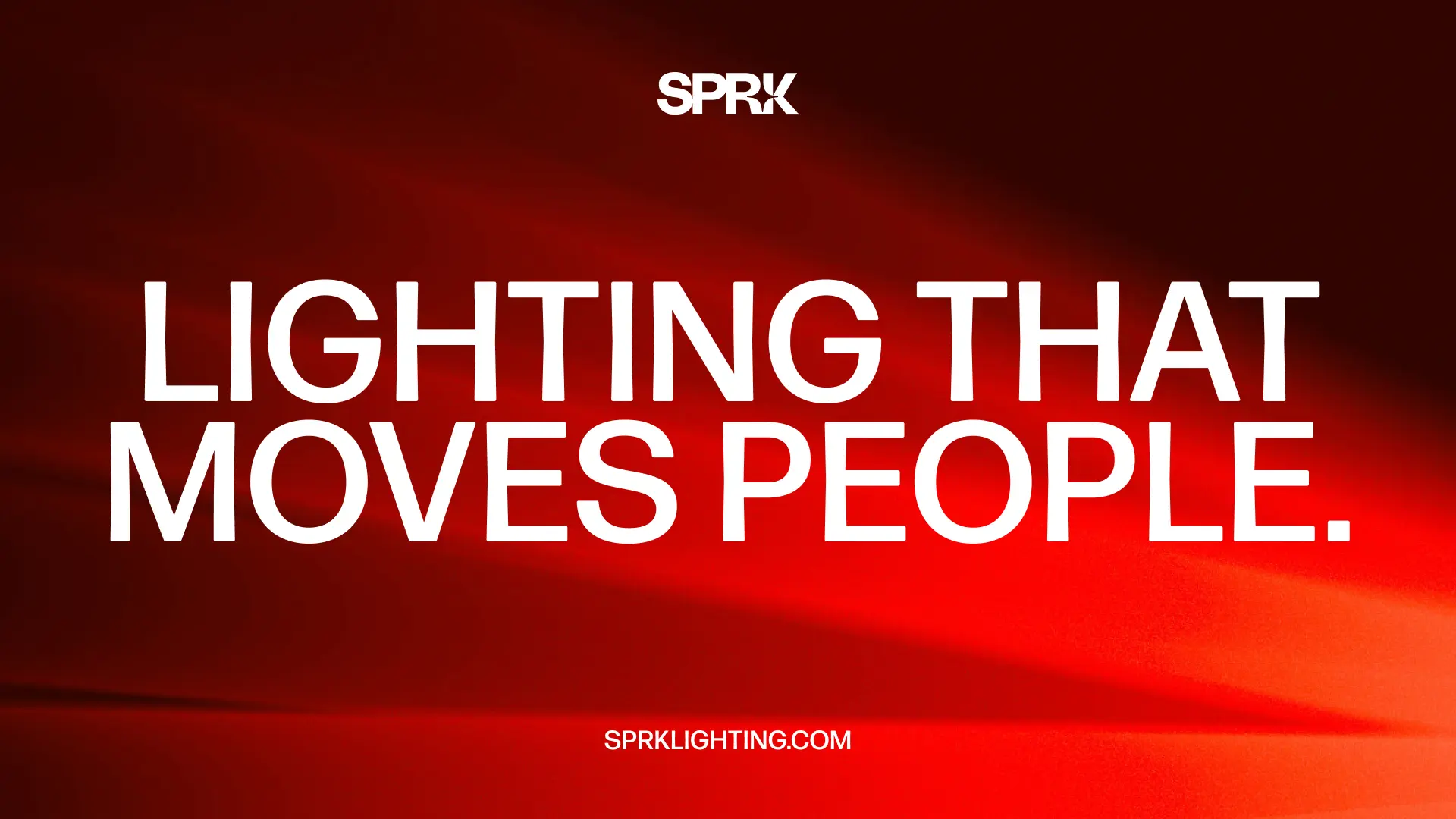
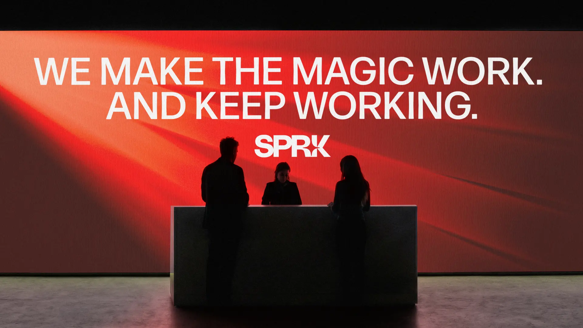

Lighting is the emotional heartbeat of any immersive environment: theater shows, rollercoasters, a walk to grab ice cream at a theme park. When it is right, guests simply feel the magic; when it is wrong, the illusion breaks. SPRK Lighting knows how to get it right. They are an integrated team of theatrical and architectural veterans who design, procure, install, program, and maintain systems for world-class theme parks and destinations. Unlike traditional studios that hand off unbuildable blueprints and walk away, SPRK runs toward complex challenges, owns the full lifecycle, and delivers lighting that moves people.
Define
Our partnership began with an intensive, month-long discovery phase. We met week after week to uncover what makes SPRK tick—and what held them back. We conducted exercises like writing a cultural obituary and mapping core values, exploring everything from their equipment service roots to the expertise behind their procurement bench.
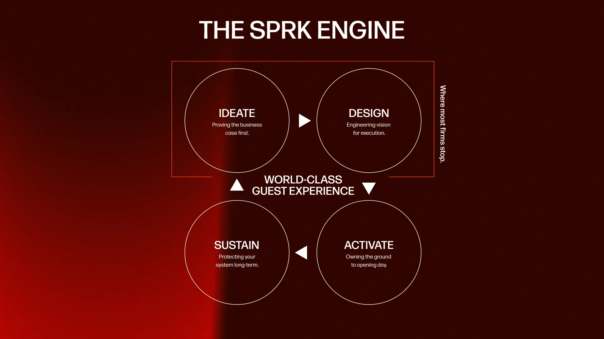
Through these collaborative sessions, one truth emerged: SPRK's power lies in how they bridge creative storytelling and rigorous technical engineering. They aren’t just another lighting vendor; they are rapidly becoming the premier firm for world-class theme parks and immersive destinations. We needed a brand strategy that reflected that unmatched authority, built around what we formalized as the SPRK Engine: their model, their approach to how they work and how they do it differently than the rest.
Design
Theme park lighting is serious work, but the people behind it know how to have fun. The main challenge was striking the right visual and verbal balance: combining technical competence with an unpretentious, approachable spirit.
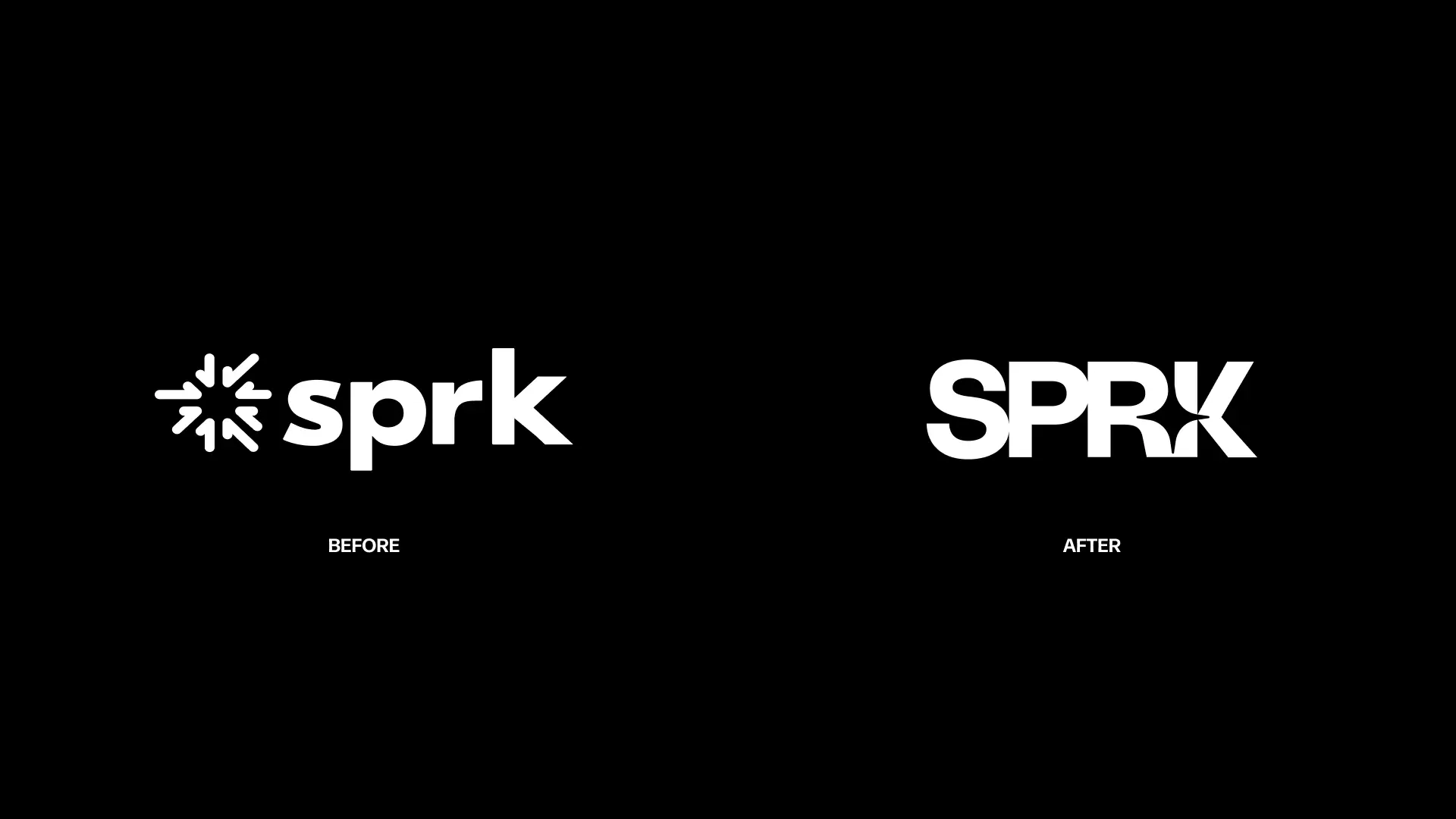
While the initial instinct was to protect their legacy logo, we pushed the team to rethink it. A symbol-plus-wordmark logo is usually reserved for forgettable names that need a graphic crutch. But SPRK has a distinct, punchy name. By leaning into a clean, powerful wordmark, we could build equity and recognition directly into the name itself.
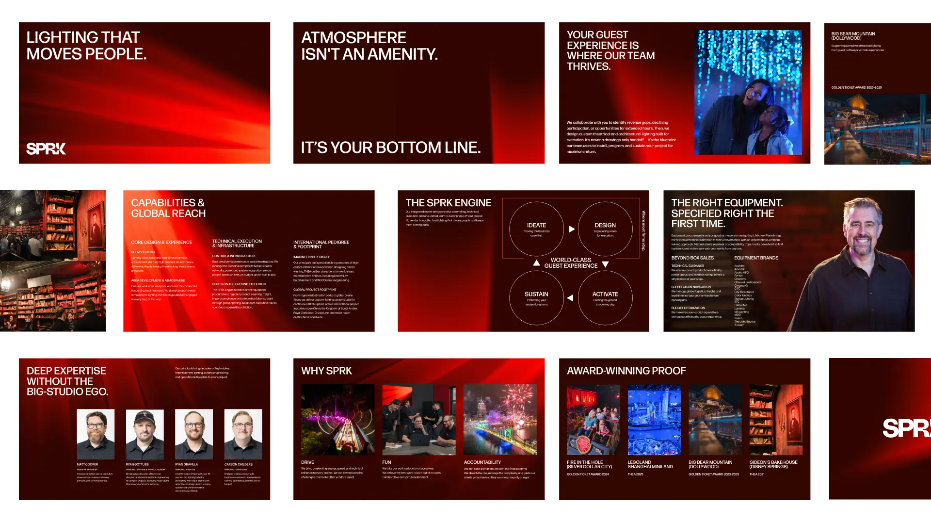
We also introduced a bold hue of red to break away from standard techy blues, establishing a dual visual system. The look balances clean, minimal layouts with dynamic, textured graphics inspired by their field equipment.
To capture their voice, we built a brand messaging framework rooted in three core pillars: Drive (Energetic & Fearless), Fun (Unpretentious & Polished), and Accountability (Thorough & Reassuring), transforming dry technical specs into human stories.
Deliver
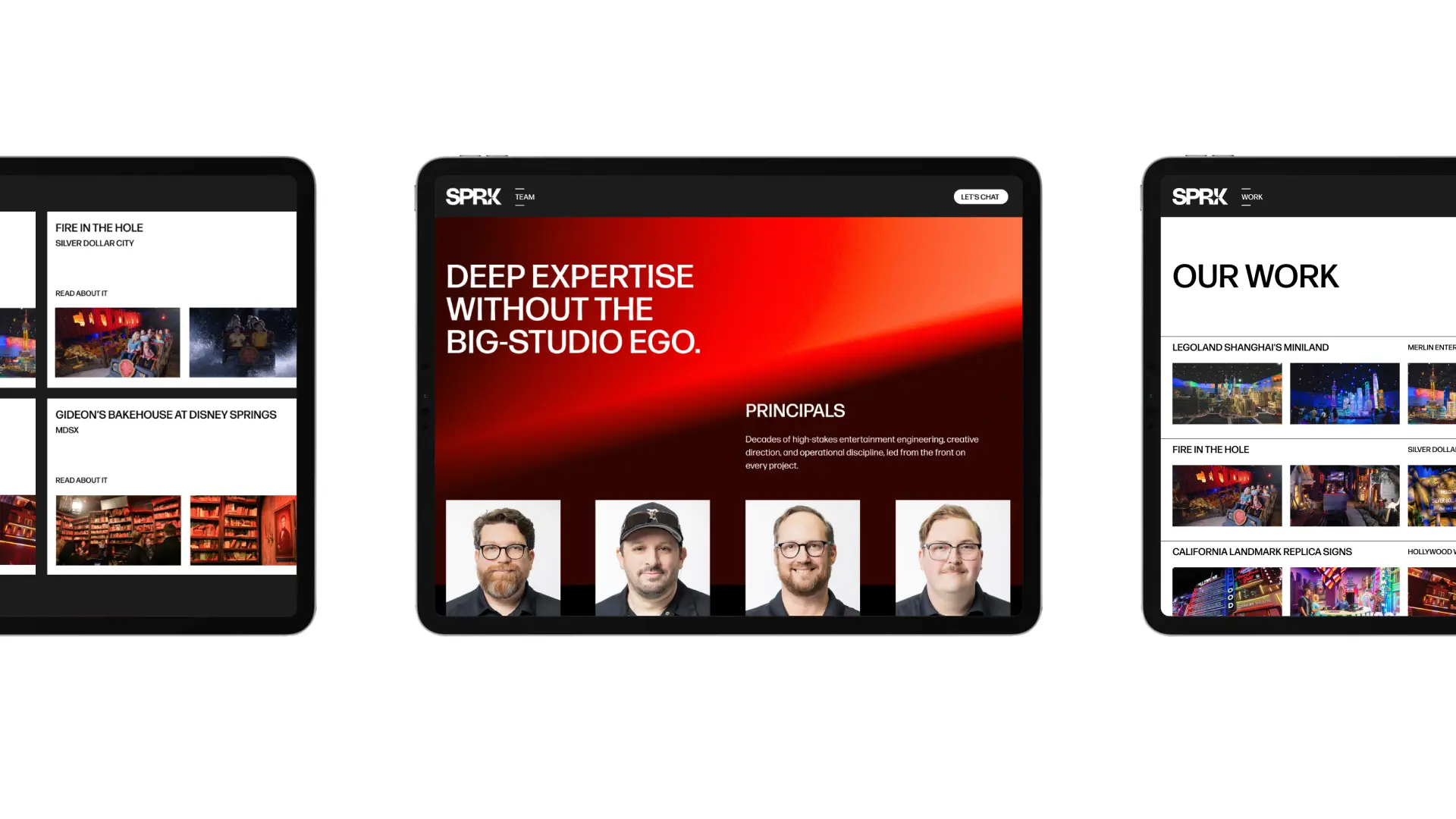
We brought the new brand to life across a complete digital and physical rollout, including a website, streamlined pitch decks, and comprehensive proposal templates.
With a unified set of brand guidelines, SPRK moved away from generic agency speak and fully embraced its identity. The result is a bold, cohesive brand system that proves when you combine top-tier pedigree with radical accountability, you don't just build better infrastructure — you protect the magic, eliminate the execution gaps, and create lighting that moves people, season after season.
Related work


Kinkead & Stilz
Brand design and web strategy that made a broad law firm offering feel focused and navigable


EM Ford
Century-old legacy meets contemporary design for a full-service financial advisory