Biplane
From a founder-named PR agency to a bold brand built for today’s fundraising






After 40 years operating under a traditional founder-named title, an established communications firm found its work shifting toward a specialized, high-stakes arena: helping mission-driven nonprofits and institutions prepare for major philanthropic campaigns. But their old name didn't match the focused work they were actually doing. We partnered with them to build a bold new brand — anchored by a rigorous naming process and a complete visual and verbal identity — designed to position them as an industry authority for their next four decades.
Define
Our discovery focused on translating decades of high-level campaign counsel away from a legacy founder moniker and into a memorable, distinctive name. We conducted collaborative workshops to solidify the naming criteria and generated hundreds of names. Ultimately, they chose Biplane.
The name carries intentional meaning. In aviation history, the biplane represents the earliest successful form of flight. It symbolizes pioneering ambition, elegant engineering, and the courage to try. Metaphorically, it reflects how the tight-knit PR team works: a biplane is built on balance, structure, and coordination rather than noise or excess, providing the dependable lift ambitious organizations need when asking boldly of their communities.
Design
The new name became our north star as we designed a visual and verbal identity.
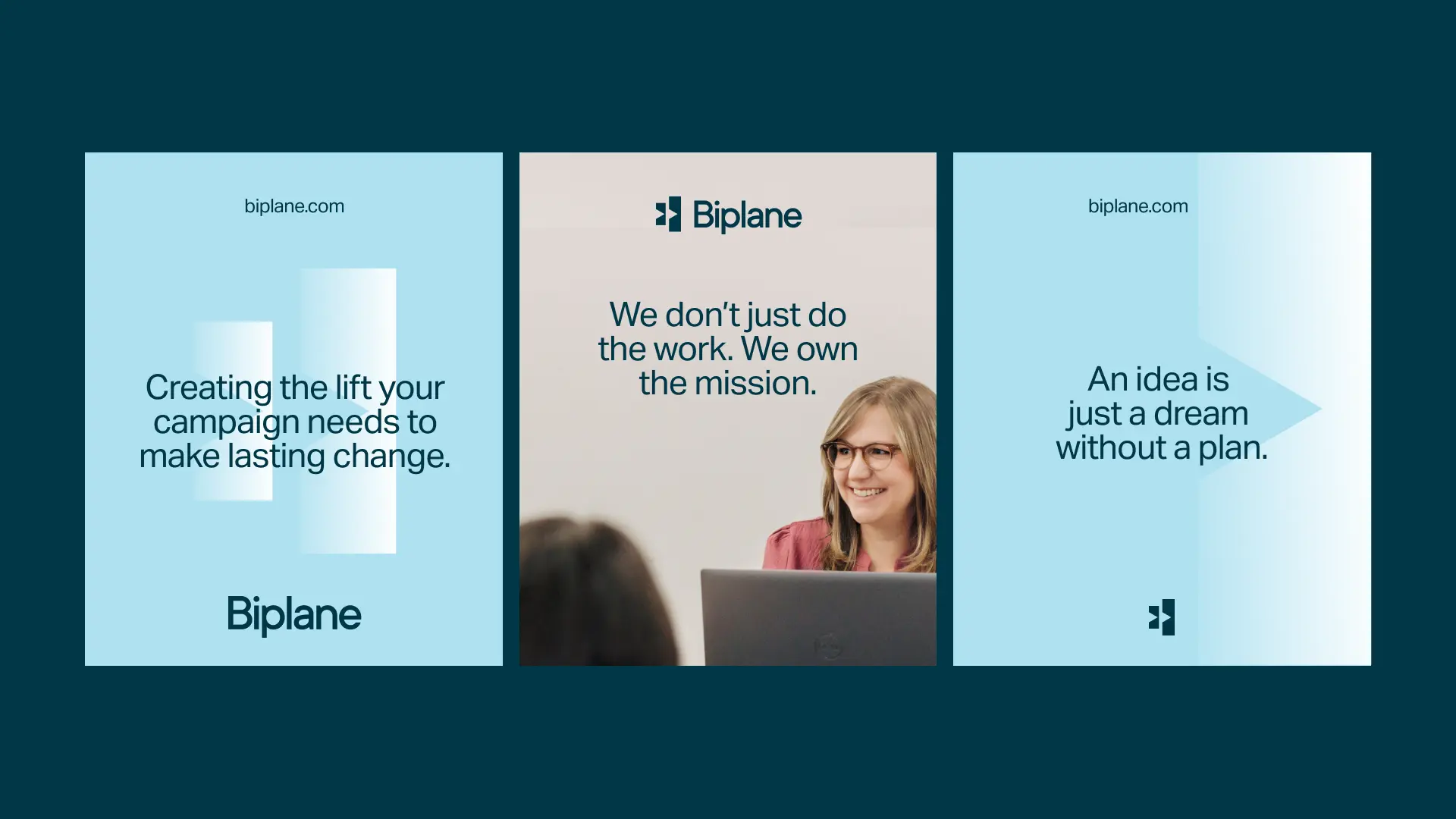
Visually, we introduced a new logo that nods to a biplane while remaining highly flexible, functioning as a recurring pattern or a framing device. We moved them away from their traditional red, establishing a fresh, sophisticated color palette built around blues, paired with clean typography that honors their company history while establishing a contemporary, authoritative aesthetic.
For messaging, we built a nuanced brand voice mixing board, ranging from the supportive Invested Partner and Candid Advocate to the strategic Informed Leader and Flexible Storyteller, giving them the tools to speak with clarity, warmth, and authority. The new language direction turns dry fundraising mechanics into deeply human, compelling narratives that resonate with donors and stakeholders alike.
Deliver
We delivered a complete brand system and a dynamic website rollout. The new digital platform translates their specialized expertise into clear, high-impact messaging — from the naming story to structured service architecture and about language.
The Biplane rebrand shows that moving beyond a traditional founder name gives an organization the freedom to carry the full weight of its expertise. By swapping a legacy title for a storytelling vehicle built around balance, lift, and structural integrity, we’ve positioned Biplane as the trusted partner for nonprofits navigating complex campaigns.
Related work

Sensiba
A fresh trajectory for one of the West Coast’s top accounting powerhouses



Kentucky Growers
From local legacy to digital clarity for a 128-year-old mutual insurer