Kentucky Growers
From scattered agents to a brand that holds them together


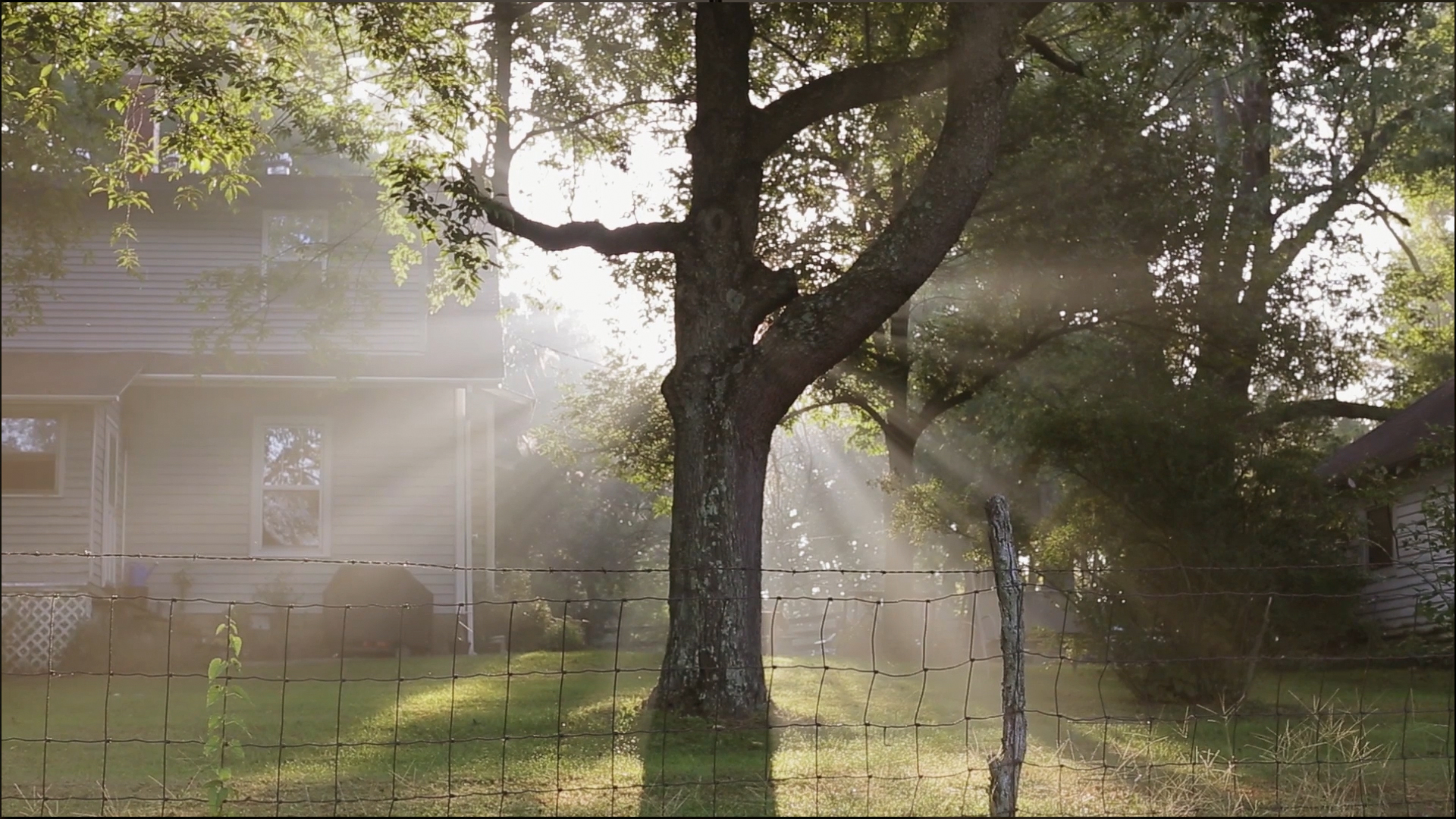

Since 1896, Kentucky Growers Insurance has been built by farmers, for families. As a mutual insurer, they answer to their policyholders — not shareholders — and their agents have spent generations earning trust across the state. That relationship-first philosophy isn't a marketing position. It's how they've always operated.
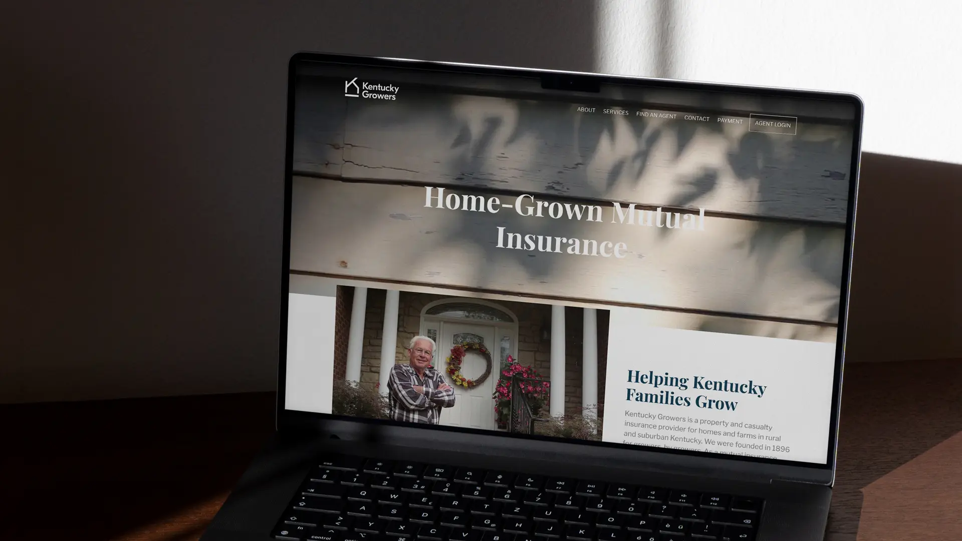
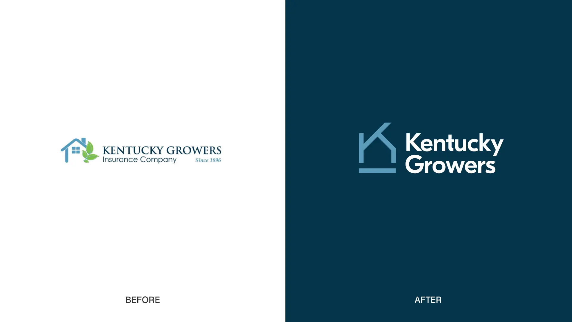
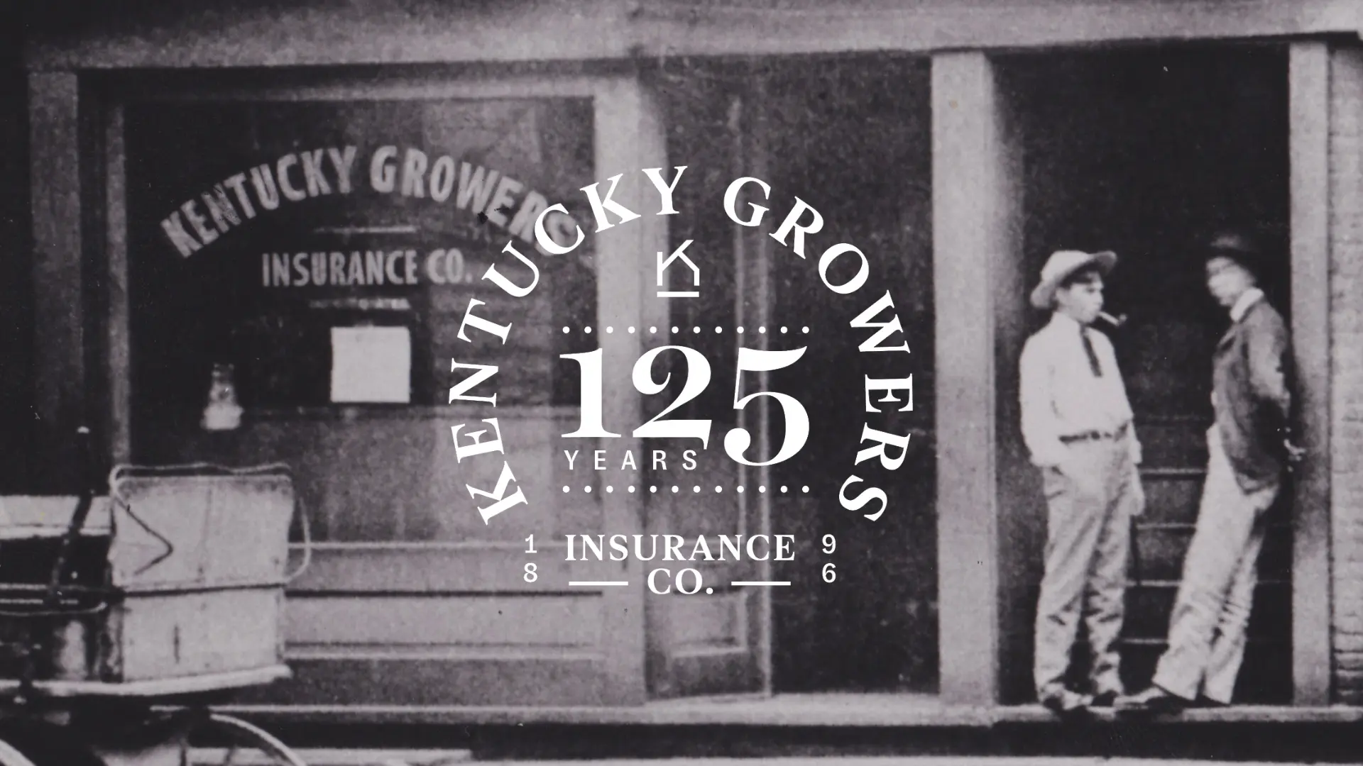
But with agents spread across Kentucky and a brand that hadn't kept pace with their story, that philosophy wasn't always visible from the outside. When they called us — after a beloved logo failed to survive the embroidery process — we recommended a comprehensive rebrand designed to connect their agents, honor their history, and carry a 128-year-old institution confidently forward.
Define
Through conversations with agents across a range of tenure and experience, a clear picture emerged. Kentucky Growers didn't compete on price or product features — it competed on character. Agents described the company as uniquely empathetic: the kind of insurer that shows up, remembers your name, and treats a claim like a human moment. That insight became our foundation. They didn't need to become something new; they needed a brand that looked like who they already were.
Design
We simplified and warmed. The visual identity was updated to feel timeless rather than dated. Brand language traded industry formality for something more conversational and human. The website gave policyholders a clear sense of what Kentucky Growers stands for before they ever speak to an agent, and a brand launch video grounded the new identity in the history that earned their reputation.
Deliver
Kentucky Growers didn't need to be modernized so much as clarified. Their values were never the problem. We gave those values a visual language, a digital home, and a launch moment worth celebrating.