Block + Lot
From blank slate to a brand that defines a market


When Greg, Peter, and Clay set out to build a new kind of commercial real estate firm, they weren't interested in doing what everyone else was doing. Their vision was to transcend traditional real estate and focus on something harder to measure — genuine community impact. They needed a name and identity that could carry that ambition from day one.
Define
The founders brought a rare combination of experience, innovation, and digital fluency to an industry not known for any of those things. Our define work surfaced a core tension: commercial real estate is typically transactional, but this team was relentlessly people- and place-focused. The brand needed to signal that difference immediately. We landed on Block + Lot — grounded in the language of real estate, but open enough to hold a bigger idea.
Design
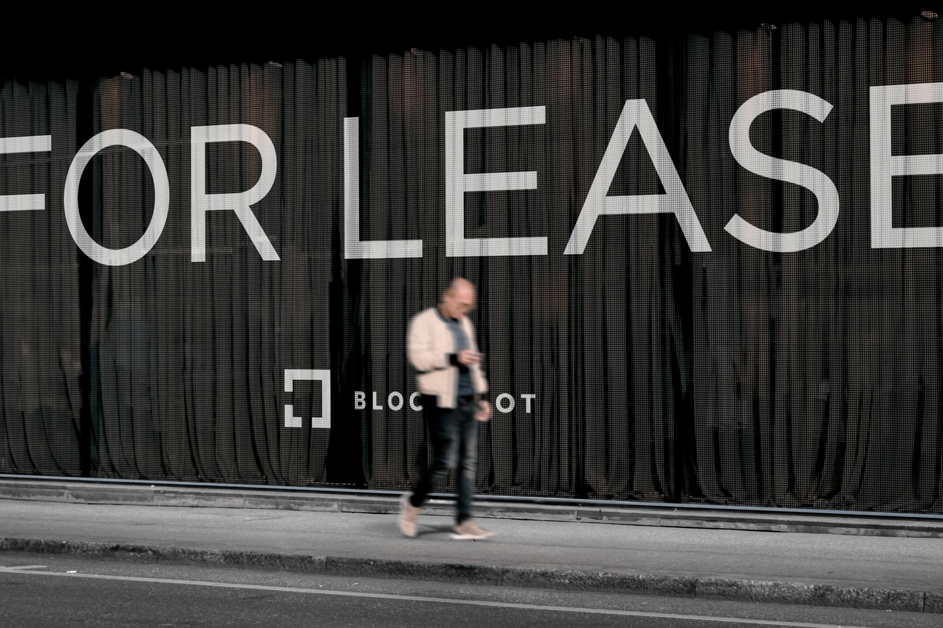
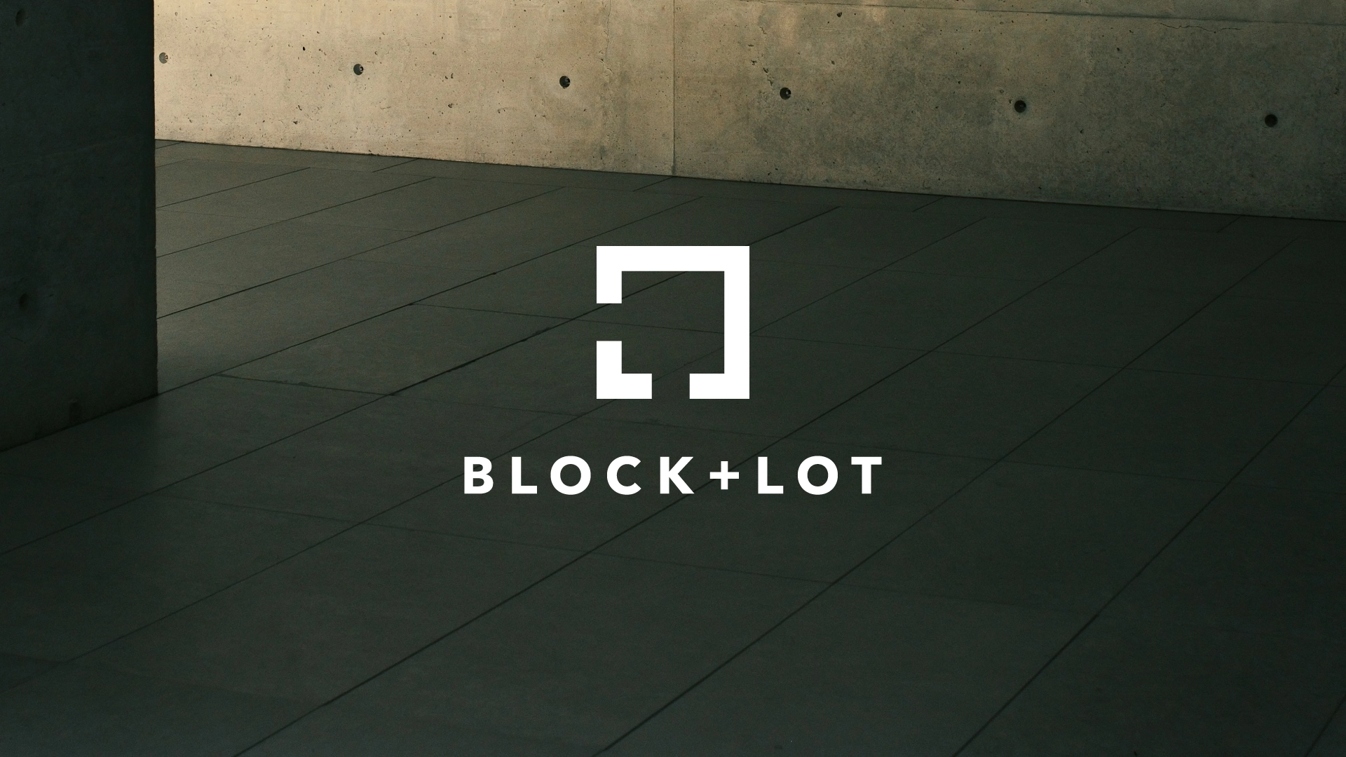
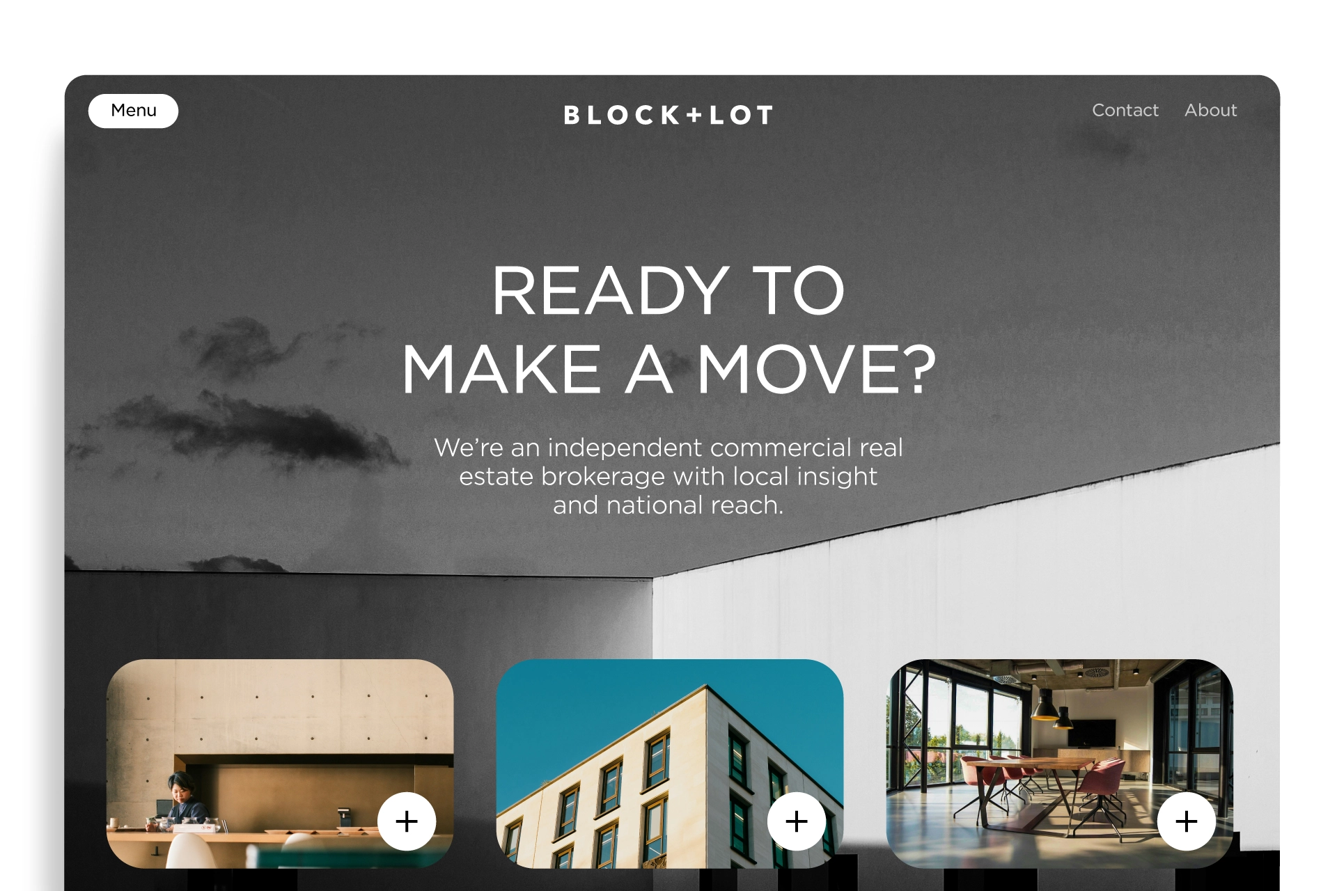
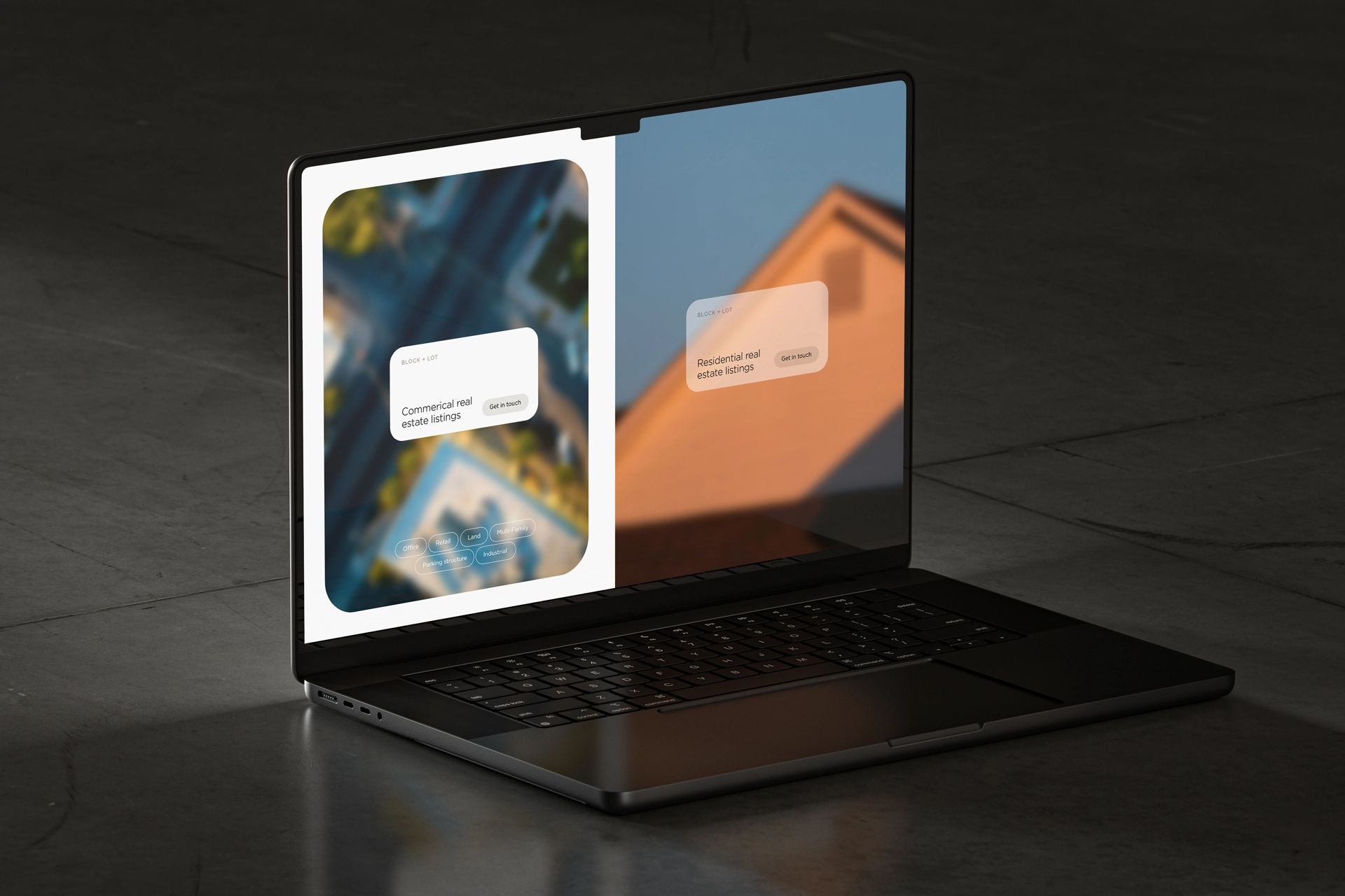
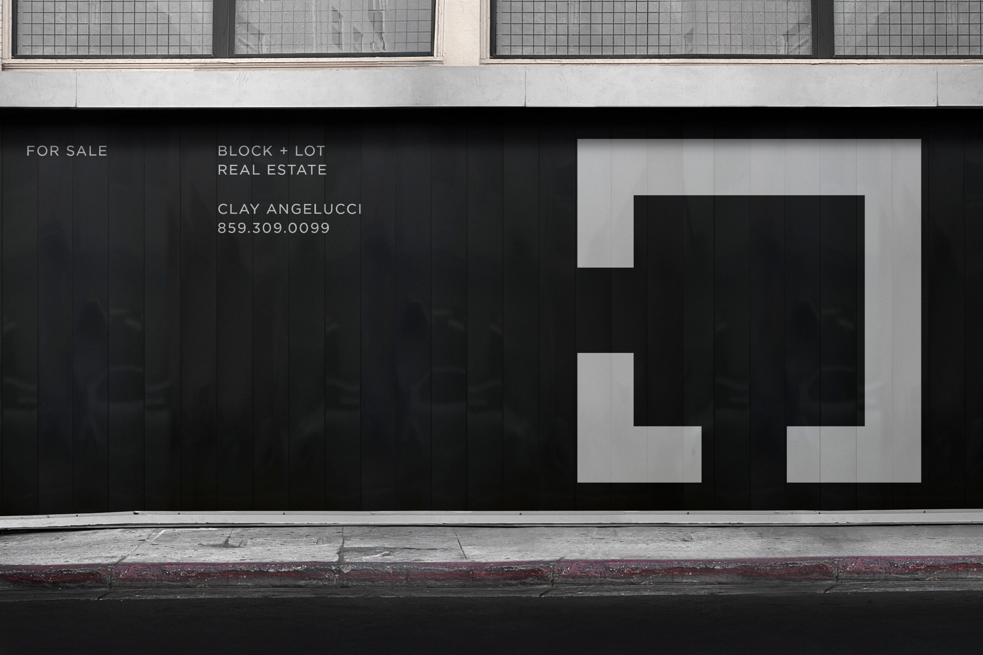
We moved away from the cluttered, conventional imagery common in the industry and built something deliberately simple. The logo draws on blueprint aesthetics, using negative space to evoke possibility — inviting viewers to imagine what a space could become rather than what it currently is. The result is a visual identity that steps back and lets the potential of each property speak for itself.
Deliver
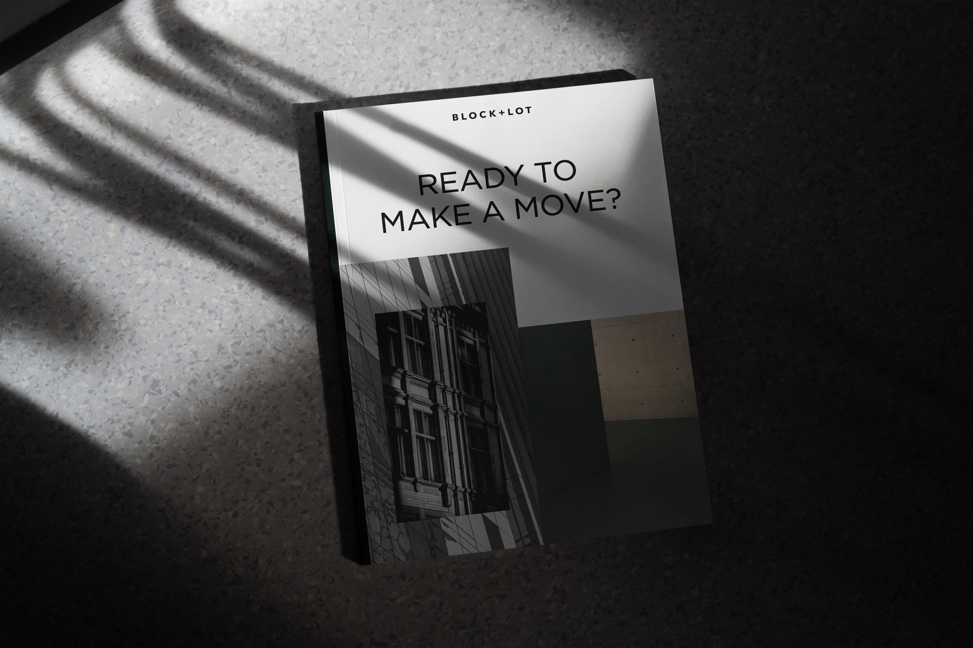
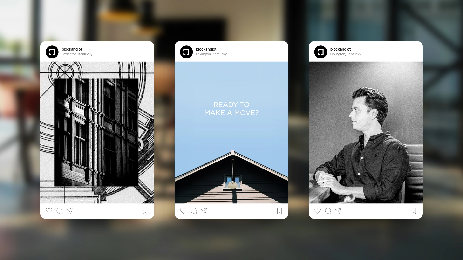
Today, Block + Lot is a recognized name in Central Kentucky commercial real estate — not just as a firm, but as a standard. The brand has played a critical role in establishing them as a market leader, and according to the founders, has directly increased company value and strengthened the relationships at the heart of their business.