REA
An interdisciplinary brand framework for a national landscape architecture firm

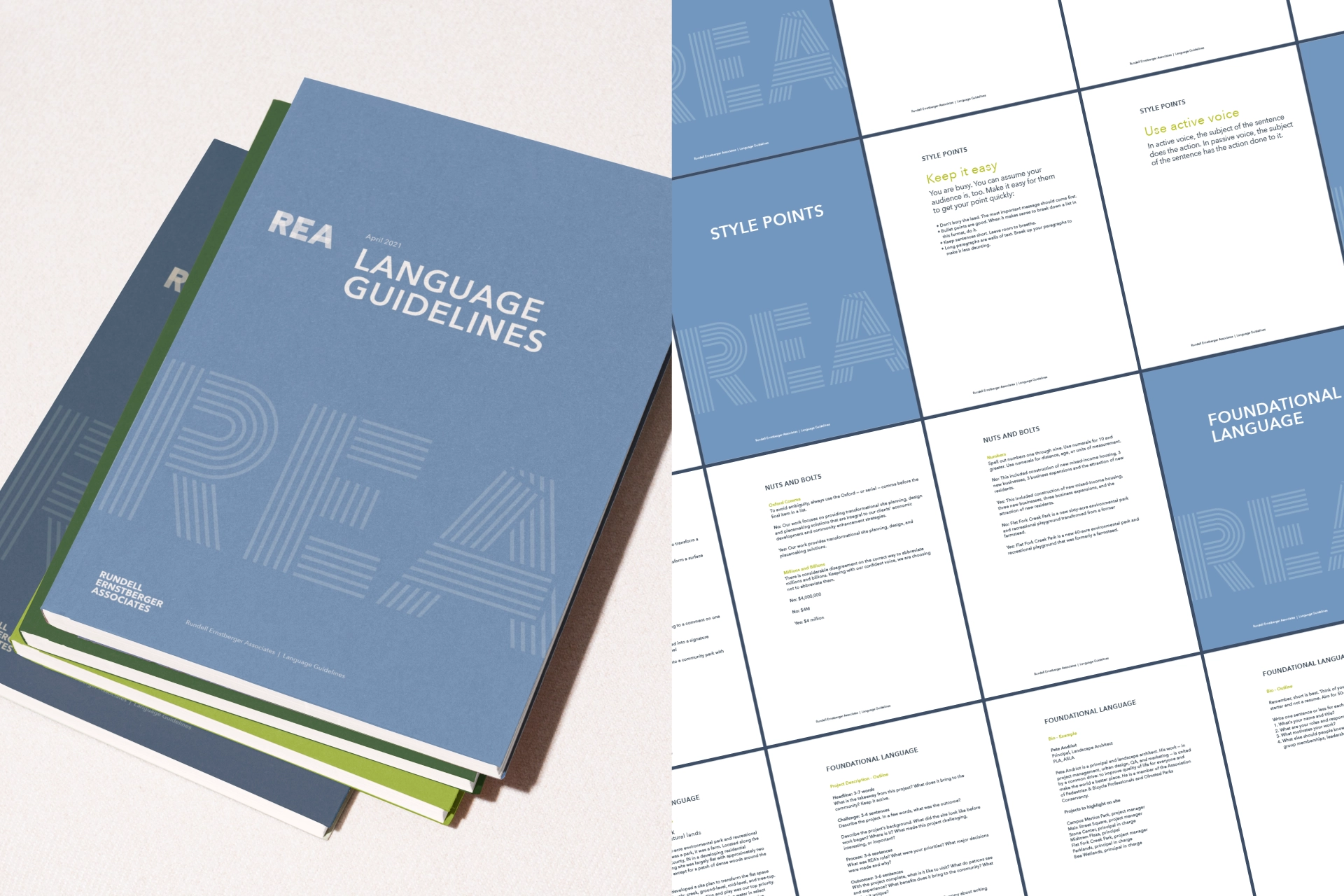
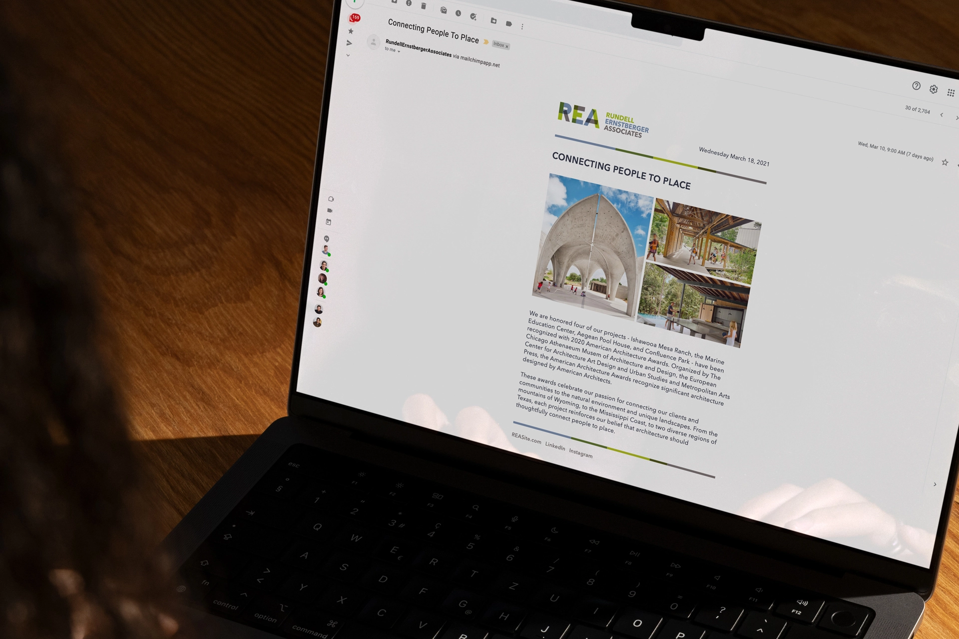
In the world of urban design and landscape architecture, technical skill is the baseline. But for Rundell Ernstberger Associates (REA), the work has always been about something deeper: the unique identity of a community. Since 1979, REA has acted as a trusted collaborator for governments, universities, and private developers, defining what true partnership looks like.
However, as their portfolio expanded to include international design awards and massive urban master plans, their brand language and digital presence remained anchored to their local roots. They needed a brand that reflected their national reach and an interdisciplinary approach that bridges the gap between the present and a more inclusive, dynamic future.
Define
We began our Define phase with a strategy-focused workshop to uncover the "human" behind the high-end design. REA isn't just an architecture firm; they are consultants to cities. Our discovery revealed a significant opportunity to move beyond the traditional portfolio model.
We identified three strategic goals for the new brand language: to position the firm’s 40-year legacy as a foundation of stability rather than a constraint on style; to emphasize its interdisciplinary nature and ability to solve problems at any scale; and to elevate its culture and collaborative approach in order to attract both like-minded clients and top-tier talent.
Design
The brand voice we developed is grounded in "informed authority." It is confident in its capabilities but humble in its approach — positioning REA as a guide through transformative change rather than just a vendor of blueprints. We replaced transactional descriptions with a narrative that feels inspiring and authentic, focusing on connection over control.
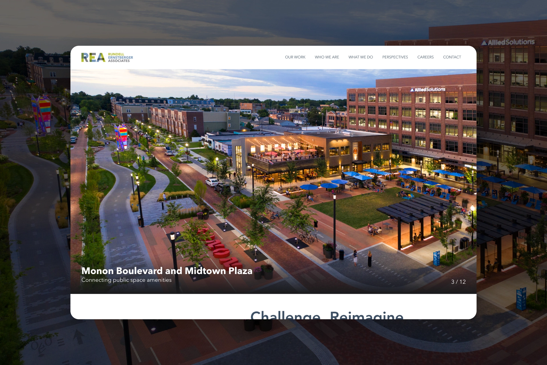
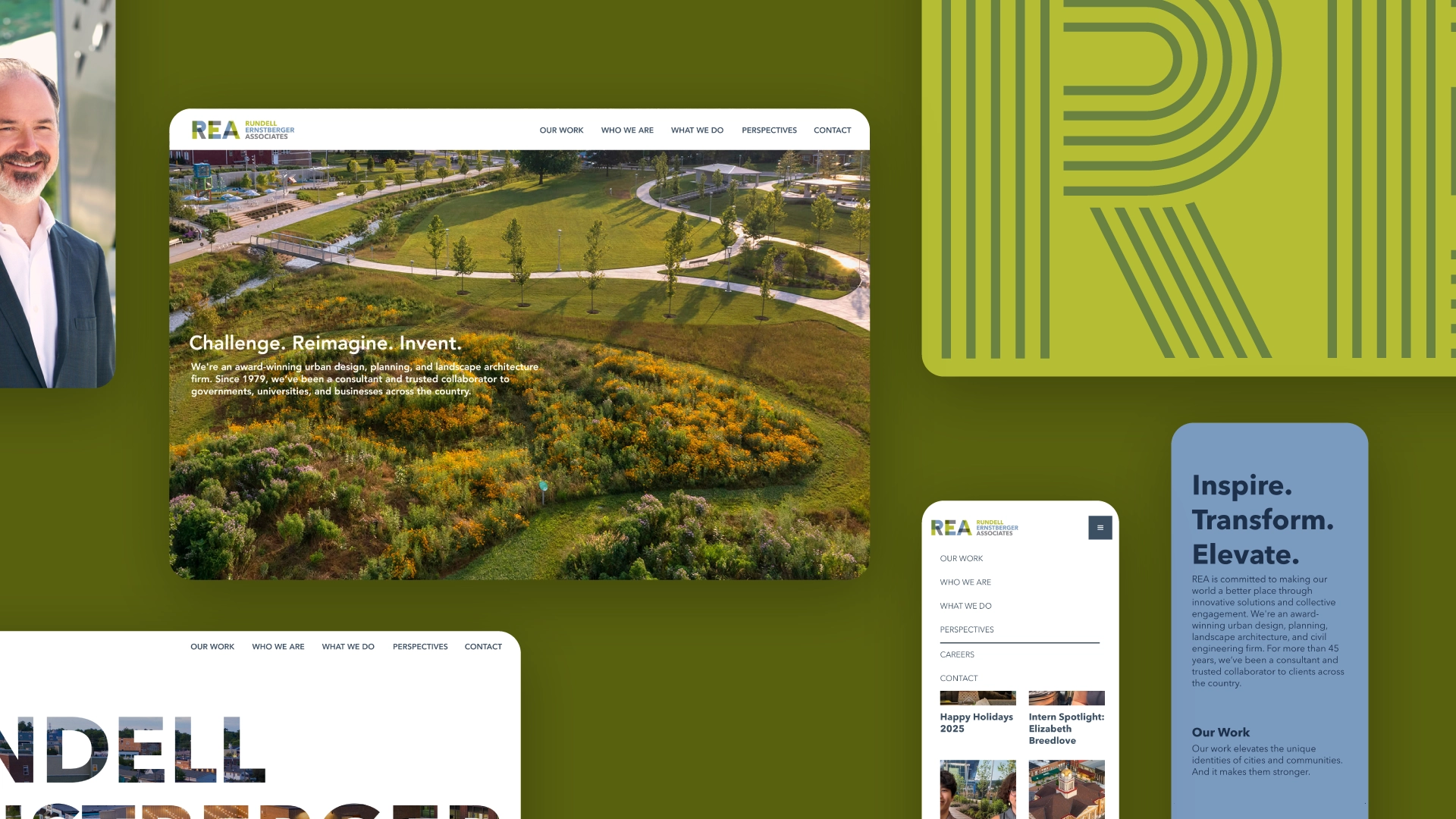
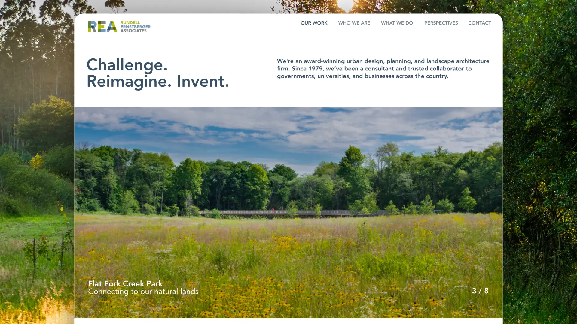
For the website, we moved away from the “static gallery” approach and instead built a digital strategy centered on categorization by capability—allowing users to navigate by the type of problem REA solves rather than just location—alongside collaboration-led case studies that reveal the “why” behind each design and how the team partners with communities to develop ideas. We also emphasized individual expertise, highlighting the specific people behind the work to ensure the firm’s boutique feel isn’t lost at a national scale.
Deliver
To ensure the new identity translated into momentum, we delivered a comprehensive brand system and a custom-built website that functions as a high-end gallery. By placing professional rigor alongside team stories, the identity as both talented architects and passionate collaborators is immediately clear.
REA is no longer just a firm with a long history; they are a firm with a clear vision. Their brand now reflects their actual impact: an interdisciplinary leader that meets people where they are and brings them along on the journey to what’s next.
Related work

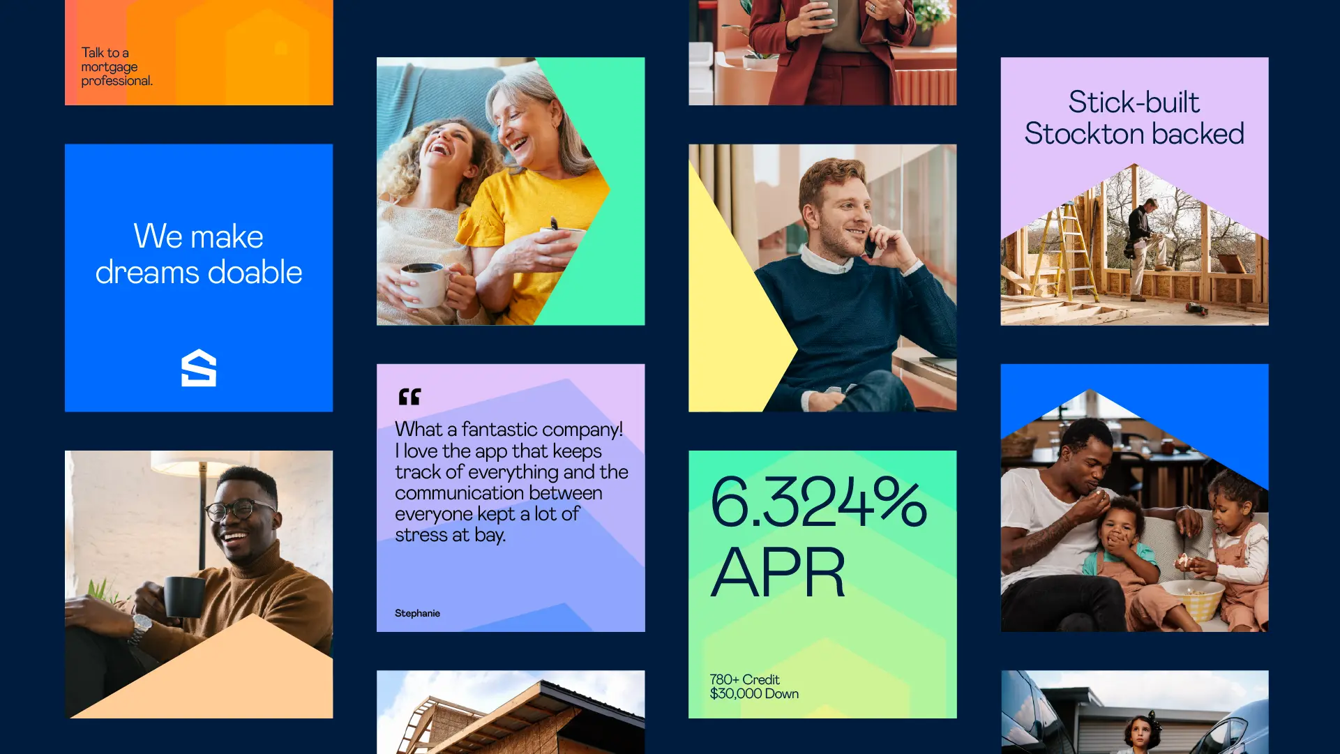
Stockton
Scaling a multi-regional mortgage lender through four eras of brand evolution

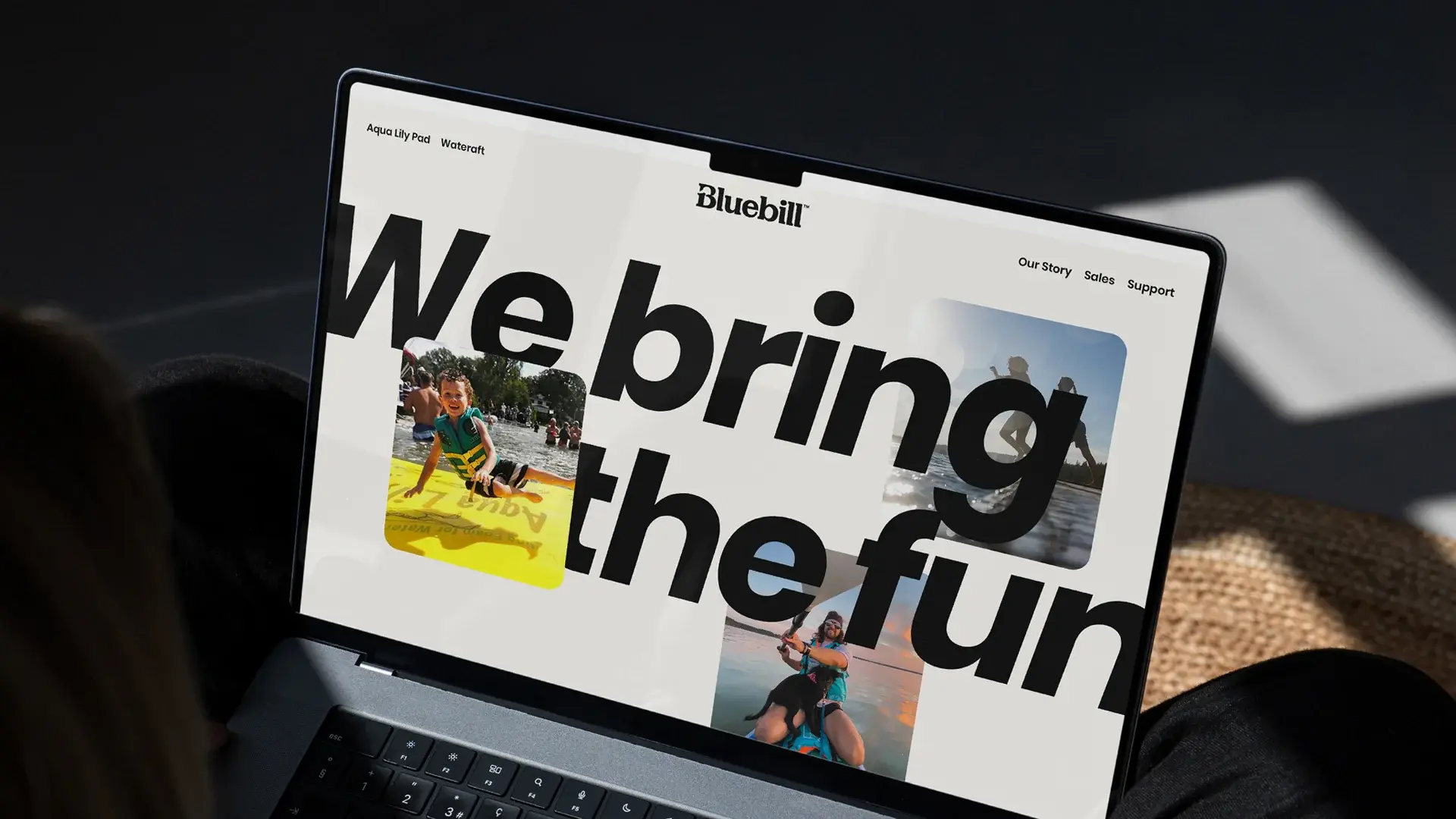
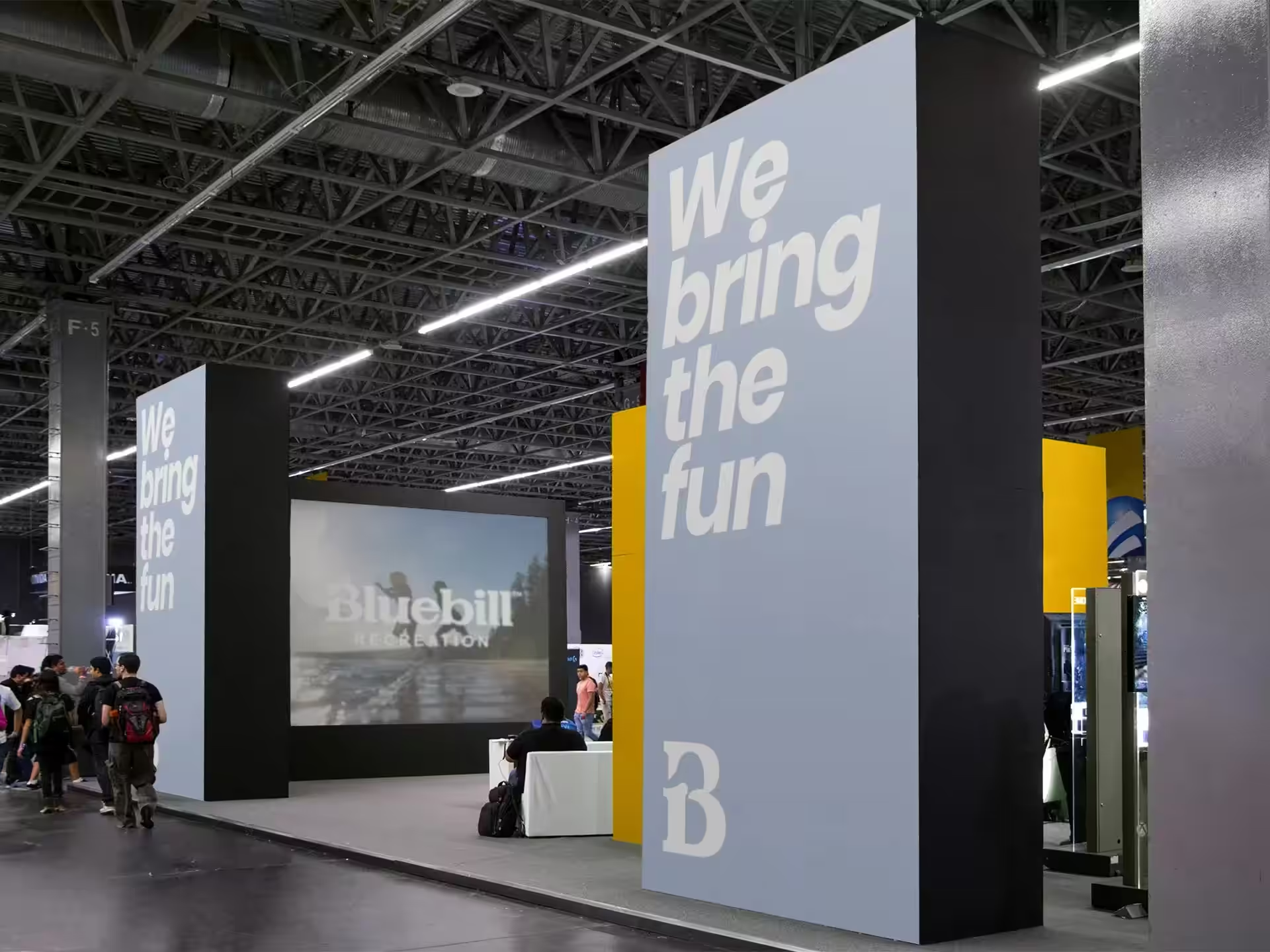
Bluebill Recreation
Creating a parent brand identity to unite a growing portfolio of water recreation products