Stockton
Championing the people behind a multi-regional mortgage brand


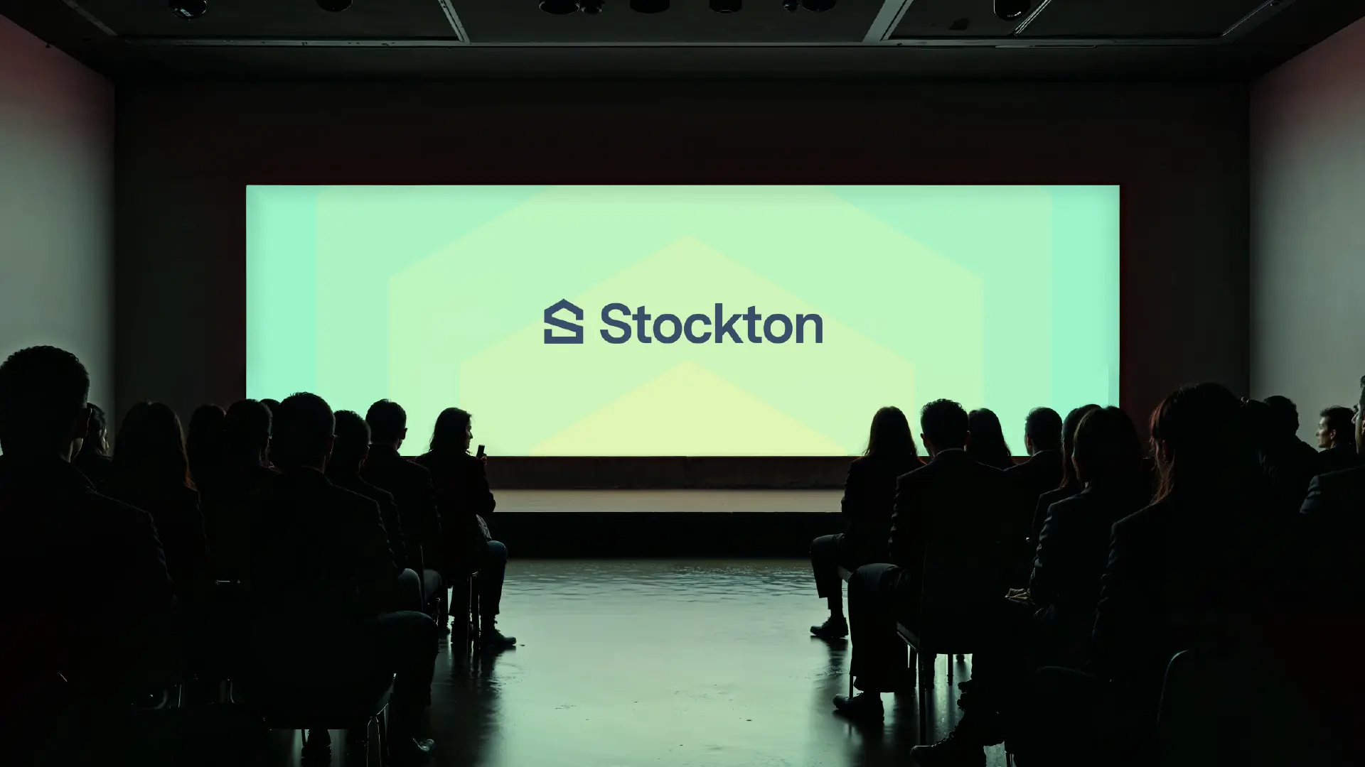
Our decade-long partnership with Stockton Mortgage spans four brand evolutions and four websites. As Stockton expanded from a local lender into a multi-regional force, we partnered with them to refresh their brand, unlocking a powerful way to stand out in a crowded, look-alike market.
Define
Most mortgage brands focus solely on the customer's final destination: the house. But Stockton's true differentiator is the team that guides them there — the loan officers, underwriters, and processors who navigate the complexity.
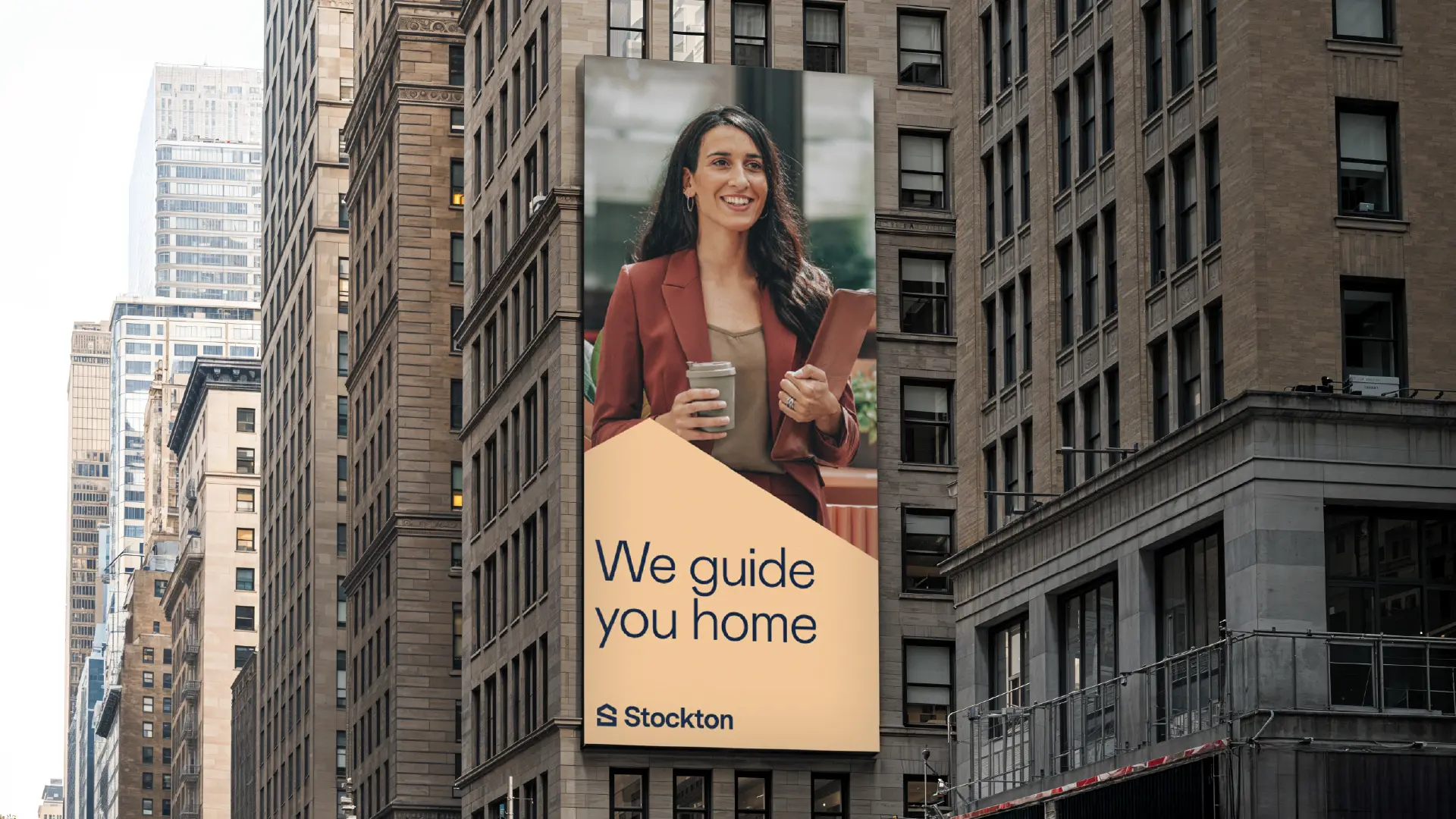
We shifted Stockton's strategy from the passive "Let us guide you home" to the active, authoritative "We guide you home." This pivoted the focus from a transactional commodity to the highly competent human experts managing the journey.
Design
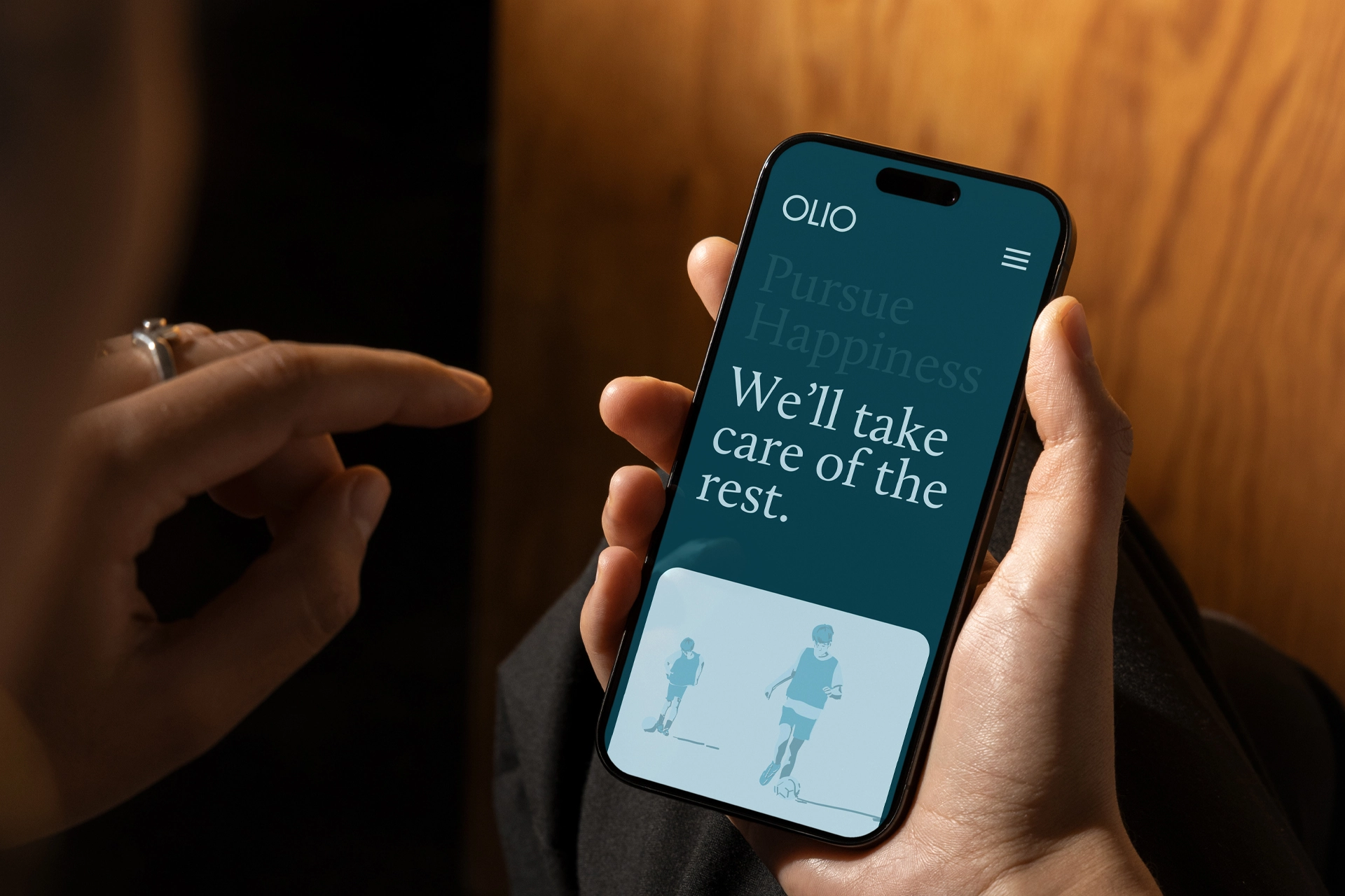
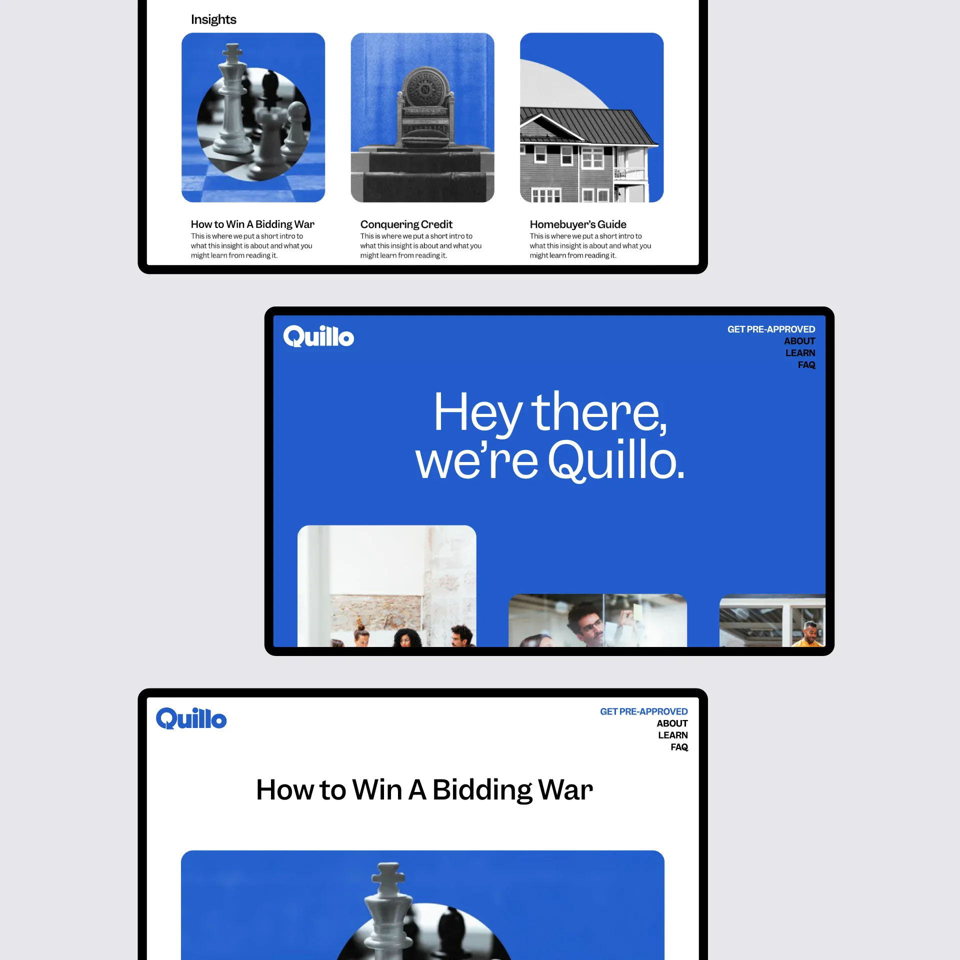
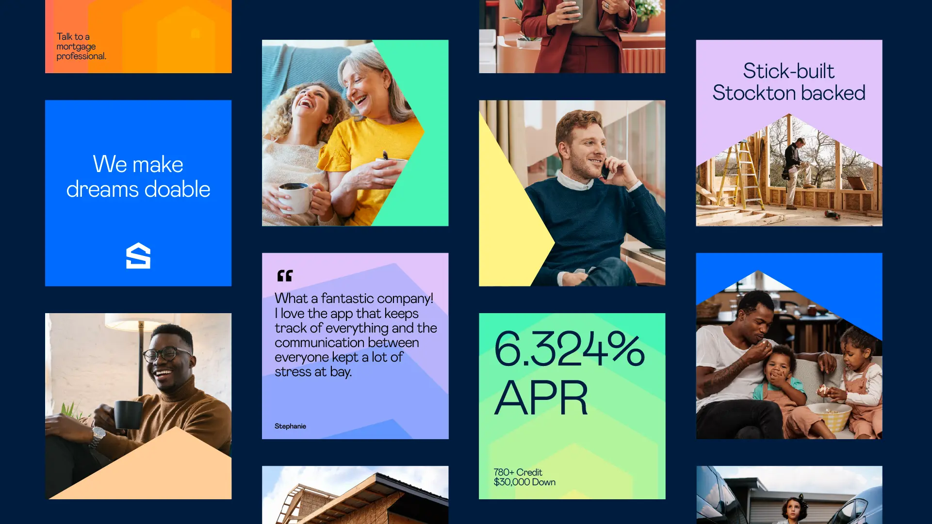
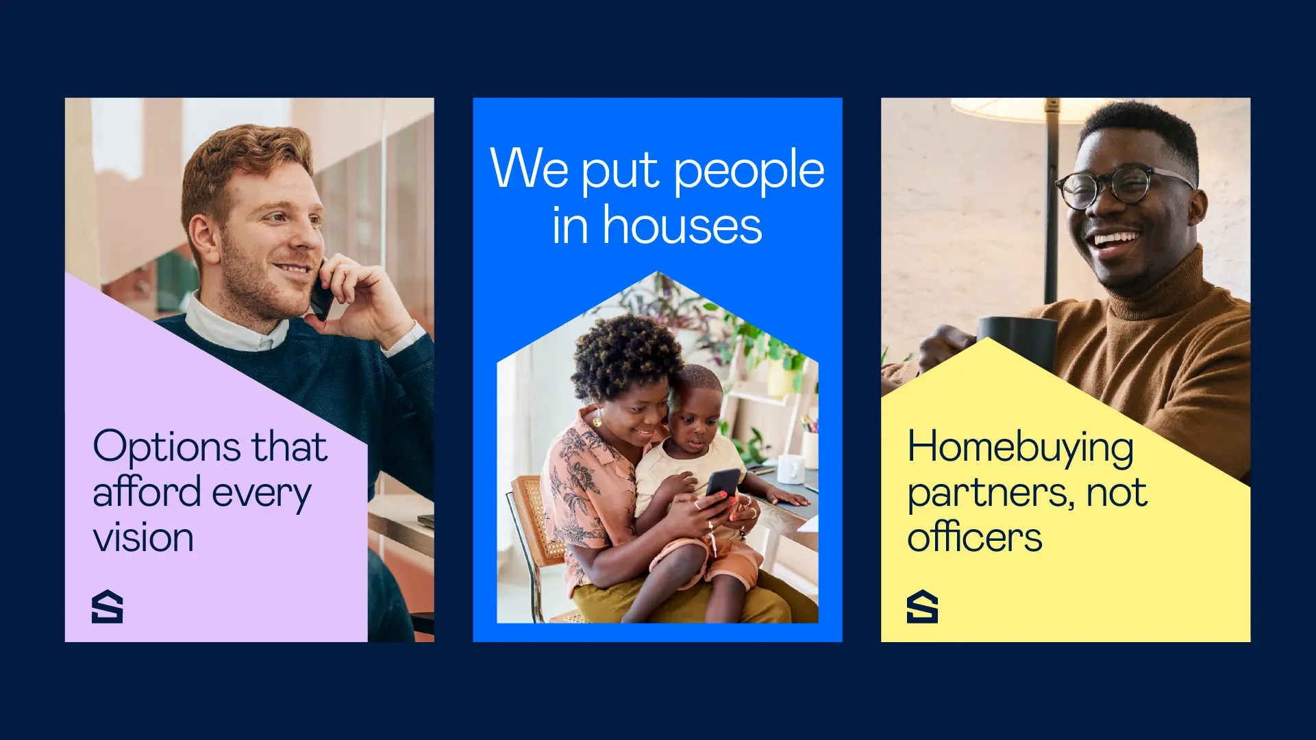
To match this strategic shift, we evolved Stockton's voice to feel heartfelt yet pragmatic, and supportive yet highly informative. We established new photography guidelines directing their team to step in front of the camera, giving customers a warm, familiar face to trust before making their first call.
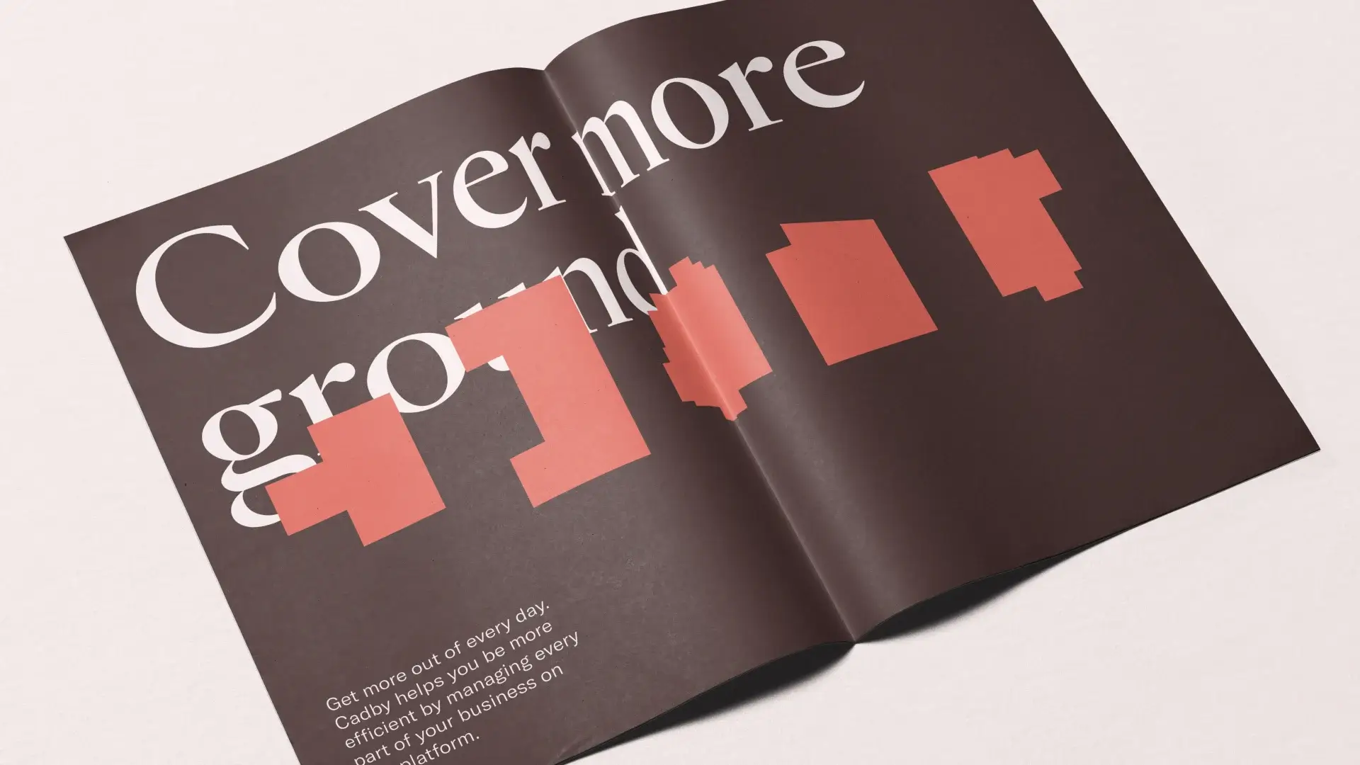
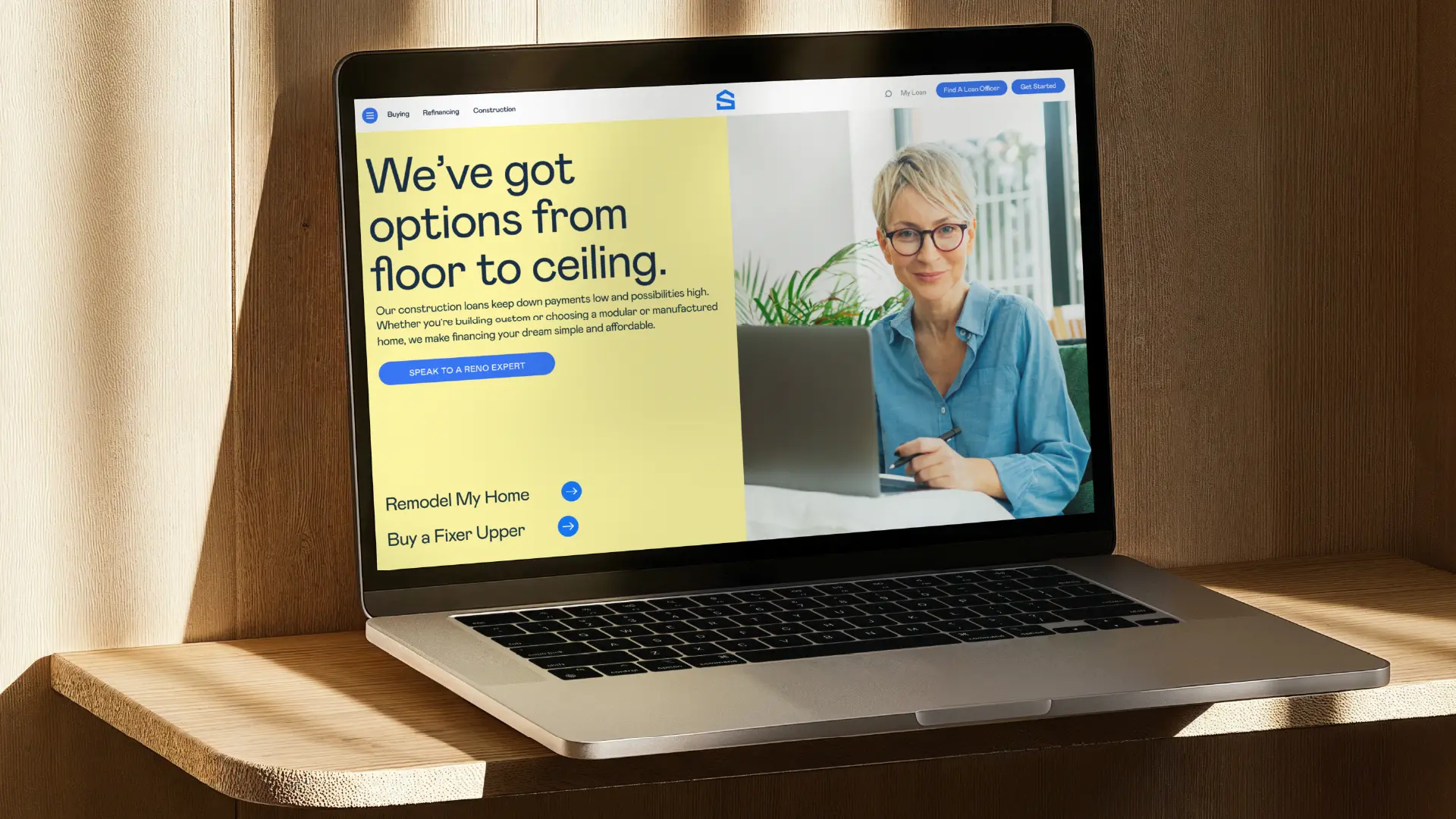
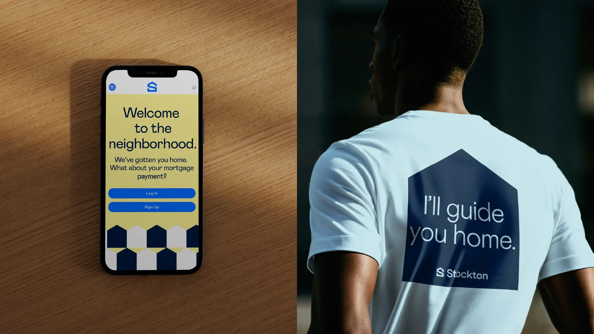
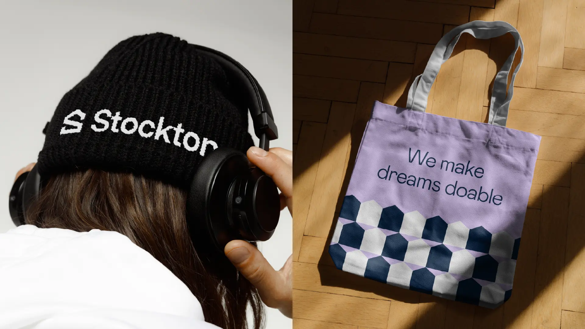
Visually, we dialed up the flexibility of their color palette and introduced a signature house pattern—a graphic device that represents their ability to literally put people in houses.
Deliver
We delivered an expanded brand ecosystem, updated visual assets, and flexible guidelines that empower local loan officers to publish on-brand content across their growing multi-regional footprint.
The Stockton refresh proves that the best way to differentiate in a commoditized market is to champion the people behind the process. By putting their team's expertise front and center, Stockton has built a lasting connection with home buyers that outlasts any single transaction.