Matthews
How we helped a multi-national real estate firm unify its global identity

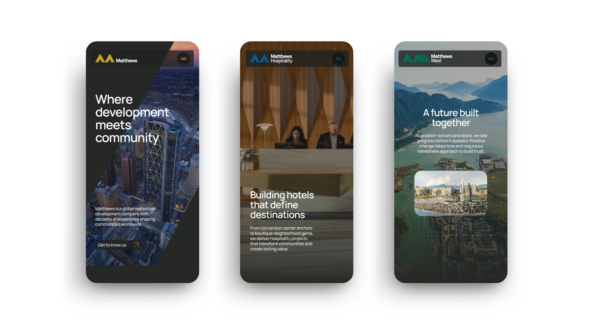


The word "development" carries a lot of baggage — torn-down structures, disposable architecture. You probably don't picture lasting relationships or community impact. Matthews is working to change that. A global real estate team that puts values first and deals second, they develop mixed-use, hospitality, civic, and industrial projects across the US, Canada, and the Middle East. But after years of growth, their identity had become unclear — to the outside world and to themselves.
Define
We started in Dallas with workshops, interviews, and project tours across teams, regions, and disciplines. What emerged wasn't a lack of identity, but a lack of alignment in how it was communicated.
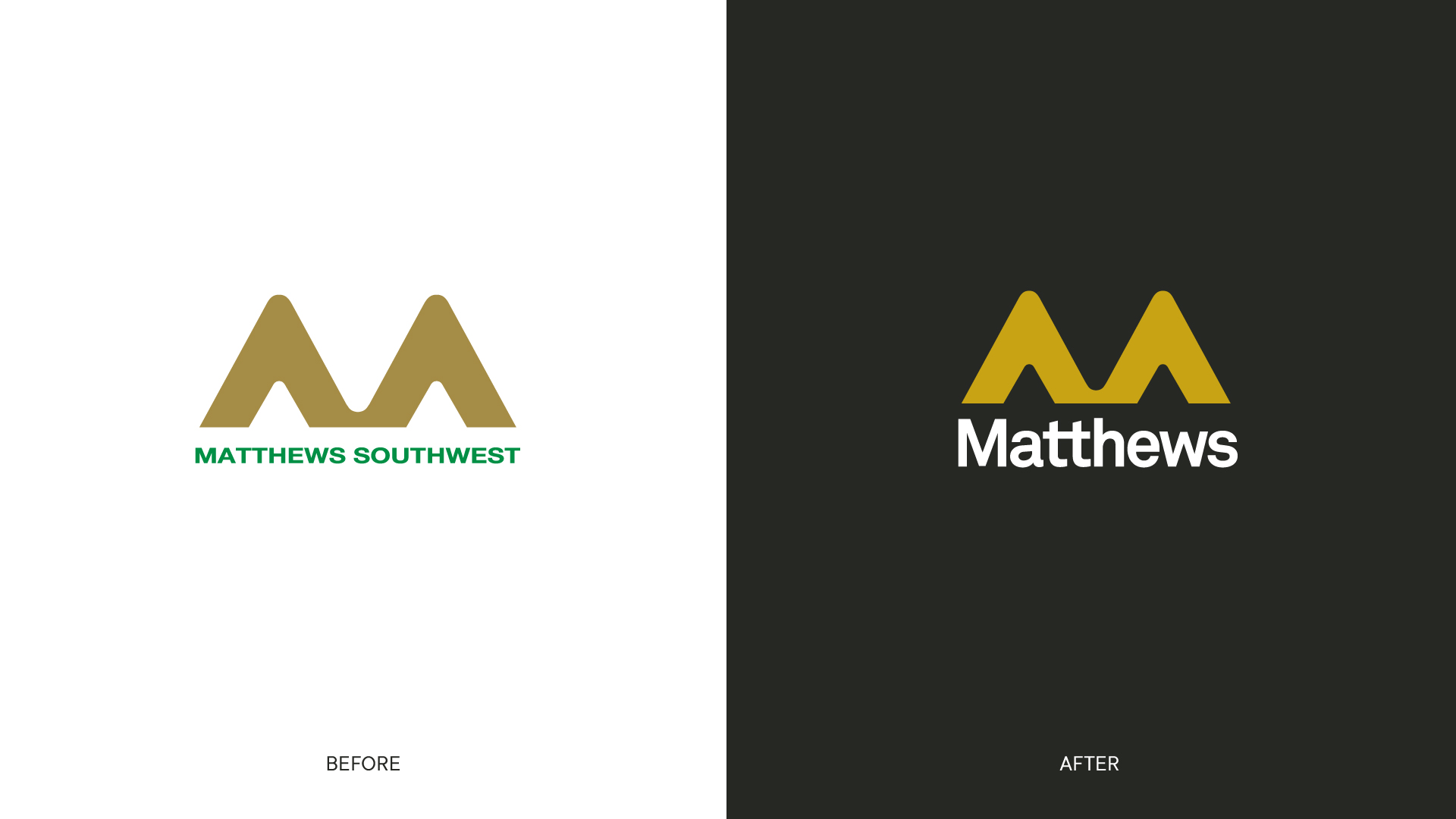
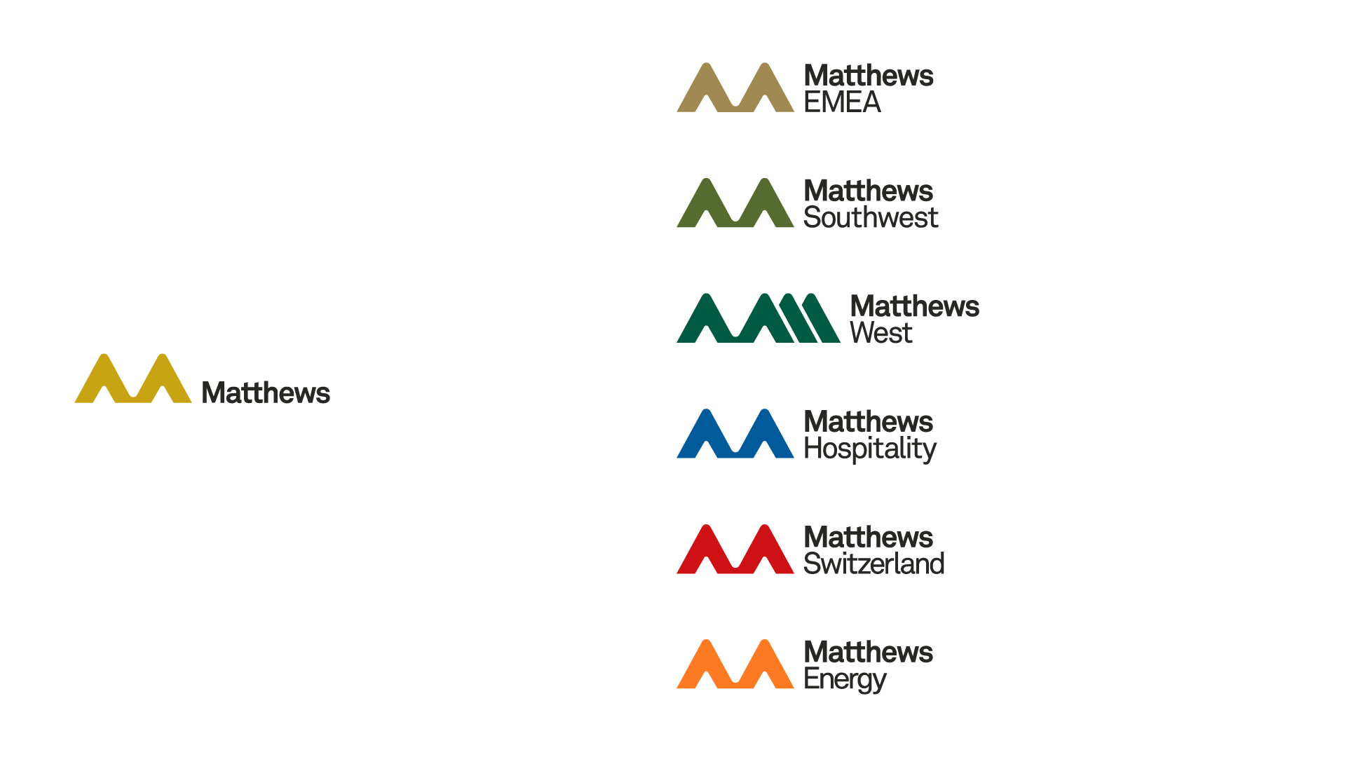
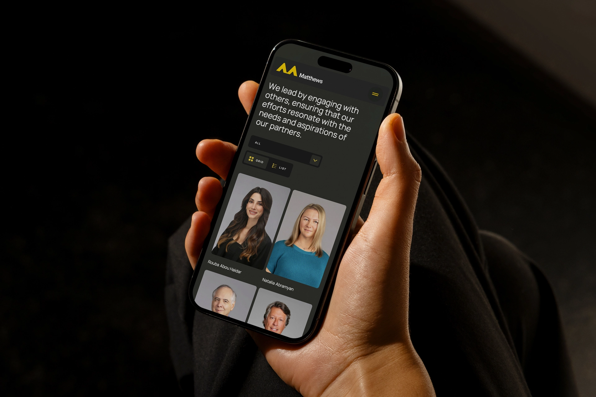
We clarified Matthews as a values-driven development partner — and addressed a key constraint in the name itself. "Matthews Southwest" no longer reflected the company's global reach. Simplifying to Matthews created a more scalable identity. From there, focus extended to the website: it needed to express a unified global company while giving individual regions and divisions room for their own voice.
Design
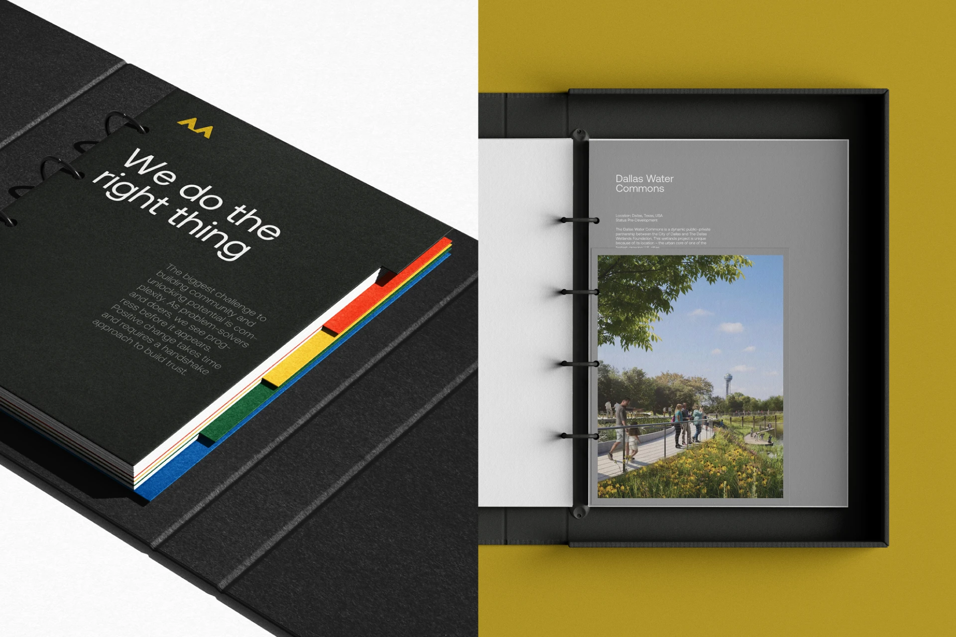
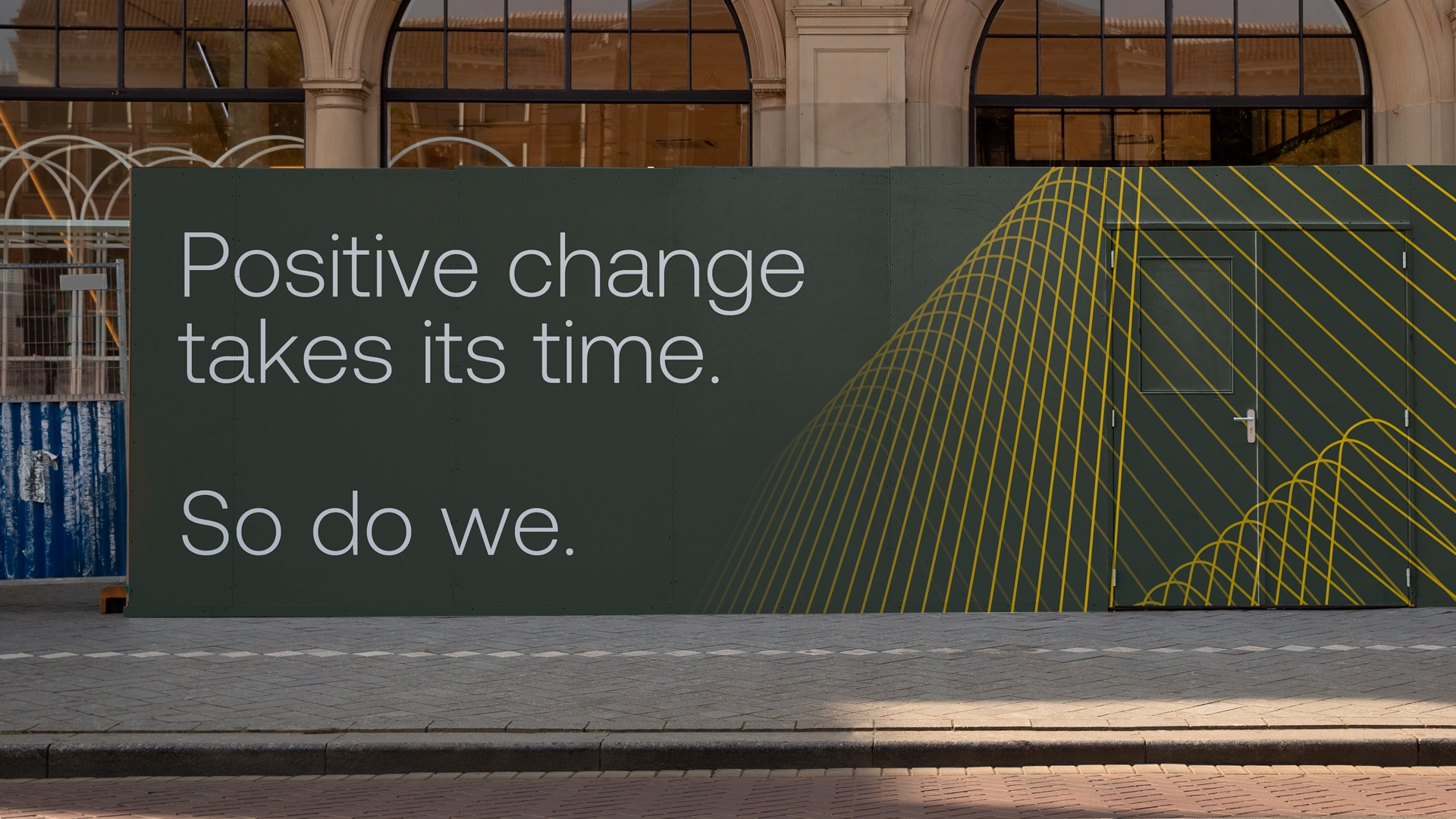
We built a simplified identity, clear visual rules, distinct color assignments across divisions, and a unified voice carried through everything from messaging to brand story.
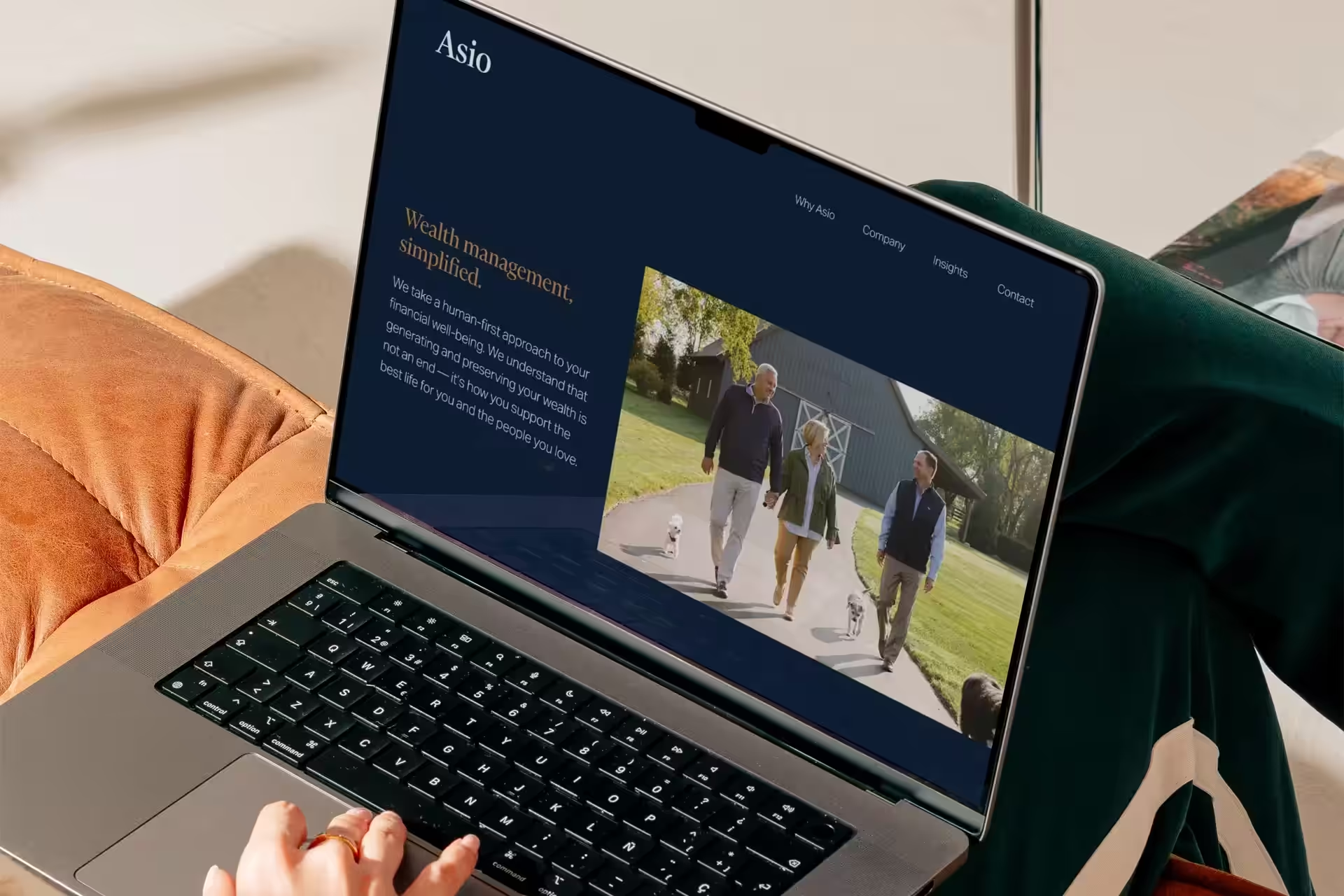
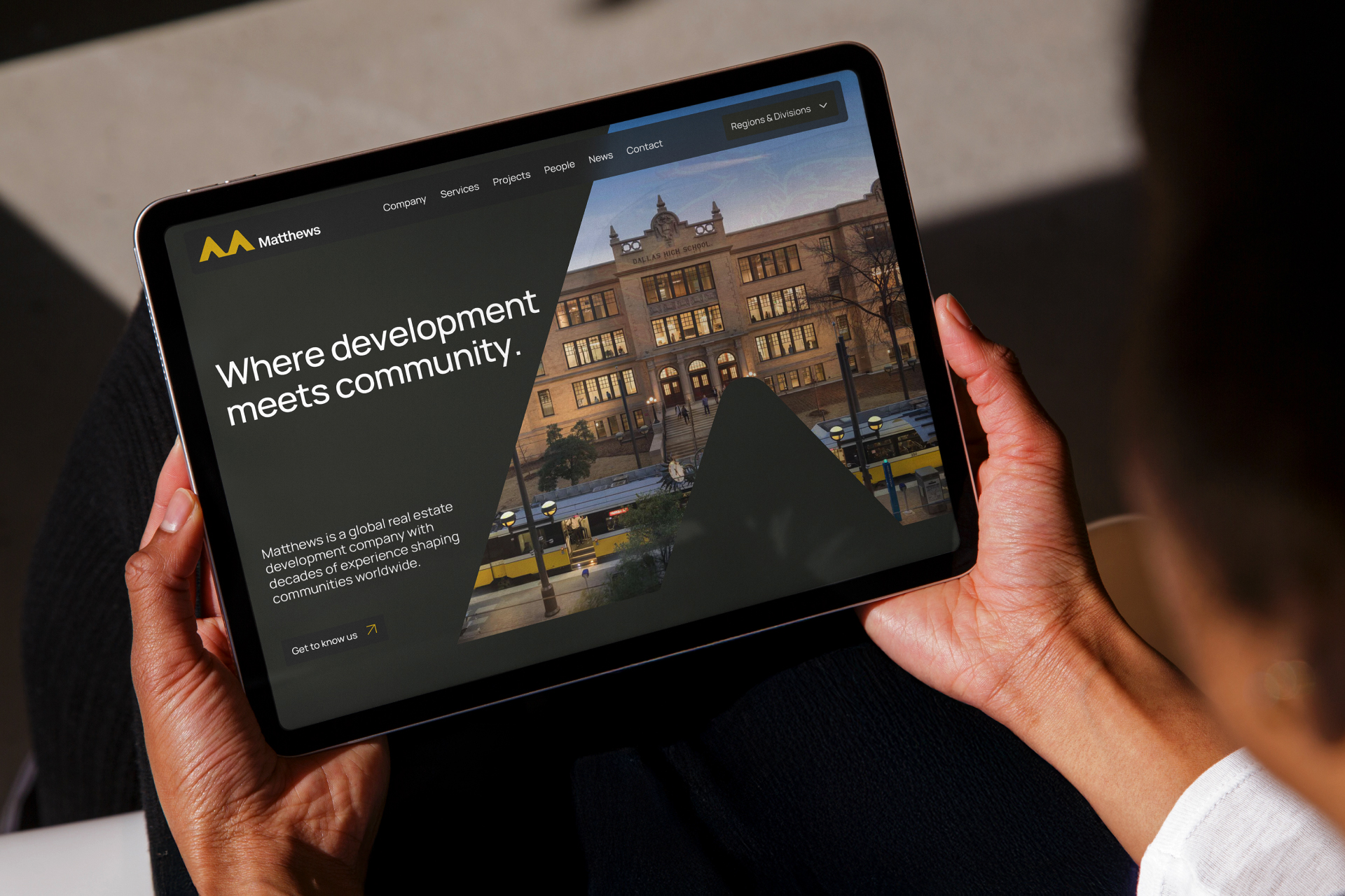
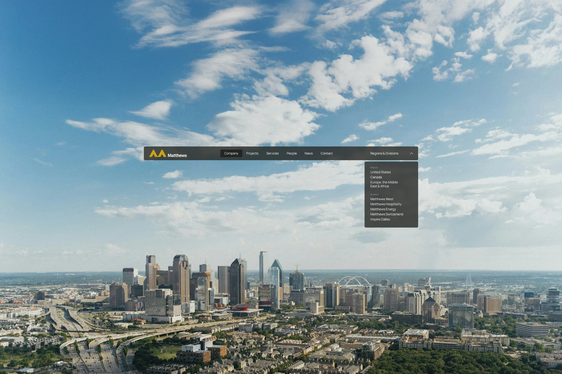
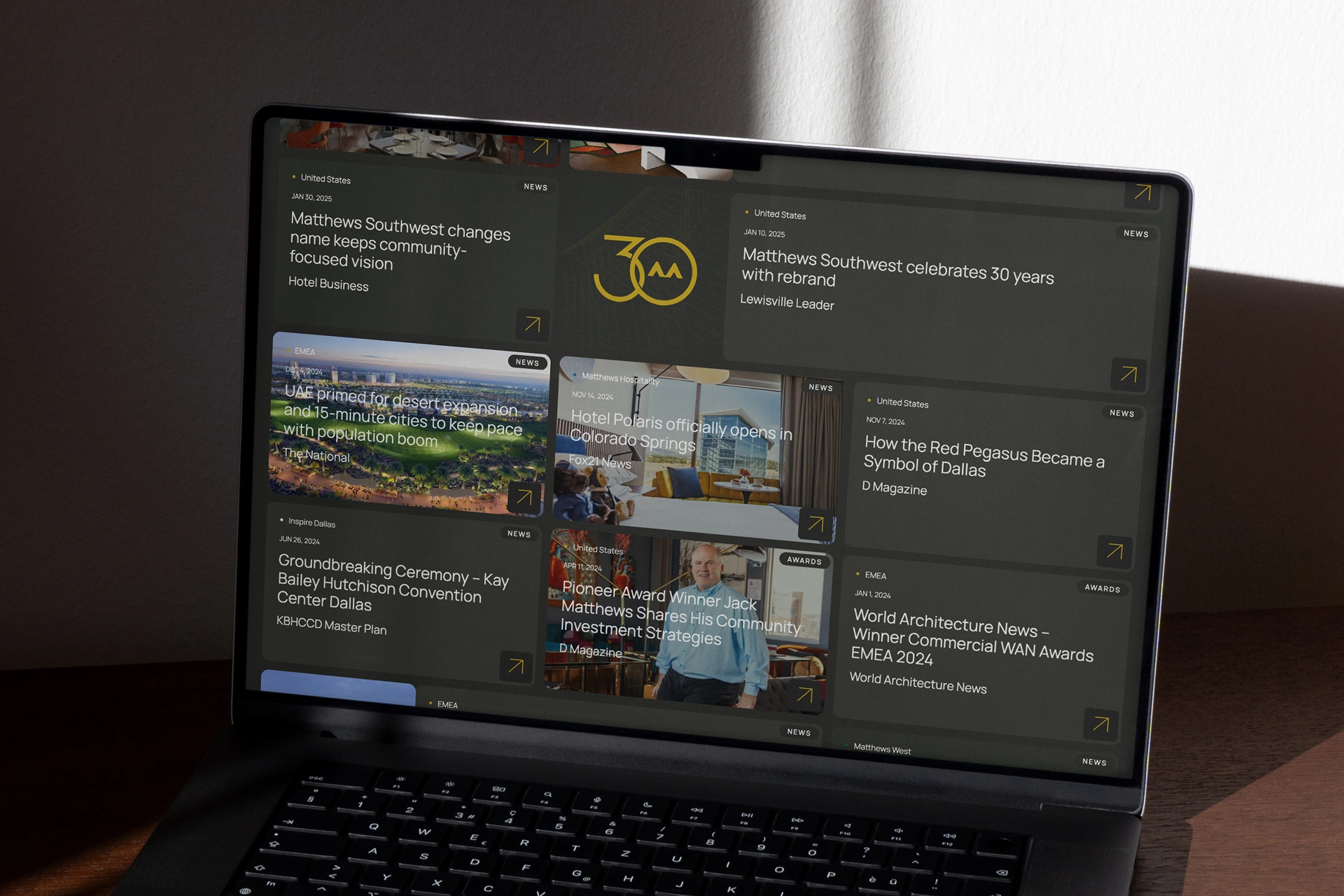
The website was designed to reflect how the company operateshandle the global complexity without sacrificing clarity or user experience. We structured the site navigation around the company's internal organization, defining the two key distinctions: Regions (e.g., EMEA, Canada) and Divisions (e.g.,Hospitality, Energy). This global-to-local hierarchy immediately established the company's breadth while providing easy-to-find pathways for users.
Deliver
After three decades, evolving how a company presents itself requires more than a visual shift. It takes alignment and trust. The Matthews brand now reflects what has always been true internally, and the website brings that clarity into the world. Together, they unify a global organization under a single identity while giving each part of the business room to stand on its own.
Matthews no longer has to explain who they are. Now, they can show it.
Related work

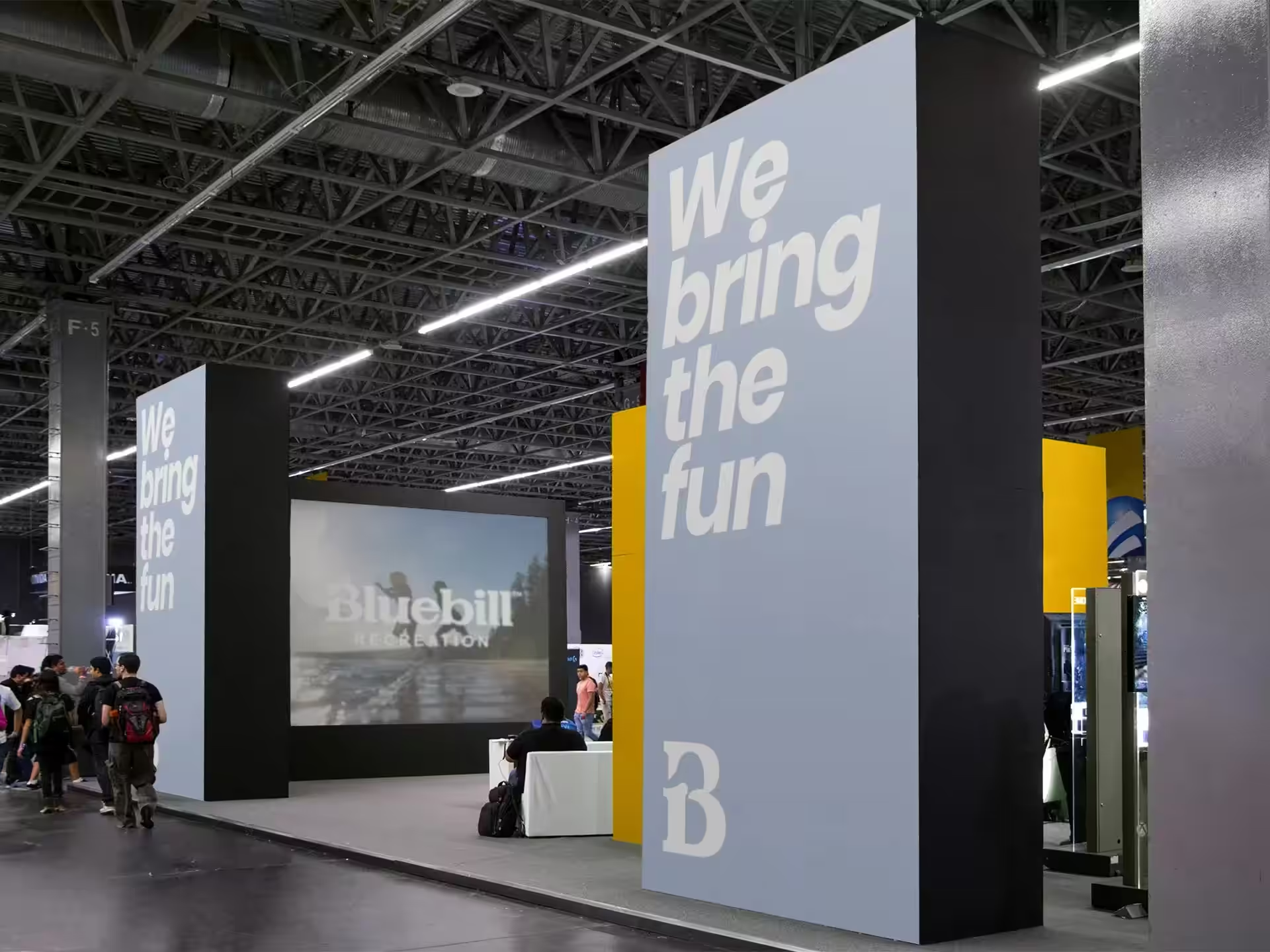
Bluebill Recreation
Creating a parent brand identity to unite a growing portfolio of water recreation products
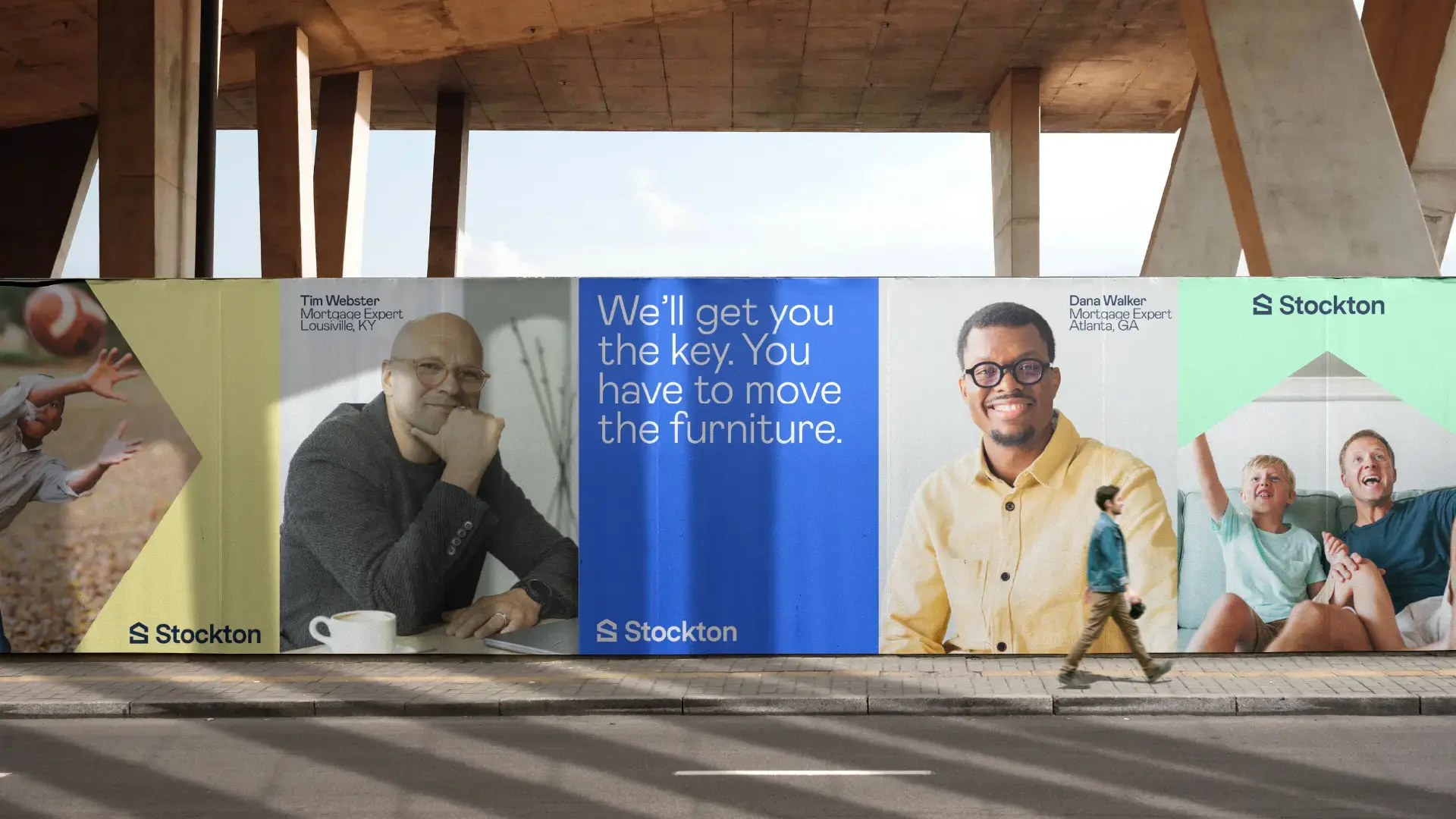
Stockton
Scaling a multi-regional mortgage lender through four eras of brand evolution