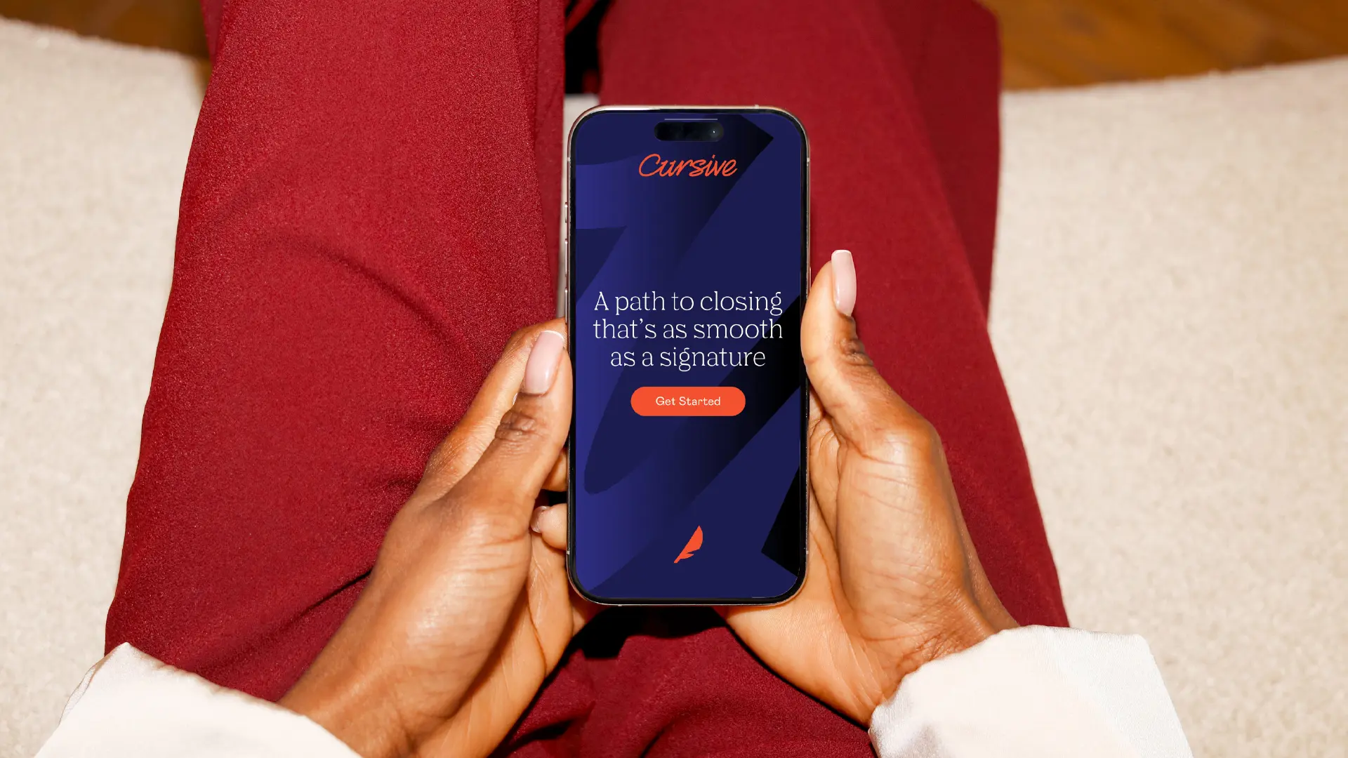
Cursive
Differentiating an acquired lender through naming


Our longtime partner, Stockton Mortgage, was growing. In acquiring a new wholesale lending arm to serve banks, credit unions, and brokers, they inherited a generic legacy name: Lender Ltd. It was a vanilla brand with zero market differentiation and looming trademark issues.
We partnered with them to build a boutique, relationship-driven brand that positions them as a nimble, concierge-style alternative to cold, bureaucratic institutional lenders.
Define
Our discovery focused on translating a high-touch, concierge wholesale model into a memorable name. From hundreds of candidates, the leadership chose Cursive.
The name carries intentional meaning. Literally, cursive is fluid, connective, and fast — mirroring their rapid loan lifecycle. Metaphorically, it evokes the "old-school relationships" that differentiate them in a digitized market, serving as a direct nod to the final, personal signature on closing documents.
Design
With the name selected, we designed a visual identity that bridges professionalism with a warm human connection. We paired deep, traditional navies with vibrant, energetic oranges, centered on a custom quill logo that represents precision, heritage, and the human hand.
Verbally, we built a toolkit that replaces rigid corporate jargon with approachable, collaborative language, anchoring their digital presence in authoritative guidance.
Deliver
We delivered a complete brand system and an intuitive website refresh. The updated digital platform simplifies their specialized value proposition, allowing independent brokers and credit unions to immediately understand how Cursive's speed and flexibility support their business.
The Cursive Lending rebrand proves B2B finance doesn't have to feel clinical. By swapping a generic name for a storytelling vehicle built around fluidity and partnership, we've positioned Cursive as the premier, trusted signature of wholesale lending.
Related work

Omni
Building a brand as intentional as its architecture
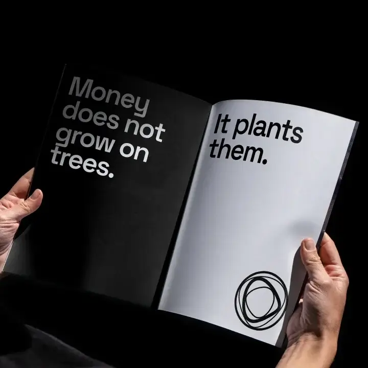


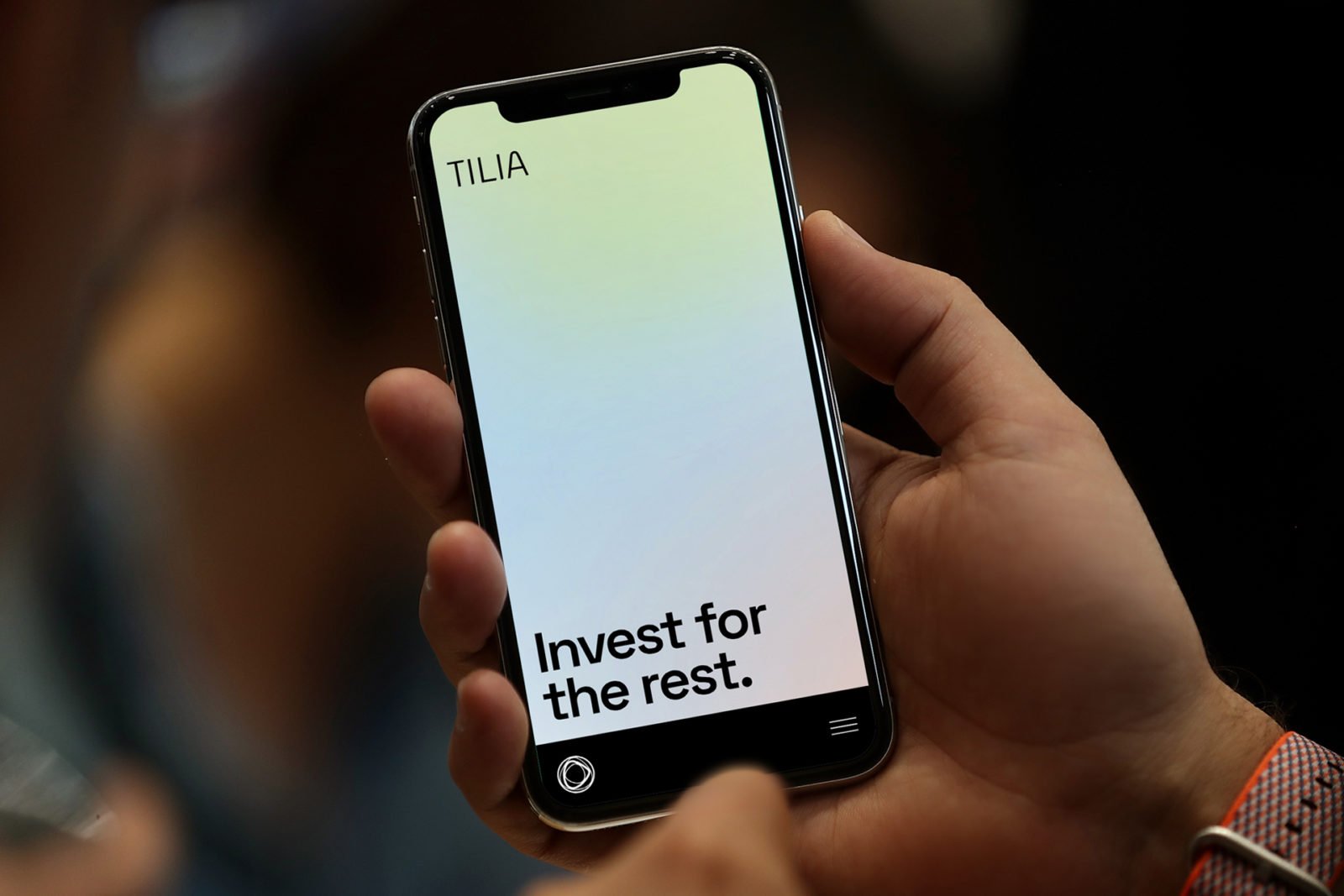
Tilia
Giving a multigenerational family office a name and identity rooted in purpose