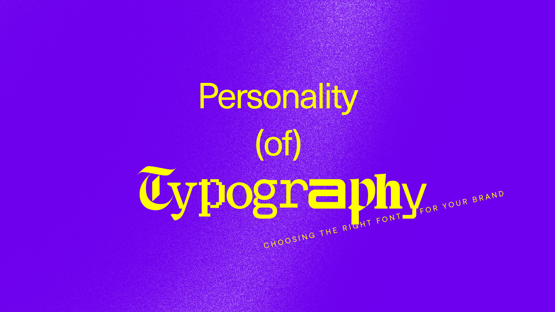
How to choose brand fonts
Open up Microsoft Word or Google Docs or Pages, and you’ll find a stable of fonts. These are the basics. The defaults. They are more than enough for your average document. But they’re hard for a brand to “own.” To stand out — to create a brand identity that is instantly recognizable as your own — you need a professional font.
Let’s start with a thought experiment. Close your eyes and picture a bank. Think about their logo. Next, picture a daycare. A death metal band. Do you see the same font in each image? Probably not. In every industry, there are underlying rules and clichés. And for a long time, those rules have worked. A bank that looks the way you expect a bank to look feels trustworthy and serious. Fonts play a central role in contributing to the personality of a brand. They establish the tone of a logo, letter, or website. And for brands, they present a choice: do you want to fit in or stand out?
Before we move on, it’s useful to talk specifics. You have probably heard of both fonts and typefaces. A typeface describes a particular style of lettering. A font refers to variations of a typeface, like its size and weight. Helvetica is a typeface, Helvetica Light Italic is a font. And Helvetica — like most professional typefaces — costs money. A brand must pay a licensing fee to use it. This license can be expensive, especially for a large and complex organization. But all professional fonts come equipped with the special characters (!@#$), ligatures, numerals, and accent marks you will need for English and for most languages derived from Latin. They are evenly kerned to increase readability. And, critically, they are unique.
There’s a sentence we often write at Bullhorn: we build impact brands with language and design. How exactly would the personality of that sentence — and the personality of Bullhorn — change in a different typeface?
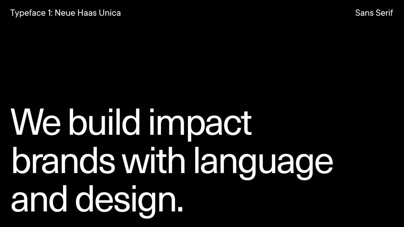
Neue Haas Unica (Sans Serif)
Created by: Monotype
Released: 1980
This sans serif font makes our sentence feel friendly but direct and no-nonsense. It’s modern and legible, clean and geometric. It might bring to mind Target, 3M, or FedEx — companies that are established but never stagnant. Like a software company always looking for the next breakthrough. At Bullhorn, we try to write thoughtfully and with purpose; powerfully and without excess. We don’t use Neue Haas Unica, but it matches our brand’s personality well.
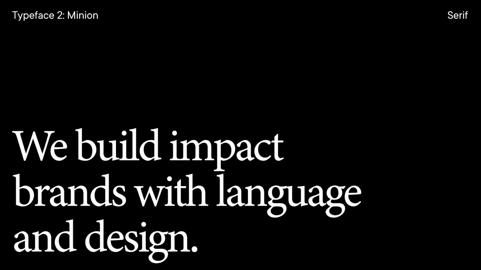
Minion (Serif)
Created by: Robert Slimbach
Released: 1990
This is a classic serif. It feels elegant and traditional. Set in this typeface, our sentence has a new gravity. It feels grounded in history and experience. It would be at home alongside JP Morgan, Rolex, or Mercedes-Benz: high-status companies that are historic but not irrelevant. It’s fit for companies with years of success and brand equity.
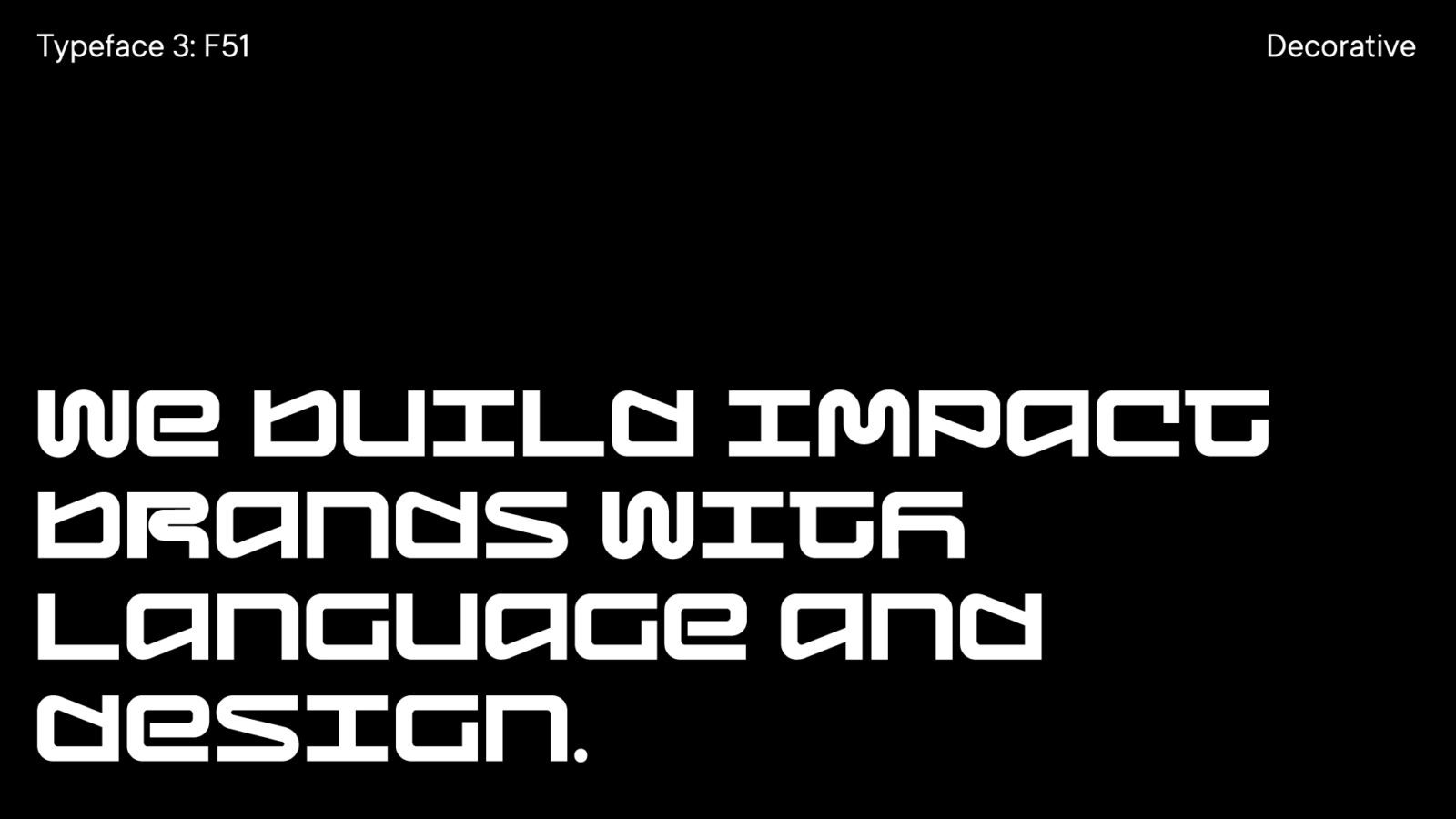
F51 (Decorative)
Created by: Foundry37
Released: 2018
F51 is a display, or decorative, typeface. It’s youthful and bold, with an energy that is immediately memorable. This is more Formula 1 than Mercedes, more Mailchimp than AT&T. F51 is meant for changemaker brands that are ambitious, confident, and not afraid to make people a little uncomfortable. And if that’s your brand’s personality, F51 will convey your attitude even before someone reads the first word.
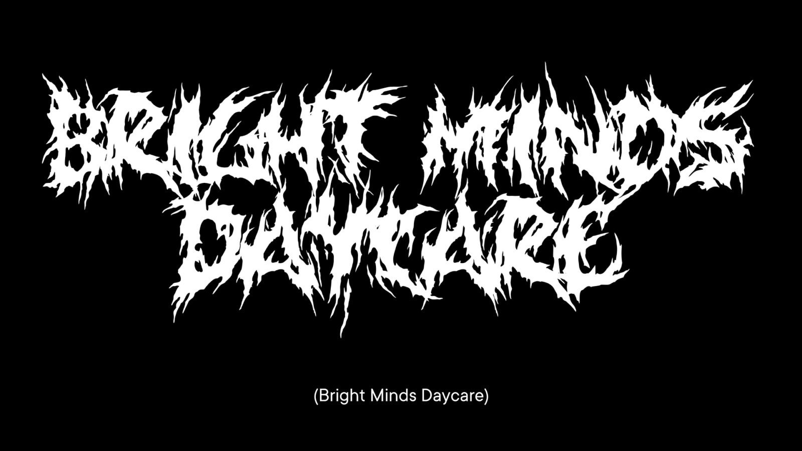
As with all design decisions, context matters. If everything in your brand is bold and brash, then nothing is. But a safe name, average logo, familiar font, inoffensive colors, and neutral language is a recipe for irrelevance. What bold means depends in large part on your industry. A small town bank lives with different expectations than a crypto startup. Or, to revisit our thought experiment, a daycare with a death metal logo wouldn’t inspire confidence with all parents.
There’s a frequent argument in branding about timelessness versus trendiness. But I would argue that relevance is the key. A brand needs to be noticed. It needs to stand out from its competition to have a chance at success. And like that death metal daycare, the wrong choice can make people uncomfortable. But here’s the trick: the right choice can, too.

Keep up with Bullhorn
Connect on LinkedIn or Instagram
Buy Brad’s naming book