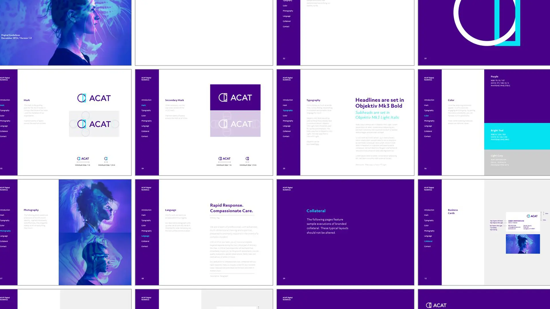
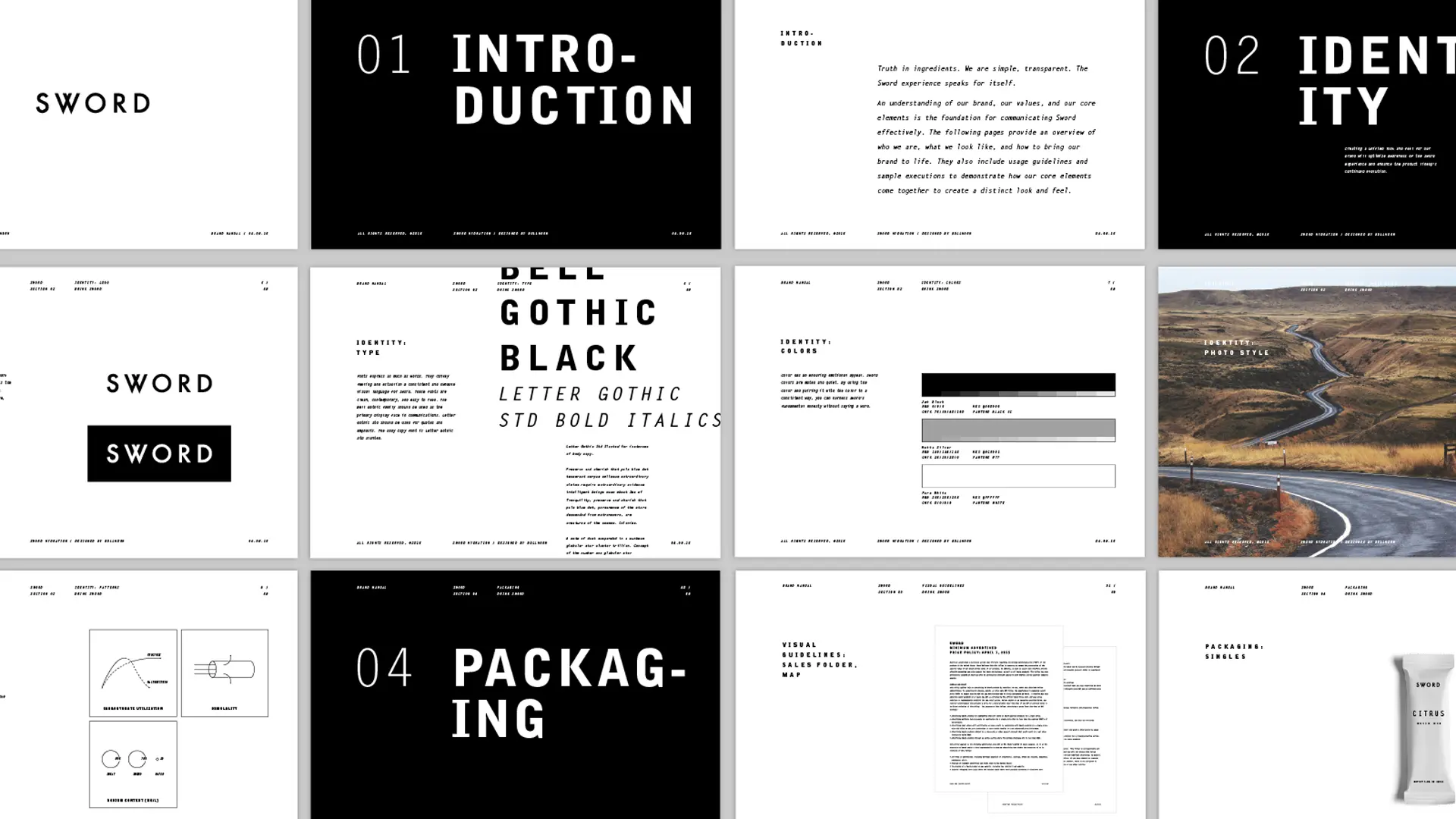
How to choose brand colors
There is arguably nothing more beautiful, complex, and befuddling in this visual world than color. Color carries feelings that are both atmospheric and direct, lighthearted and serious. And for these reasons and more, color must be a respected part of your visual identity.
A quick lesson on color: Color refers to an aspect of any object describing hue, lightness, and saturation. And, we all perceive it differently. To have color, you must have light; with different qualities of reflected and emitted wavelengths of light, perception changes. As light hits the rods and cones of the eye, electrical signals trigger the brain through the optic nerves. These signals are transmitted around the brain and body. It is an intensely personal experience, which presents a challenge when choosing colors to represent your company.
So how do you choose the best colors for your brand?

Stick to strategy
When beginning to choose your hue (name of a color), put aside likes and dislikes and refer back to your vision and strategy. I love hot pink and black together, but building clients’ brands around these colors would be consistently overwhelming. (Unless they are looking to exist in the best and worst parts of the 1980s.) Consider the range of available colors in the color wheel and ask these simple questions:
Is my brand:
- reserved or energetic?
- traditional or contemporary?
- in an industry typically associated with a specific color or palette?
The colors you select should reflect your answers to these questions. You can probably envision an energetic, contemporary brand color palette — vibrant colors that maybe feel digital. But what if that is what everyone in your space is doing? Maybe you shift those colors in some way, using color to set yourself apart.
Use contrast
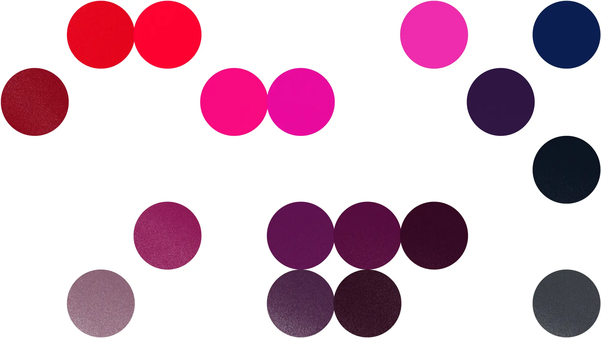
Give your brand interest by contrasting hue (see above), value, and saturation. In addition to hue, value refers to the relative lightness and darkness of a color. Saturation refers to the amount of color present. Pink is a tint (a color plus the presence of white) of red. Putting subtle hues together (like Valentine’s Day pink and red) can be visually stimulating. But if pushed too far, the result can be an inaccessible experience.

For example, Waterfront Park, a nonprofit public park needed to differentiate from municipal offerings and be visible in the park’s landscape. We put ourselves in the shoes of a visitor. In a green space, is it easier to find staff in a bright orange or a green? We built a palette anchored in a deep orange to draw the eye, create a sense of energy, and serve as an identifier for patrons. In the simplest terms, we built the identity to stand out.


Conversely, the palettes of Elwood and Fiddletree, a boutique hotel and restaurant, live in a sophisticated, contemporary color group appropriately reserved for the locale. The hunter green of Elwood is reminiscent of the surrounding landscape. We paired it with an unexpected subtle pink tone. Similarly, the Fiddletree brand uses a lighter tone, a warm peach, with a deep navy, like that of a blazer. Both entities balance a mix of classic and contemporary.
More is not better
Building a palette requires consideration of trends and your typical output. Having a five- or six-color palette seems like a great idea, but can become a significant budgetary issue if your business produces a lot of materials. We tend to recommend anchoring a color palette in one or two hues. Anything beyond that should be used sparingly and with very good reason.
When in doubt, don’t overthink it. Take each consideration with appropriate care and shrug off your tendency to add unnecessary elements. (We love black and white.)
Brand colors that are purposeful and intuitive will always work for you.

Keep up with Bullhorn
Connect on LinkedIn or Instagram
Buy Brad’s naming book
%20(1).webp)