Why your brand should use motion graphics
Have you ever been out to eat with friends and there’s a tennis match on a huge tv, right over your friend’s shoulder? Even if you don’t care about tennis, you probably find yourself frequently checking the screen. We are naturally drawn to things that move.
If you have a business in 2021, you likely have some kind of digital presence — a website, an app, a social media account. But, on the over-saturated internet, static content struggles for attention. Motion graphics have the ability to cut through the noise and be the extra touch that helps your audience connect.
But when you think of the word animation, you probably think of Disney movies or cartoons. With motion design, or motion graphics, graphic designers use the same principles as traditional animators. Things like squash and stretch, easing, anticipation, follow through, and staging. But instead of telling stories to keep kids entertained on Saturday mornings, we use these tools to tell brand stories and explain abstract concepts.
Tell a story
Think about a TV commercial that gave you goosebumps or made you laugh. Likely, it was memorable because you connected with the story it told. When we use motion to craft a story, we have the space to set up the problem and demonstrate how your brand is solving it. And, we can do it in a way that evokes emotion. It’s an engaging and easily shareable visual elevator pitch for a new brand or product line.
For example, if your brand is nostalgic, we might find a song that feels warm and cast a voiceover artist who sounds like your grandfather. The visuals might move slowly, fluidly, like a dream. The colors might be soft and warm, like a memory. Every aspect of a video is a choice to help communicate your brand’s reliability and trustworthiness.
The Naming Book takes a workbook approach. It includes exercises that walk you through how to find the right name. Part of the process is generating a long list of words and crossing out the options that don’t meet your criteria.
To introduce the book, we animated the typography one word at a time to mimic generating a list of name options. In some spots, the words come in slow and laborious:
And in other spots, they come in quick bursts all at once.
Sometimes it feels like you keep coming back to the same idea over and over again.
The result is a video that mimics the feelings a potential reader may be experiencing, ending in an empowering resolve.
Explain abstract concepts
Imagine you are playing a board game for the first time with some friends. If no one has played it before, you have to read the rules (probably several times and by multiple people) to gain a vague idea of how it works. If someone has played before, they will probably demonstrate on the board to explain the rules. The same concept applies to motion graphics. We’re visual learners.
At its simplest, designing an identity is creating a visual metaphor for who you are as an organization. With motion graphics, we take those metaphors and bring them to life. Instead of explaining the transformation, we show it with graphics. This approach makes the metaphor easier to understand and more memorable.
We drew inspiration for the Lexington Theater Company logo from the proscenium arch, an architecture element found in many theaters. It speaks to the connection enabled by the theater between the actors and the audience, the performance and the community. During the concepting phase of this project, we jokingly called it The Tombstone. To avoid any confusion on launch, we built this animation to make sure the idea was clear.
The animation traces the arch shape on multiple stages reinforcing the shape association we want to create. To give the repetition a sense of momentum, only the final arch animates to completion.
Once you get the idea, we drop the curtain.
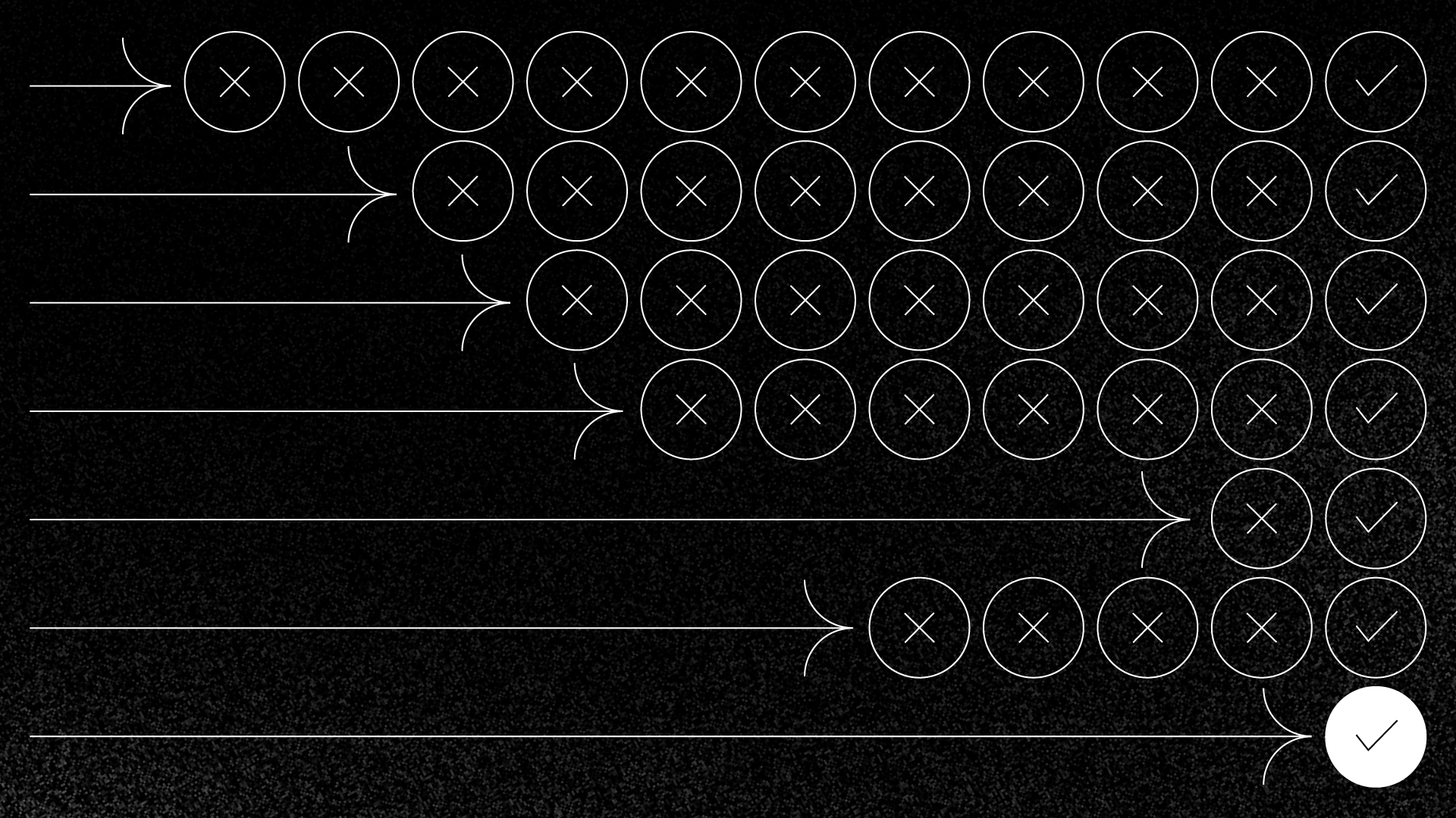
But say what you’re doing is something hard to understand. It’s complicated, and there isn’t a tangible thing to show. Maybe you’re trying to get someone to understand and invest in real estate.
We worked with real estate investment platform Cadre to build a visual metaphor for their complex offering. Using motion, we demonstrated the concept to make it more accessible for potential investors.
To explain investment strategy, we animated a checkerboard. The pieces are bouncy and playful, making it feel friendly and inviting.
Then, we visualized abstract ideas, like an investment portfolio, as game pieces that move around, bolstering the idea that it is easy to use.
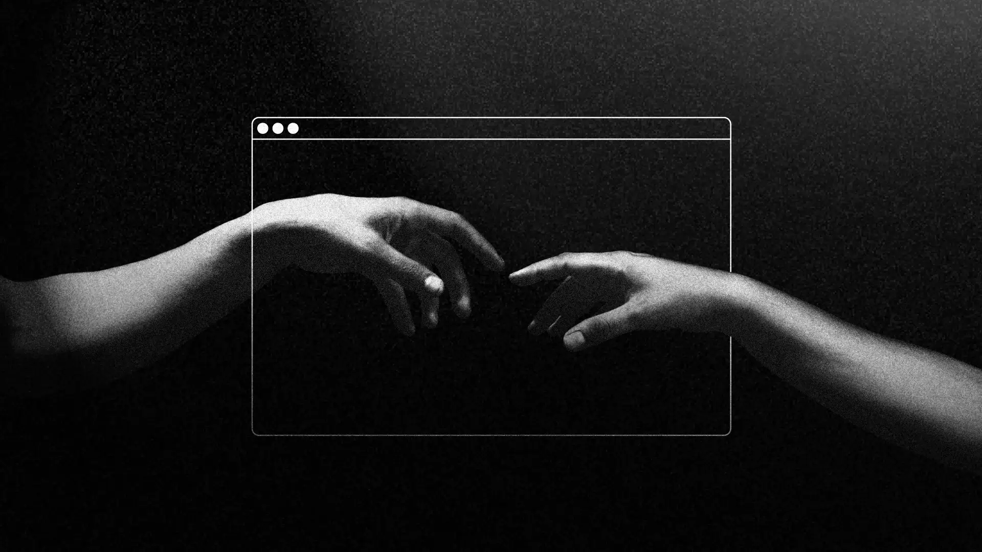
Motion graphics can help your brand go beyond communicating with your audience, it can help you connect with them. Especially in an increasingly digital world, it has the ability to cut through the noise and catch someone’s attention for the second it takes to forge a relationship. It can be the extra touch that helps bring your brand to life.

Keep up with Bullhorn
Connect on LinkedIn or Instagram
Buy Brad’s naming book