If you provide a service, your website should do these four things
Building a website is kind of like building a house. It can be big, small, custom, or a template. The major difference is that you don’t help the construction crew lay the concrete footers or work alongside the plumbers as they install the pipework. But you are necessary to the process. You have to help at almost every step to get the best website.
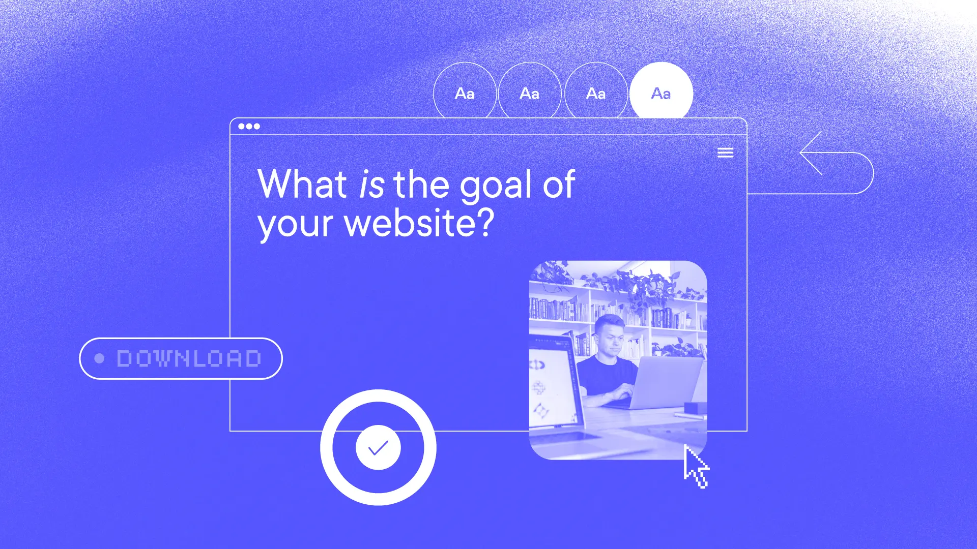
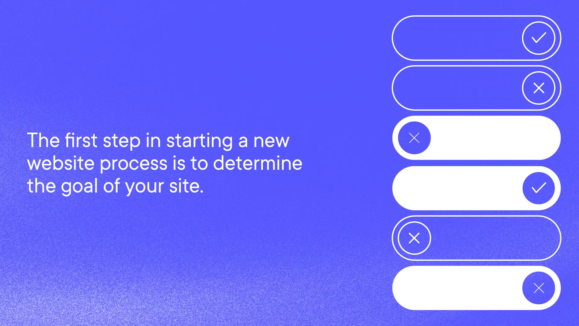
The first step in starting a new website process is to determine the goal of your site.
What is the goal of your website?
For a product site, the goal is to sell your goods. Simple. You see call-to-action buttons, including “Shop” and “Buy now.” It’s pretty straightforward.
For a service provider, you likely have several goals for the website, but ultimately, it needs to validate who you are. Potential customers or clients come to learn more based on a recommendation from a friend or colleague. They are interested in your particular service, but they need to see that you are genuine, knowledgeable, and easy to work with. Yes, you want to sell your service, too, but more on that another time.
We’ve recently partnered with a lot of service providers and believe the following four aspects are must-dos for your new website to meet its goals and differentiate you from the rest.
Display your brand’s positioning
We love a good headline at the top of your homepage. But if you don’t spell out who you are and what you do early in the scroll, everything else is pointless. Most visitors to the site will have some idea of what you do, but they are looking for that immediate validation.
Make sure you have strong and clear positioning and about statements in your brand language lexicon. These should be short and straightforward answers to the question, “what do you do?”
Show your expertise
Our clients who provide a service are good at what they do. Their brains can information-dump with the best of them. We need to hear all of it to understand what they do, how they do it, and why. But how much of that information makes it on the website? We argue that only half or less makes it to the main navigation pages. Your potential clients or customers want to know what you do, but they also need to understand it right away and determine if it’s what they need. If your website goes into paragraph after paragraph or bullet list after bullet list of each of your services, you’ve buried your lead and potentially lost a customer. Save the deeper dives for your blog, further resources, or when you connect with them on the phone or in person.
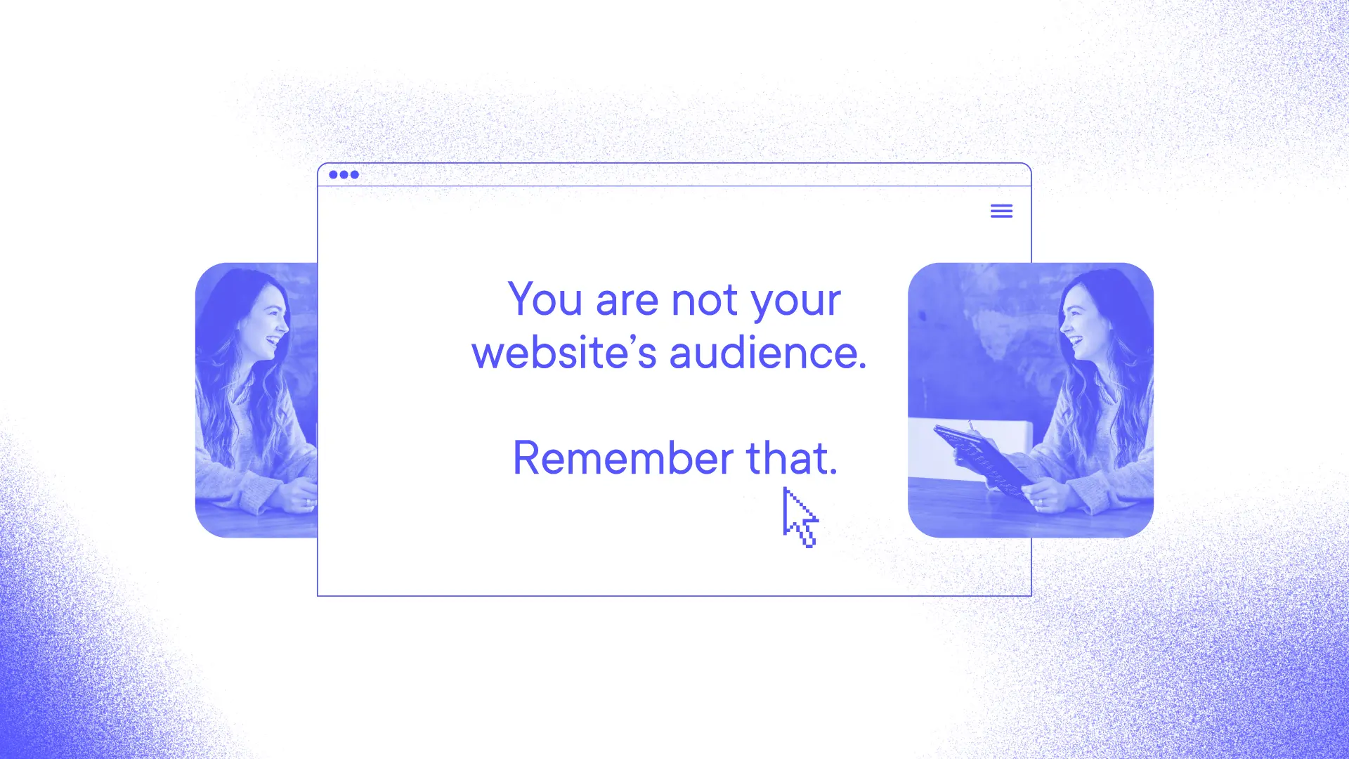
Keep your content on the main pages of the site simple. Spell out what your client’s challenges are. How does your service solve them? Use real photos of your team and your work (if possible), and let the language on the site speak directly to your primary audience. Let them see themselves working with you. You are not your website’s audience. Remember that. So, all of that information stored in your brain doesn’t need to live on your site. You will still look like experts, trust us.
Build immediate trust
Consistency and transparency build trust. And that starts with your brand. Your website is an extension of your brand and your brand’s personality. First, take care of the low-hanging fruit and ensure that your logo, color palette, fonts, and brand voice are transferred to your site. Your brand guidelines should include some guardrails for digital versions of your brand.
Your website should also be easy to use. Keep the navigation jargon-free and straightforward, avoiding an overwhelming number of top-level menu items and overloaded dropdown menus. Too many clicks can be tiring and convey that you are complicated.
Be transparent about your services using straightforward language, or consider highlighting testimonials or case studies from past projects. This social proof also shows your expertise and demonstrates your positioning. If pricing is a factor in your service industry, be clear about your fees and how they work.
Make contacting you clear and easy
The end game of a service provider’s website is to sell a service to a customer. But that probably doesn’t happen on your site. It happens over the phone or in person. You ultimately want a visitor to your site to get in touch with you, the expert.
Your main call-to-action should be clear on your site. Whether it’s Get in touch, Let’s chat, Contact us, or something more clever and on-brand, let the language speak for itself. Contacting you could be a phone call, scheduling an appointment using a plug-in like Calendly, or filling out a form. Whatever it is, keep it user-friendly, so you can focus on having a good conversation with a potential customer and hopefully making a sale. And if you have a long sales cycle, let this be step one in keeping them in your contacts to keep the conversation going.
Need help with your website? Whether you want to rethink your website’s goals, extend your brand to your site, or reimagine your users’ journey, we can work with you to brainstorm ideas.

Keep up with Bullhorn
Connect on LinkedIn or Instagram
Buy Brad’s naming book