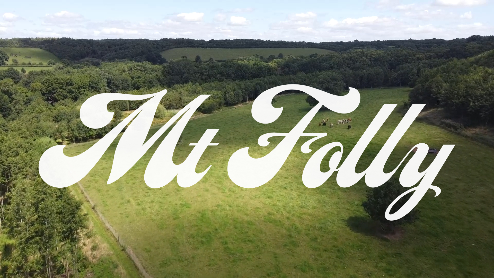
Mt. Folly
Regenerating a brand for a network of farmers
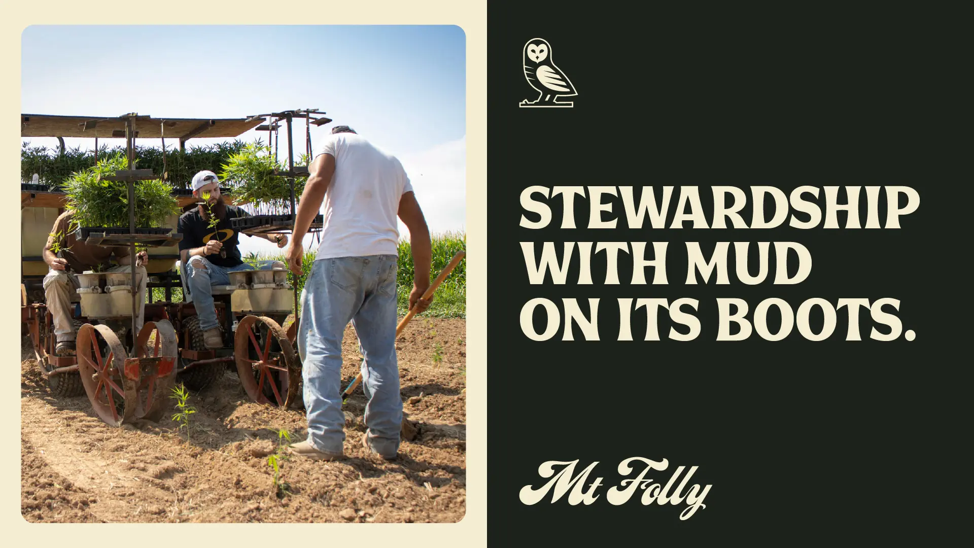
Farming is more than planting and harvesting crops. It’s about hard work, making a living, and giving a damn. But farmers don’t always get the credit they deserve. And in Kentucky and the greater Ohio River Valley specifically, outsiders have grown rich from the region’s abundant natural resources and its producers.
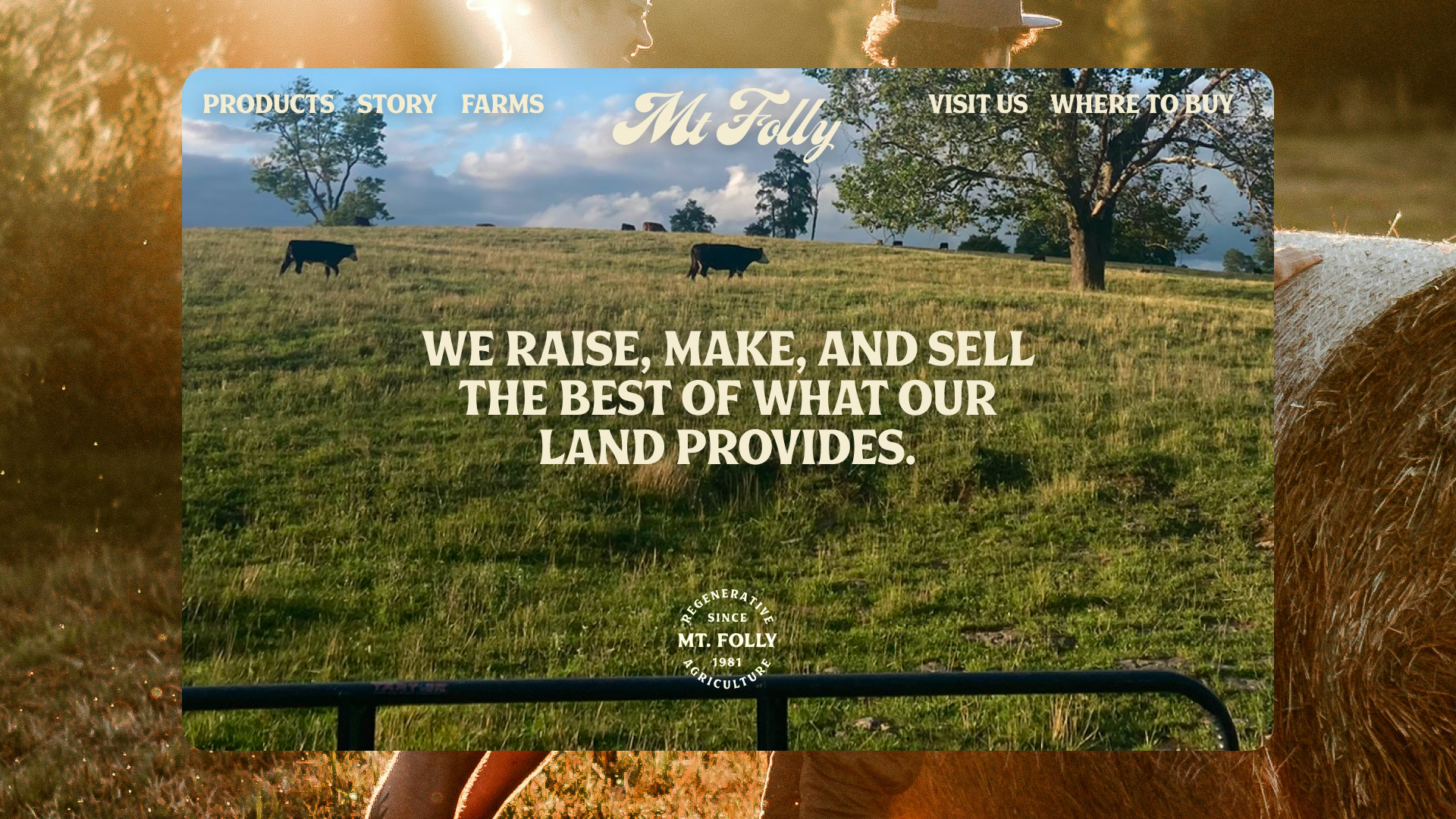
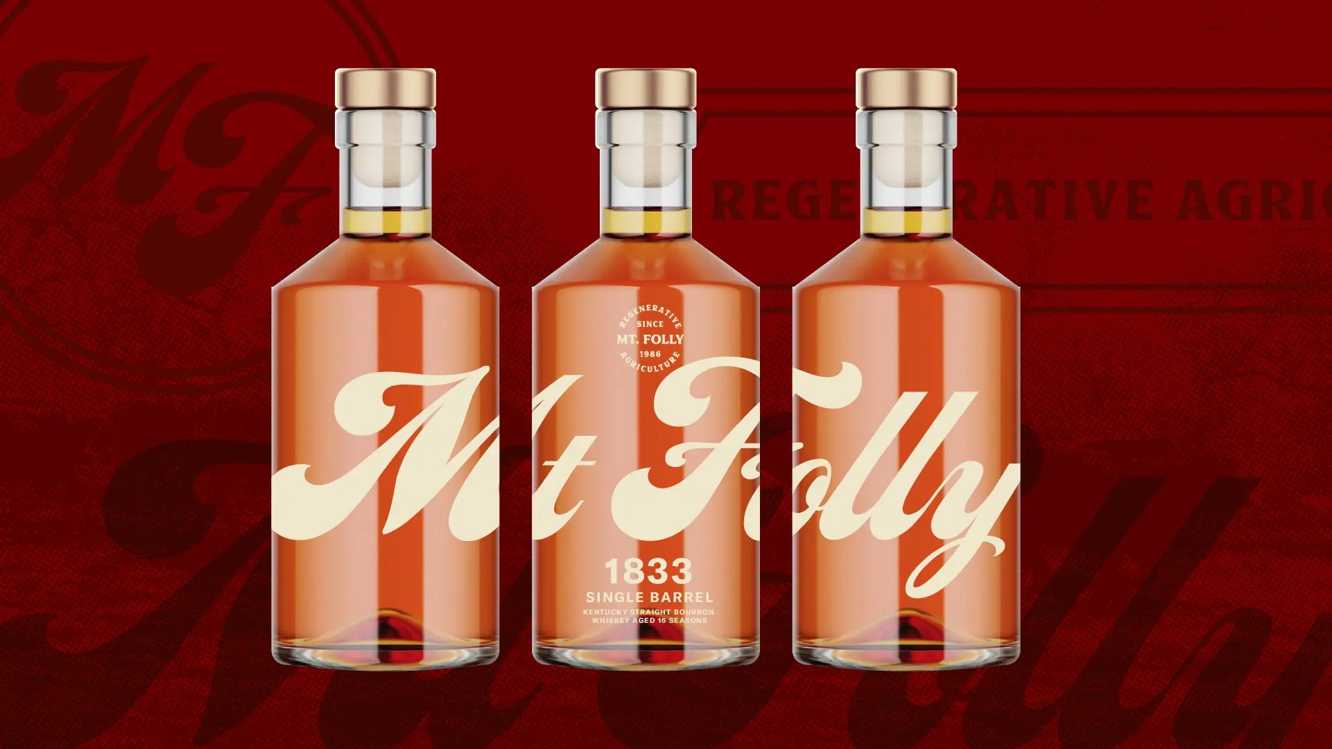
Mt. Folly is a community of regenerative farmers and advocates working to restore the people and places of the Ohio River Valley region. They do a lot. From beef to hemp to whiskey and other goods, they raise, make, and sell the best of what the land provides. They also partner with like-minded farmers to sell their goods while guiding and empowering them with the best holistic practices. In other words, they put farmers first. And are on a mission to teach others to do the same.
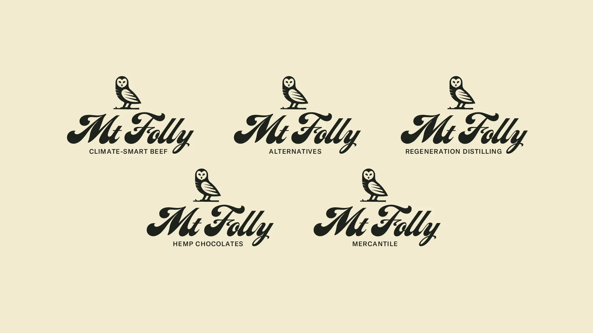
We partnered with the long-standing farm to help them tell a bigger story through a new Mt. Folly brand — a cohesive force encompassing their current brands while leaving room to evolve as they grow regenerative farming practices in the region. Our challenge was to reintroduce Mt. Folly as a parent brand, a new AND established network of farmers, makers, and stewards in the business of making real change in the industry.
Our teams collaborated in several workshops. From dreaming big to profiling audience personas to nailing down the biggest goals and risks, we defined brand tones that would inform the entire identity moving forward. Motivated advocates, aggressive problem-solvers, rooted connectors, unapologetic stewards.
To tell Mt. Folly’s story as a parent brand, the new identity needed to build trust with big retail buyers while not straying from its local roots. The brand tones had to remain authentic while not relying on jargon and hyperbole to avoid greenwashing accusations. And it was time for the brand to lead with its evolving purpose, not solely relying on the founder’s broad recognition.
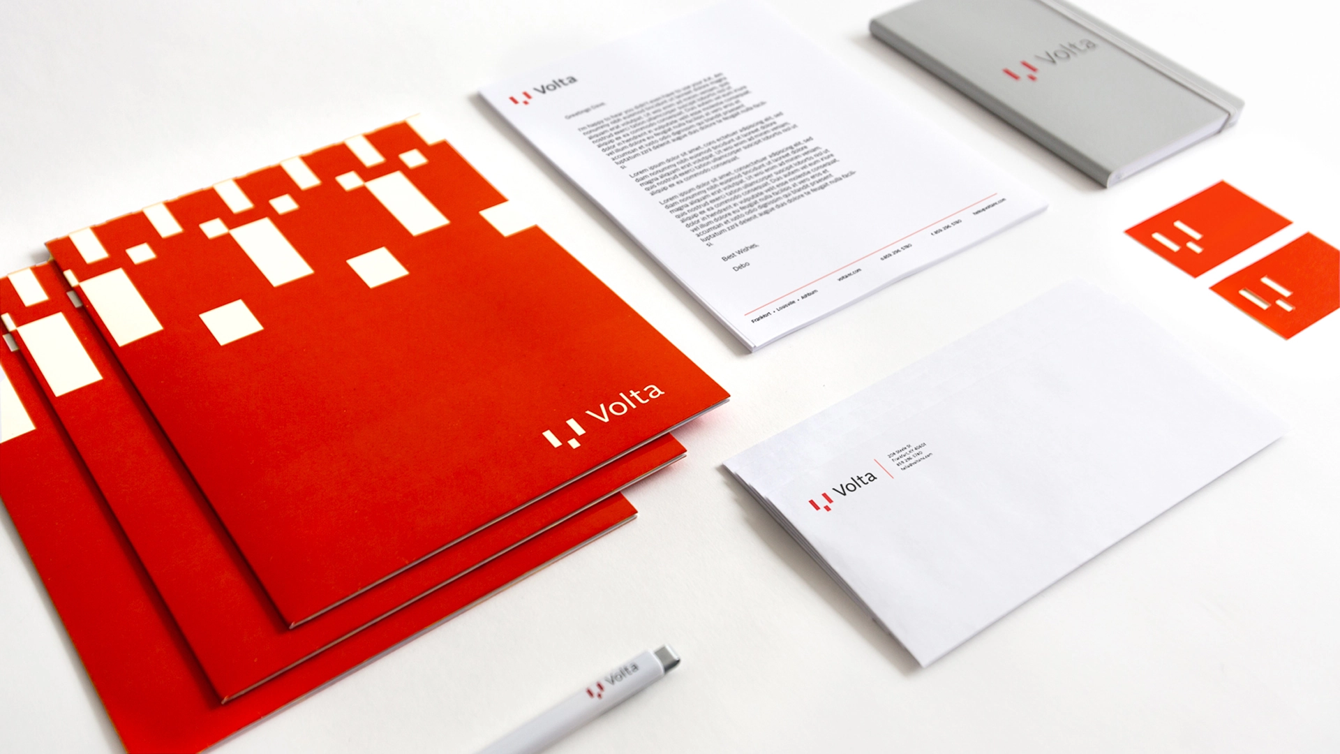
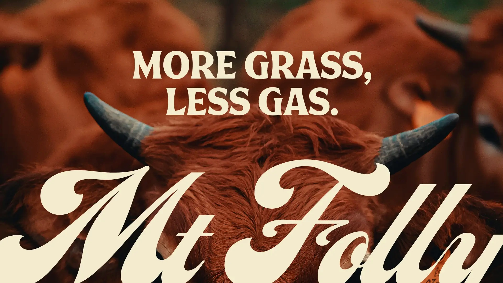
We updated their owl logo to something more functional, a symbol that maintains local independence but with polish to build trust. Then pulling inspiration from old hand-painted produce signs, we designed a custom wordmark full of character and a sense of history.
The new owl, combined with the new wordmark, becomes a new suite of symbols and lockups that hint at the farm’s personality but provide flexibility. And refreshed bold language that doesn’t apologize for its ways adds an authentic edge to showcasing farming for a living.