Lender Limited
Delivering in a hidden market


Small banks have more opportunities than they can fulfill. They have the relationships, they know about the projects, and they are aware of the properties. But often, they don’t have the resources to underwrite the necessary loans.
Lender Ltd. exists to support small banks and help them grow and retain their homegrown relationships. Lender Ltd. provides white-label mortgage services to small and community banks. They help in two ways. One, with lower overhead, they can often offer cheaper loans than a bank with branches and a larger staff. And two, Lender Ltd. can provide larger loans. This empowers banks, gives the lender better rates, and keeps relationships local.
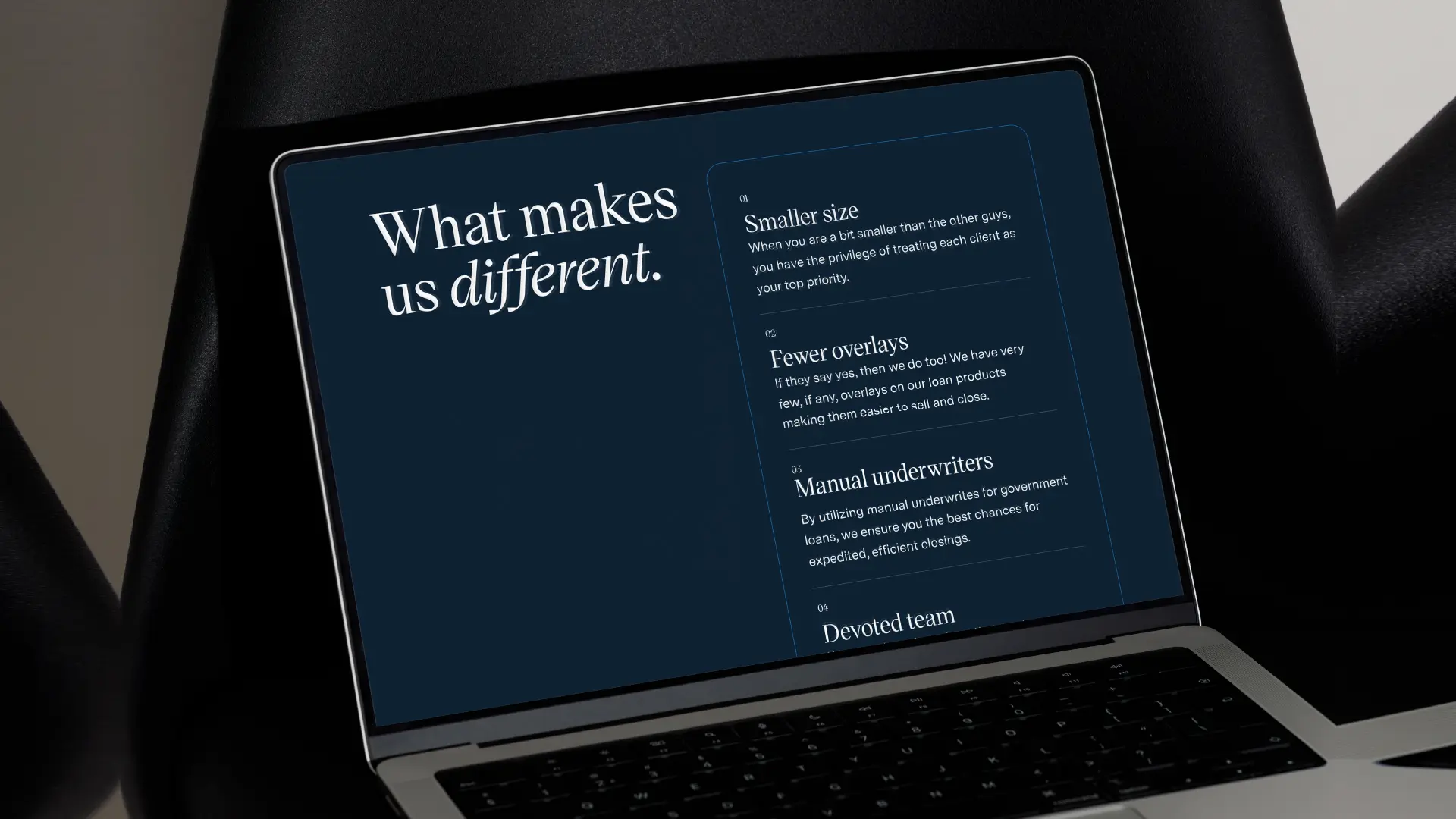
Our work had two main goals: build trust and prepare our client for the future without alienating the people who got them where they are. The color executes this. The primary blue is calming, traditional, yet rich enough to come across vibrantly on-screen.
The house-shaped logo implies the industry, while an L-shaped knock-out provides differentiation. The all-caps contemporary typeface of the logo mark makes you stop to read it. The secondary typeface in the headlines balances the boldness of the logo with serifs that look established and are designed to be easy to read in multiple sizes.
We developed the website experience to be minimal and quickly get users the information they need. Function is prioritized over form. We acknowledged that this is a practical resource, not a place to browse.
Lender Ltd. is prepared to further its mission with a brand identity that inspires trust, shows professionalism, and conveys a future orientation.