City of Lexington
Building a cohesive brand identity
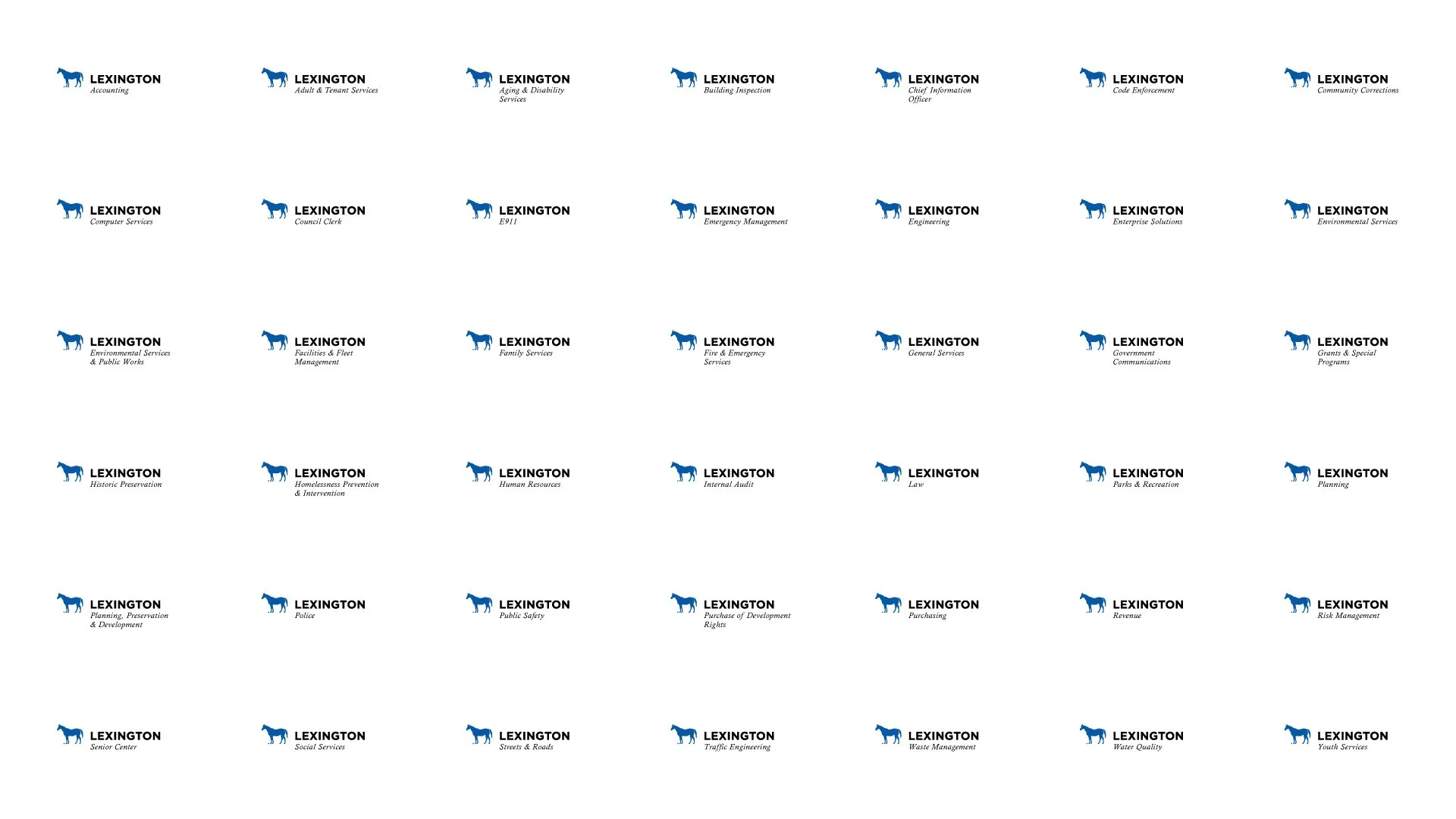
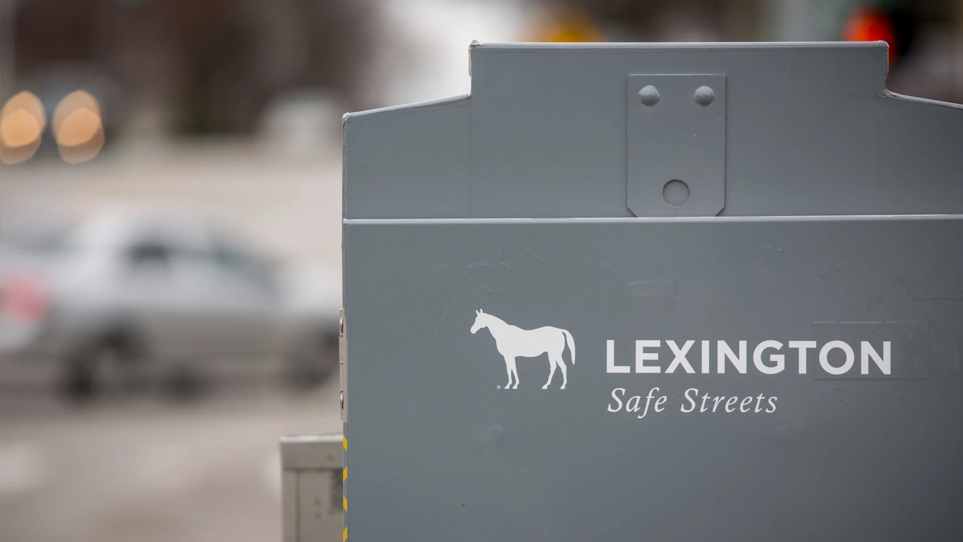
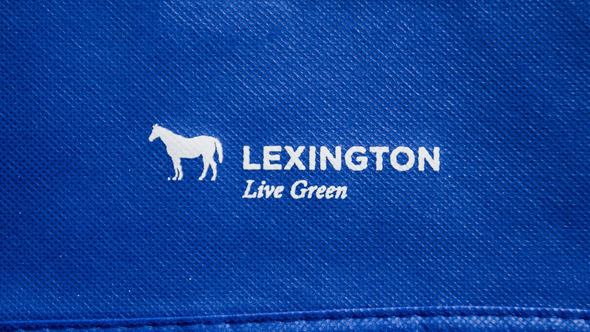


Over time, any organization experiences logo proliferation. A city is an extreme example. Lexington had a seal. It had used a couple of logos over the last 20 years. Each still existed on trash trucks or benches or buildings. Additionally, each department had a different logo. Under the departments there were divisions that often had different logos. And those departments had initiatives or events that also had different marks. There were hundreds of logos associated with the city.
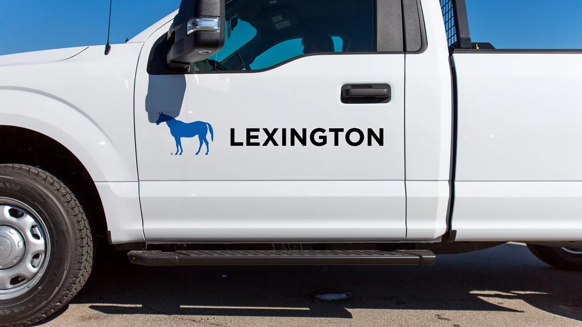
The blue horse lock-up was designed for the Visitors Bureau. It made sense for the City and Visitors Bureau to provide a unified front. We were tasked to figure out how it would apply across the vastness of the City Government. It was also our task to roll it out in such a way that would garner support from people within the government who were used to having control over their own visuals and from the general public who were lukewarm towards the blue horse at best.