Website accessibility: a conversation with Adam and Evan
Lately, clients have been asking the question: Is my website accessible? It’s a big topic, and Anne Dean sat down with Adam and Evan to talk about accessibility on the web. While they barely scratched the surface (again, it’s a big topic), they had a few important points for businesses and startups rethinking their websites.
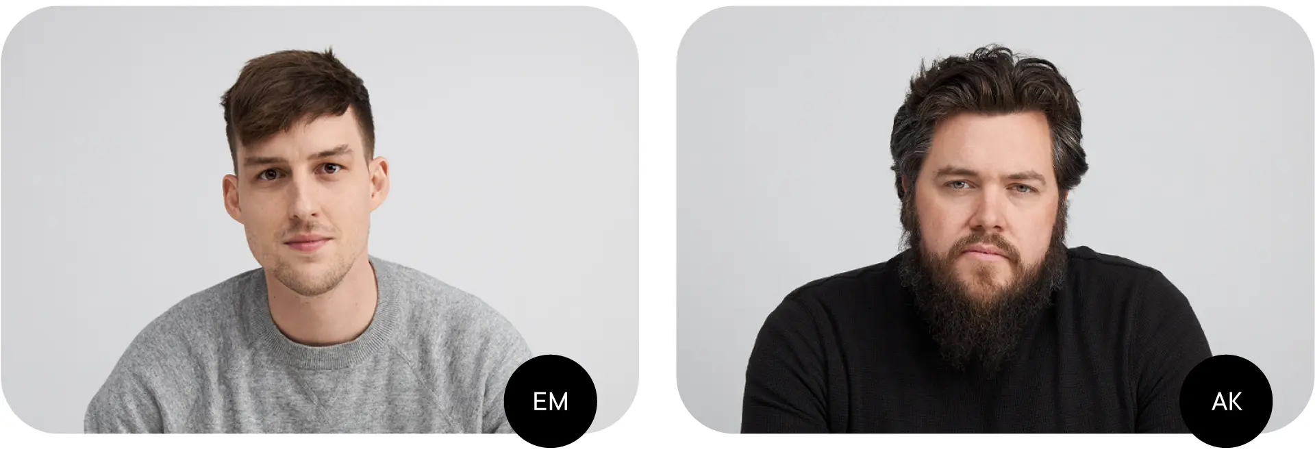
Anne Dean Dotson (AD): Who is relying on the internet being accessible?
Evan Markert (EM): Everyone.
AD: Oh. I assumed it was only for those who identify as having a disability.
EM: Accessibility is about everyone. What if I break my right arm tomorrow? I’m right-handed, so I use my mouse with my right hand and type with my left. But if I lose the ability to use my right hand, I’m in trouble. How do I navigate a website? Temporary or permanent, everyone can experience a disability.
AD: Is there a difference between usable and accessible?
EM: Yes. I think people conflate those terms. Just because a website is usable doesn’t mean it’s accessible. But if a product is accessible, it’s very usable.
AD: Accessible equals usable, but it’s not always the other way around. So, is accessibility a design or a development problem?
EM: It’s both. Website menus used to be straightforward, with five headings across the top link structure. But now, menus are hidden behind a ton of interaction and wizardry — they might require a user to hover over them, or they might not appear until a user clicks them. And a developer has to figure out how a screen reader can parse that information and read it aloud appropriately. So, design and development teams must be working in tandem to solve those potential problems.
Adam Kuhn (AK): We have to design with empathy.
AD: And develop with empathy.
AK: Yes. You have to put yourself in the shoes of every user. Do your research to figure out the problems people are having on the internet.
AD: So what does Bullhorn do?
EM: We follow our best practices. We know the ratios for colors, we know the minimum font sizes, we know the tap target sizes. It’s baked into what we do no matter what.
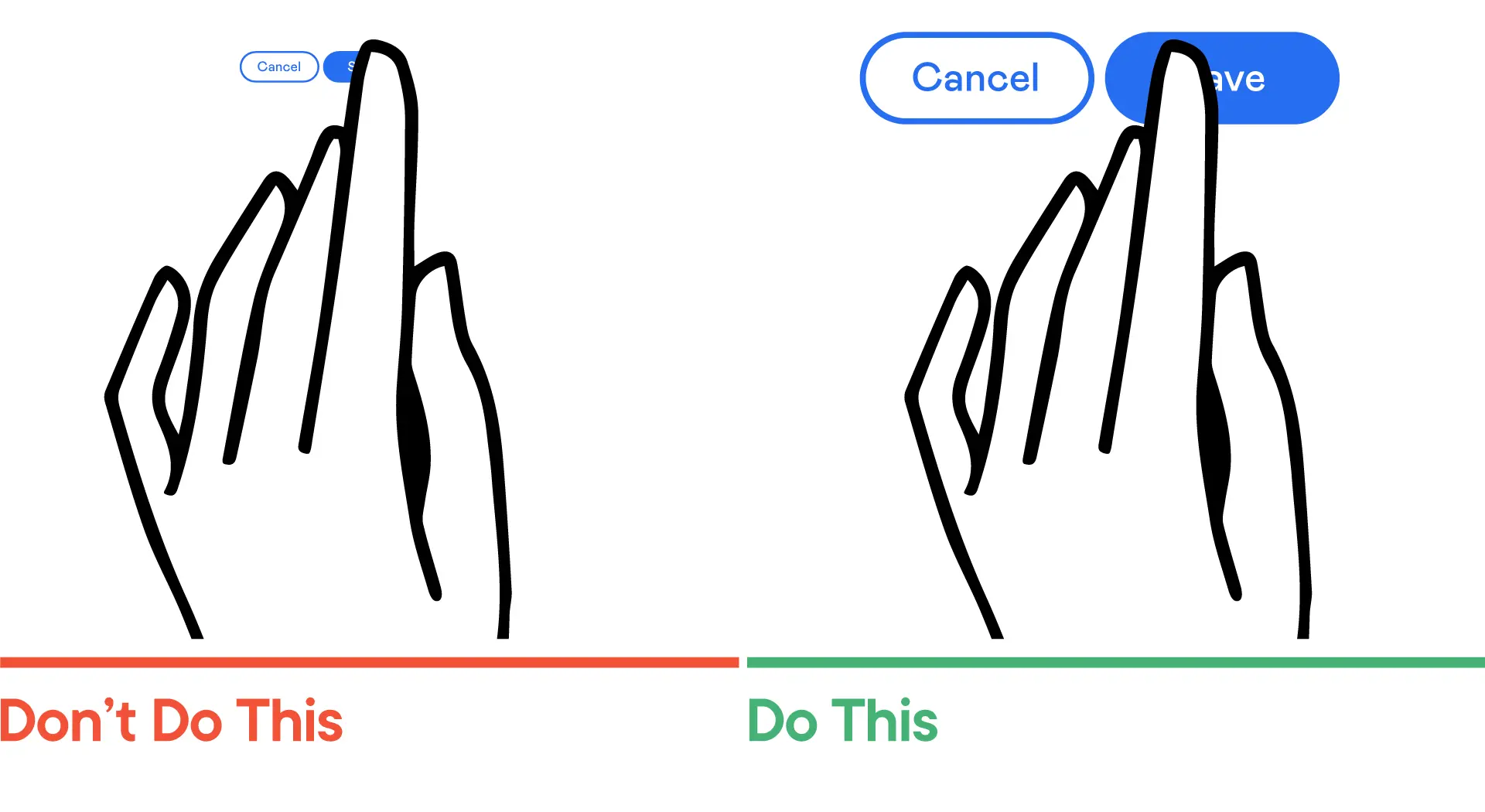
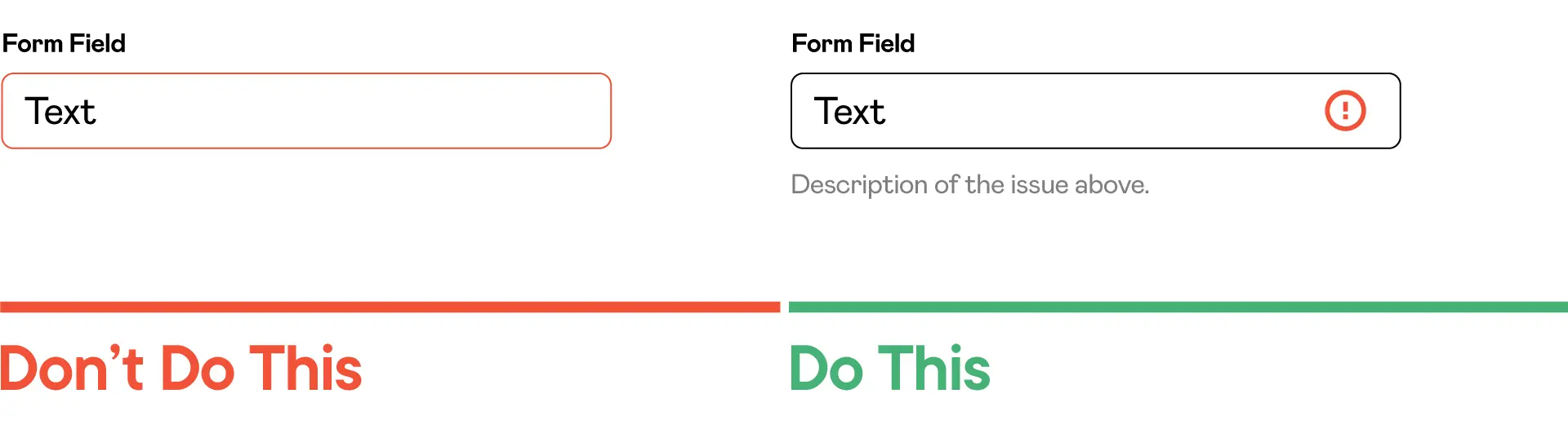
AD: You’re going to have to explain tap targets.
AK: Think about your finger tapping a button on a website from your phone. There’s a point at which your finger is a certain size — and everyone has different size fingers — and the button on your screen is too small. How are you going to touch the button? That’s an accessibility issue.
EM: Okay, Adam, I’m going to put you on the spot. Do you know that the minimum is for a tap target?
AK: It used to be eight millimeters by eight millimeters.
EM: It’s 48 pixels square.
AD: You all officially speak in different languages. Are there any specific laws regarding accessibility on the web?
EM: Yes. The same law in place for accessibility in a physical space, the Americans with Disabilities Act (ADA). But it’s not very specific when it comes to the web. You need to treat your website like it’s your brick and mortar.
AK: You should be able to order the same pizza online that you could order inside that same restaurant.
EM: Exactly. There is also the Web Content Accessibility Guidelines. They outline all the different levels of what’s standard, but there are no true laws for web accessibility.
AD: What sorts of things might be in the guidelines?
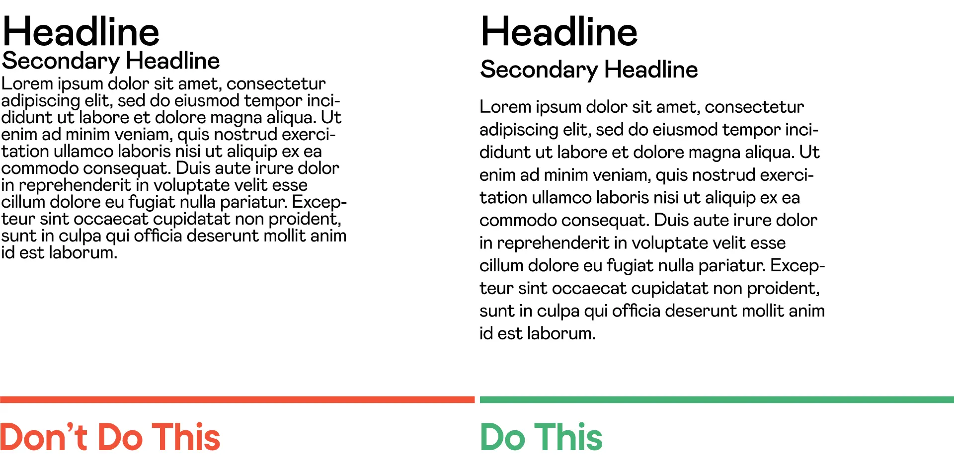
AK: As a designer, I think about the tactics, from color contrast to the physical size of letters. Have you ever looked at your grandparents’ phone?
AD: Zoomed to super-scale?
AK: Exactly.
AD: So, every website should be big?
EM: And in black and white.
AK: Yes, every website should be ugly.
AD: You’re not serious.
AK: No. But that’s what a lot of people think.
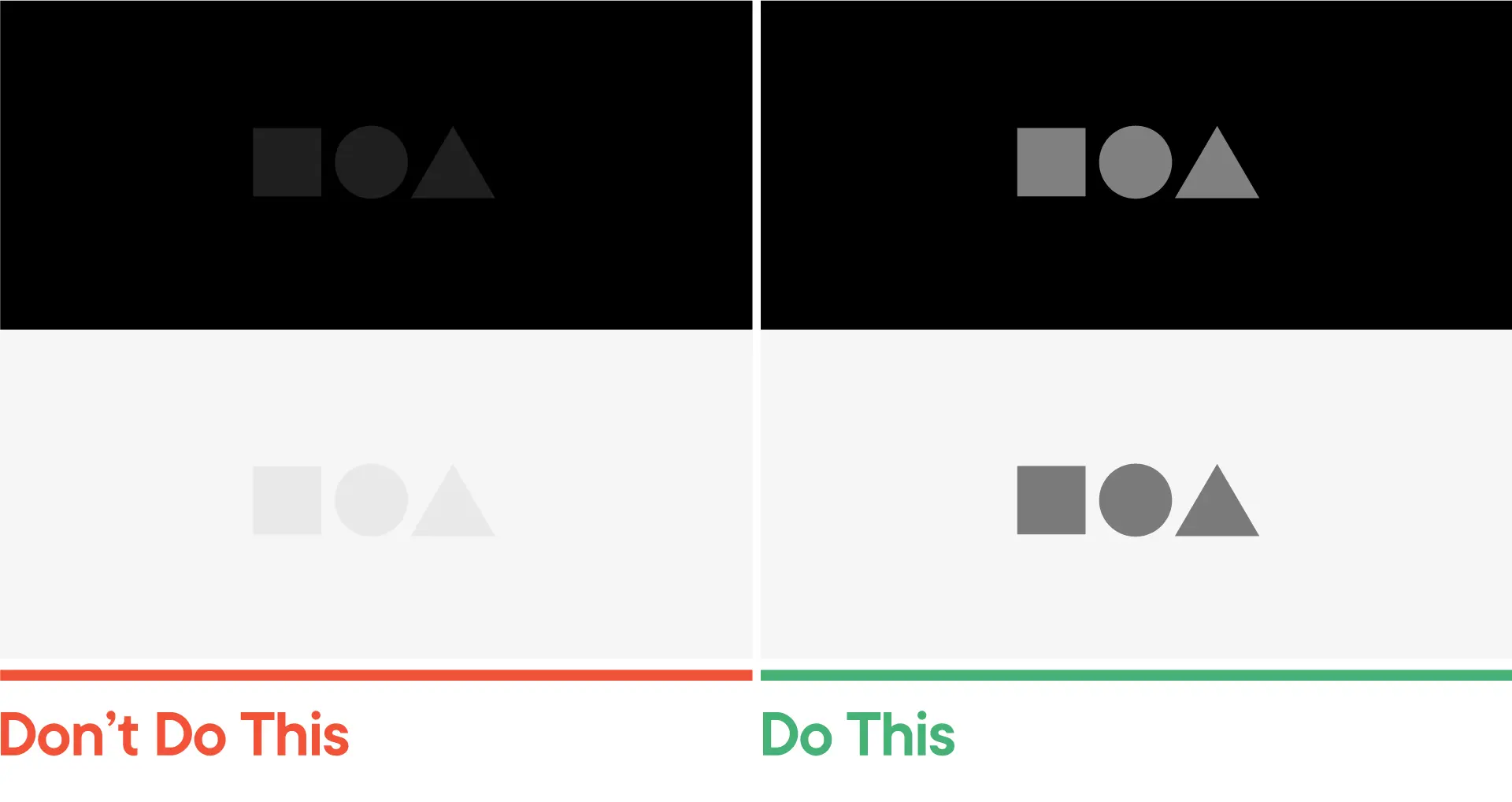
EM: People think accessibility is the millstone around your neck. And it’s not. In reality, there are these other things you need to think about as you are designing and developing a site. For example, a website might lean on too light a grey to signal a disabled state on a button —
AD: Wait. What?
EM: A disabled button. It shows that a call-to-action button that says something like Buy Now isn’t interactive. If they aren’t operating, developers will lighten them or grey them out to show they aren’t active.
AD: Are we in the weeds a little right now?
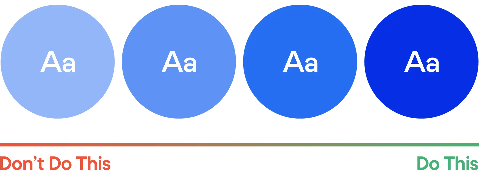
EM: A little, but the details matter. A person who has a vision impairment might not see that button if the background is white or a brand color with low contrast. So, you need to think of another way to indicate a disabled state to let people know this button does not work. Do you hide it entirely or change the color?
AK: I keep thinking about the minimalist design trend. How minimal or subtle something is can often be a counterpoint to accessibility. It’s not just about making a big green button to signal “buy.” You need to write the words “pay now” on top of the green button and then multiply those clues. As a designer, creating these redundancies should become second nature.
AD: So, are our clients asking for this level of detail?
AK: No, Evan and I do a lot of this as a practice. We’re making many of these choices for our clients. It’s the kind of B Corp motive to try to be better.
AD: I love that. Are there tools that can help too?
EM: Yes. A lot of the tools we use to develop websites have these features cooked in them.
AK: Tools that nudge you to make better choices.
AD: So what do you say when someone calls and asks if their current website is accessible?
AK: We just flip the accessibility switch on the backside of the website.
EM: Ha, I’ll get right on that.
Design tips:
Further reading:
Web Content Accessibility Guidelines (WCAG)
Accessibility Drives Aesthetics
How to Make Organizations Aware of an Accessibility
Keep up with Bullhorn
Connect on LinkedIn or Instagram
Buy Brad’s naming book
.webp)