
God's Pantry Food Bank: Making hunger visible
1 in 6 people in Central and Eastern Kentucky are hungry. And unsure of where they will get their next meal. The number is staggering, perhaps surprisingly so, because hunger is hard to see. God’s Pantry Food Bank, a regional food bank on a mission to end hunger in the state, considers us all as neighbors. And as they work to make hunger visible, to bring this reality to light, they believe neighbors should always help neighbors.
God’s Pantry Food Bank has been a cornerstone of support in Central and Eastern Kentucky since the 1950s when Mim Hunt began offering food out of the back of her car. What began as a one-woman mission is now a multi-county operation serving hundreds of thousands of Kentuckians. They are well-known in the community. Many recognize the blue barrels in their Kroger, have participated in a local food drive, or attended a fundraising event.


Brand awareness wasn’t really an issue for them. But a lot of people perceive them only for what they see. They envision a smaller operation that sets up meal programs and pantries. God’s Pantry Food Bank wanted to keep its strong existing foundation and reintroduce itself with a more active brand identity, visual and verbal, to educate neighbors on the state of hunger in their backyards and empower them to join the mission.


We began by getting to know the organization from the inside out. We toured facilities in Fayette County and Floyd County. We talked to various staff members: team members, new and old, forklift drivers, volunteers, board members. We conducted a brand foundations workshop to dig deep into values and talk about where they want the organization to go. And we volunteered.

We immediately learned how central our neighbors are to God’s Pantry Food Bank’s mission. So, our brand strategy was simple: our neighbors are our north star and should inform every decision we make. As we started to create concepts, we kept our neighbors at the top of the board. They guided us to develop an identity that felt personal yet hopeful.


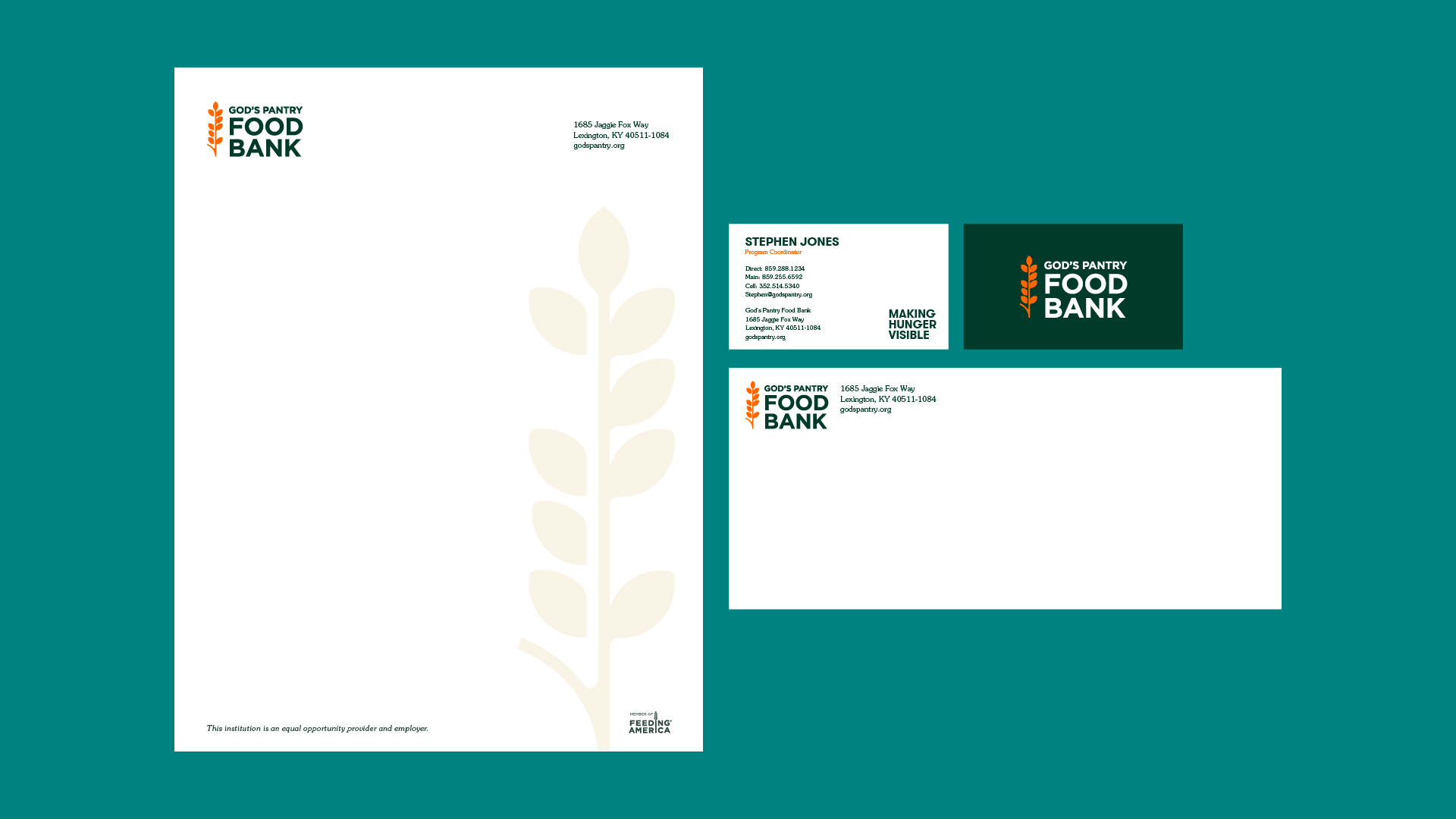
We brightened the palette and tightened the existing logo. And we created a graphics system for social media, print marketing, and the website. The logo is seen far and wide across the state — on trucks, donation barrels, billboards, fundraising materials — so flexibility was a must.
The voice is warm but unflinching. It’s realistic, not sugar-coating the hard stuff, but also hopeful, empowering others to take action. New values-based foundational language helps make hunger personal and rallies people to take action.